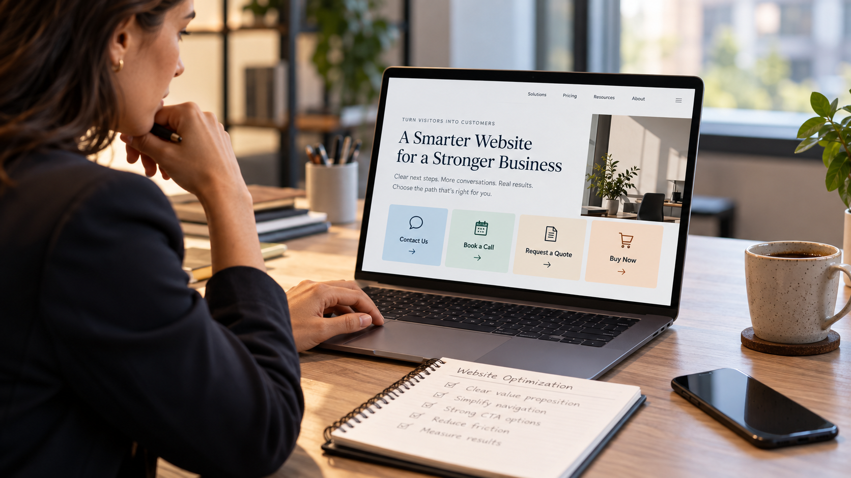
Should your website say Contact Us, Book a Call, Request a Quote, or Buy Now? The right call to action depends on what you sell, how customers make purchasing decisions, and what your business can actually deliver. Here's a practical guide to choosing a primary CTA that supports better user experience, qualified leads, and measurable conversions.
Imagine someone visits your website for the first time.
They understand what your business does.
Your homepage explains whom you serve.
Your products or services appear relevant.
And the visitor is interested in taking the next step.
Then they encounter five different buttons.
Contact Us.
Learn More.
Book a Discovery Call.
Request Pricing.
Get Started.
Each button leads somewhere different.
One opens a general contact form.
Another displays a calendar.
A third asks for project details.
And another leads to a page that repeats the same information the visitor just read.
Which one should they choose?
The answer may seem obvious to the person who designed the website.
But it isn't necessarily obvious to a first-time buyer.
Now imagine another website.
The visitor sees one clear primary action.
The button describes exactly what happens next.
A relevant secondary link allows visitors who aren't ready to act to continue researching.
And the process after clicking works as expected.
That is a much clearer experience.
A website doesn't need more calls to action. It needs a clear primary call to action that matches the customer's readiness and the business's actual sales process.
For some companies, that action should be Contact Us.
For others, Book a Call.
For manufacturers and project-based businesses, Request a Quote may make more sense.
And for companies selling standardized products online, Buy Now may be the natural next step.
But choosing the right label isn't simply a copywriting decision.
It's a business strategy decision.
A service firm that requires a detailed qualification process shouldn't automatically invite every visitor to book an immediate sales meeting.
An industrial manufacturer shouldn't promise instant pricing for a custom product that requires technical review.
And an ecommerce store shouldn't make customers contact sales when the product can be purchased directly.
At Ritner Digital, we believe website conversion strategy should reflect how the business actually operates.
That means considering the customer's information needs, the type of purchasing decision involved, the company's internal processes, and the outcome marketing should measure.
For 2027, the goal isn't to chase a universal button color or a supposedly perfect conversion phrase.
It's to help suitable visitors take the appropriate next step with as little unnecessary confusion as possible.
Here's how to choose.
What Is a Primary Call to Action?
A primary call to action, or CTA, is the main action you want a visitor to take on a particular page.
It may appear as a button, a clearly emphasized link, or another accessible control.
The purpose is to help the visitor move toward a meaningful outcome.
That outcome depends on the business.
For an online retailer, it may be a completed purchase.
For a professional services company, it may be a qualified consultation inquiry.
For an industrial manufacturer, it may be a request for quotation.
For a highly specialized technical supplier, it may be the beginning of an application review.
Primary Doesn't Mean Only
This distinction matters.
One clear primary CTA does not mean your website should contain only one link or one possible action.
Visitors still need navigation.
They may want to explore products, review capabilities, read technical documents, or learn about the company.
A homepage may also benefit from a secondary CTA.
For example:
Primary: Request a Quote.
Secondary: Explore Our Capabilities.
These actions serve different levels of readiness.
One invites a commercial inquiry.
The other supports additional research.
The key is visual and functional hierarchy.
The page should communicate which action is the main next step without preventing people from finding other useful information.
One Primary CTA Per Decision Point
A company's homepage might prioritize a general consultation inquiry.
Its individual product pages might prioritize RFQs.
An ecommerce product page might use Add to Cart.
And a resource page might guide visitors toward a relevant product category.
Those differences are reasonable.
The rule is not that every page across the entire website must use the same button.
The rule is that each important page should have a clear primary action appropriate to its purpose.
Before Choosing the Button, Answer Four Business Questions
Many website projects begin with a discussion about wording.
Should the button say "Let's Talk"?
Or "Get Started"?
Or "Schedule a Consultation"?
That conversation happens too early.
First, understand the business process.
Question 1: What Is the Visitor Actually Ready to Do?
A person visiting your homepage may be exploring.
Someone reading a grade-specific industrial product page may be ready to discuss a purchase.
An ecommerce customer may have already selected the item they want.
These visitors have different levels of commitment.
The CTA should not demand more commitment than the visitor is reasonably prepared to make.
Question 2: What Information Does Your Business Need Next?
Some services can be discussed in a short call.
Others require project details before an estimate is possible.
A standardized product may be ready for immediate checkout.
A custom chemical manufacturing project may require a technical and commercial feasibility review.
The button should lead into that real process.
Question 3: What Can Your Team Reliably Deliver?
If you offer direct scheduling, your team must be able to honor those appointments.
If you invite RFQs, someone must review them.
If you offer online purchases, the checkout and fulfillment process must work.
And if you invite contact inquiries, they need to reach an appropriate person.
The CTA shouldn't promise a process the company cannot consistently support.
Question 4: What Outcome Will You Measure?
A click on a button is not necessarily a successful conversion.
A scheduled meeting isn't necessarily a qualified opportunity.
An RFQ isn't automatically a sale.
And an initiated checkout isn't the same as a completed order.
Choose the CTA alongside the definition of success.
The best primary CTA connects buyer intent, operational capability, and a measurable business outcome.
Option 1: When "Contact Us" Is the Right Primary CTA
Contact Us is one of the most familiar website actions.
It's flexible.
Most visitors understand it.
And it can work well for businesses with varied inquiry types.
But it also has limitations.
Best for Businesses With Several Legitimate Inquiry Paths
Contact Us may be appropriate when:
The company offers several distinct services.
Prospective customers may not know which option fits.
Requests require initial review.
The business serves multiple kinds of customers.
Or the next step cannot be standardized into a quote or scheduled meeting.
A specialized industrial business may receive inquiries about custom manufacturing, technical capabilities, distribution arrangements, and existing products.
A broad contact route can help when there isn't one obvious commercial action for every visitor.
The Problem With Generic Contact Pages
Some Contact Us pages offer nothing more than:
Name.
Email.
Message.
Submit.
The visitor has no idea what information to include.
And the business may have no clear process for routing the request.
This isn't necessarily a button-wording problem.
It's an inquiry experience problem.
How to Make Contact Us More Effective
Explain what types of inquiries the company welcomes.
Identify relevant contact options.
Keep the form understandable.
And route submissions appropriately.
For example, a manufacturer may distinguish technical inquiries from general business questions without forcing every visitor into a complicated workflow.
An Illustrative Improvement
Weak CTA: Contact Us.
More descriptive CTA: Contact Our Team.
Supporting text: "Tell us which product or manufacturing capability you're interested in, and we'll direct your inquiry to the appropriate team."
This should only be used if that routing process actually exists.
When Contact Us May Be Too Vague
If someone is looking at a specific product with clear purchasing intent, Request a Quote may better describe what they want.
If a visitor is ready to buy an available standardized product, Contact Us may add unnecessary friction.
And if the company's commercial model relies on scheduled consultations, a general contact form may not provide the best next step.
The Key Principle
Choose Contact Us when the visitor needs a flexible way to begin a conversation and the business has a reliable process for handling different requests.
Option 2: When "Book a Call" Is the Right Primary CTA
Book a Call can work well for professional services and consultative businesses.
The action is concrete.
It tells the visitor that the next step is a conversation.
And it may eliminate the back-and-forth required to arrange an appointment.
But it isn't automatically better than a contact form.
Best for Consultative Sales Processes
A scheduling CTA may be appropriate for:
Professional service providers.
Specialized agencies.
Consultants.
Business software providers using demonstrations.
And other organizations where a conversation is the natural next step.
For example, a B2B marketing agency may need to understand a company's goals, current website, and commercial priorities before proposing work.
An introductory discussion may be more appropriate than a generic quote form.
Why Scheduling Can Create Friction
Not every visitor is ready to reserve time.
Some may want to ask one preliminary question.
Others may need to confirm whether the provider serves their industry.
A prospective customer may be researching on behalf of a colleague.
And some visitors may not want to share detailed information before understanding the process.
Requiring an immediate meeting can feel like too much commitment.
Don't Assume More Calendar Bookings Mean Better Leads
An unrestricted calendar may attract people outside the company's service area or commercial focus.
It can also create no-shows, cancellations, and meetings that aren't relevant to the business.
The most useful metric isn't simply the number of appointment slots filled.
It's the number of appropriate conversations that take place and progress toward meaningful outcomes.
What the Scheduling Experience Needs
Clear meeting purpose.
Accurate availability.
An appropriate time zone display.
Reasonable introductory questions.
Confirmation and cancellation information.
And a working scheduling system.
The visitor should know whom they're meeting and what the conversation is intended to accomplish.
Offer an Alternative When Appropriate
A secondary contact route can be useful for visitors who have a question but aren't ready to schedule.
That doesn't weaken the primary CTA.
It acknowledges that not every buyer follows the same process.
The Key Principle
Choose Book a Call when a scheduled conversation is genuinely the most useful next step and your business has the resources to conduct and qualify those meetings.
Option 3: When "Request a Quote" Is the Right Primary CTA
Request a Quote can be especially appropriate for B2B manufacturers, contractors, specialized service businesses, and companies selling products without fixed public pricing.
The wording signals commercial intent.
The visitor is indicating interest in a potential purchase or project.
But quoting isn't always immediate.
And different businesses require different levels of information before they can provide a price.
Best for Products or Services Requiring Defined Requirements
A manufacturer may need to know the actual product or grade.
A contractor may need the project scope.
A custom fabricator may require drawings or specifications.
A chemical toll manufacturer may need to evaluate technical feasibility before discussing commercial terms.
These businesses may benefit from an RFQ pathway.
Don't Confuse Requesting a Quote With Receiving a Quote
A button labeled Request a Quote usually means the visitor is asking the company to review a request.
It doesn't necessarily promise an immediate price.
A company shouldn't use "Get an Instant Quote" unless it actually has a reliable system capable of producing an appropriate quote immediately.
Likewise, a submitted request isn't automatically a binding commercial offer.
Build a Form Around Actual Qualification Needs
A useful RFQ form may gather:
The product or service of interest.
Relevant business contact information.
A general project or purchasing requirement.
And other details necessary for an initial review.
The correct fields depend on the business.
Don't require every visitor to provide extensive information that isn't needed at the first stage.
Consider Technical Confidentiality
Industrial customers may need to discuss proprietary specifications, formulas, drawings, or processes.
A public RFQ form should not demand confidential information through an unsuitable channel.
Where detailed technical information is necessary, provide an approved secure process.
Route RFQs Correctly
A specialized manufacturer may have different commercial teams by product family, region, or authorized distributor.
A successful request should reach the correct person or system.
If a company promotes Request a Quote, it needs a reliable process behind that promise.
The Key Principle
Choose Request a Quote when the visitor is ready to discuss a defined commercial requirement and your business can appropriately evaluate it.
Option 4: When "Buy Now" Is the Right Primary CTA
Buy Now works when the customer can genuinely complete a purchase online.
It's a direct action.
There's little ambiguity about the intended next step.
But it should only be used when the buying process supports it.
Best for Standardized Purchasable Products
An online store selling readily purchasable products may benefit from Buy Now or Add to Cart.
The customer can review a product.
Understand the price and terms.
Select relevant options.
And complete the transaction.
The checkout process should work without requiring unnecessary contact with the business.
Buy Now and Add to Cart Are Different
Buy Now often suggests proceeding toward an immediate purchase flow.
Add to Cart allows a customer to build an order before checkout.
The appropriate label depends on the actual ecommerce experience.
Don't use Buy Now to send visitors to a general inquiry form.
That creates a mismatch between the promise and the action.
Consider Product Complexity
Some industrial businesses sell standardized consumables or parts online.
Others sell materials that require qualification, controlled distribution, or specialized handling.
Not every chemical product is appropriate for direct online sales.
Product eligibility, customer restrictions, safety requirements, shipping rules, and applicable commercial arrangements must be addressed.
Don't Use Ecommerce Language to Bypass Required Review
A company shouldn't offer unrestricted checkout for a product requiring controlled sales or regulatory evaluation simply because an immediate purchase button may produce more clicks.
The transaction process must reflect the actual product and applicable requirements.
Make the Purchase Experience Trustworthy
Present accurate product descriptions.
Explain relevant pricing and fulfillment terms.
Avoid hidden charges or misleading availability claims.
Provide suitable support and policy information.
And ensure that checkout works on mobile and desktop.
The Key Principle
Choose Buy Now when the product is genuinely available for direct purchase and the company can reliably complete the transaction.
How to Choose Between Contact, Call, Quote, and Buy
A useful decision process begins with how the customer can realistically proceed.
If Customers Can Purchase Without Sales Involvement
Primary CTA: Buy Now or Add to Cart.
This may fit standardized products and straightforward ecommerce transactions.
The visitor should be able to complete a legitimate purchase.
If Customers Know What They Need but Require Pricing or Review
Primary CTA: Request a Quote.
This may fit manufacturers, contractors, project-based services, and many B2B suppliers.
The request should initiate a real review process.
If a Conversation Is the Natural First Step
Primary CTA: Book a Call.
This may fit consultants, agencies, and other consultative providers.
The scheduling process should be reliable and relevant to the visitor.
If Inquiry Types Vary or Qualification Must Begin More Generally
Primary CTA: Contact Us.
This may fit businesses with several customer needs or offerings that aren't easily standardized.
The form should still provide clarity and routing.
The Most Important Exception
Some businesses will need different primary CTAs across different pages.
A manufacturer's homepage might use Explore Products or Contact Technical Sales, while a specific product page uses Request a Quote.
A consulting firm's homepage may prioritize Book a Consultation, while its careers page uses a different action.
A retailer's homepage may encourage shopping, while product pages use Add to Cart.
Don't force a website-wide CTA to override what a particular visitor actually needs to do.
What If Your Business Has More Than One Type of Customer?
This is common in B2B.
A chemical manufacturer may sell standard products while also providing custom manufacturing.
An equipment business may sell replacement parts online while quoting larger systems.
A professional services firm may serve both small businesses and enterprise clients.
In those cases, one universal sales action may be inappropriate.
Choose a Primary Action for the Homepage's Main Audience
The homepage should communicate the business's main commercial direction.
Then provide pathways into distinct product or service categories.
For example, a manufacturing business might primarily direct visitors toward its capabilities.
Its product catalog could then provide grade-specific RFQ options.
Its custom manufacturing page could invite a feasibility discussion.
Don't Confuse Hierarchy With Exclusivity
The homepage can still contain navigation links.
Existing customers may need support.
Job applicants may want careers.
Technical visitors may need documents.
These should remain accessible.
But they don't all need equal emphasis in the homepage's opening section.
Use Intent-Specific Landing Pages
A paid advertising campaign targeting a defined service may benefit from a landing page with one clearly matched action.
A product detail page may be more suitable for an RFQ.
An educational resource may direct visitors toward a related product family before introducing a commercial CTA.
The action should reflect the purpose of the page.
What About "Request a Sample," "Get a Demo," or "Start a Trial"?
These are legitimate primary CTAs in appropriate situations.
The four options in this article represent common categories, not an exhaustive list of button labels.
Request a Sample
A specialty chemical or advanced-materials manufacturer may use this when an approved sample evaluation program exists.
However, a submitted request isn't the same as sample approval.
Technical, commercial, safety, and shipping reviews may apply.
The website should communicate that distinction.
Get a Demo
A software or equipment provider may demonstrate its offering before a purchase decision.
If the demo requires a salesperson, the CTA should set that expectation.
If it's a self-guided product experience, the wording and destination should reflect that.
Start a Trial
This is appropriate when the company genuinely provides a trial.
The visitor should understand the relevant terms, limitations, and any billing arrangements.
Get Pricing
This may work when the business provides pricing information or an estimate pathway.
But if the next step is simply a general contact form, Request Pricing Information or Request a Quote may set expectations more accurately.
The Rule Behind All These Alternatives
Label the action according to what actually happens after the click.
That principle matters more than whether the button follows a popular conversion-copy trend.
How to Write CTA Copy That Makes the Next Step Obvious
CTA wording should be specific.
But it doesn't need to be overly clever.
Consider several comparisons.
Vague: "Learn More"
More useful when appropriate:
"View Our Manufacturing Capabilities."
"Explore Product Families."
"See How the Service Works."
These explain the destination.
Vague: "Get Started"
More useful when appropriate:
"Book an Introductory Call."
"Request a Project Quote."
"Start Your Order."
These communicate the intended action.
Vague: "Submit"
More useful on a form:
"Send Inquiry."
"Submit Quote Request."
"Confirm Booking."
"Place Order."
These describe what the action accomplishes.
Don't Add False Urgency
"Book Before It's Too Late" may create pressure without providing useful information.
"Only Three Slots Left" should not be used unless accurate and relevant.
Likewise, don't claim guaranteed response times or instant approvals that the company cannot support.
Write the Button and Surrounding Copy Together
Sometimes the best solution is not a longer button label.
For example:
Button: Request a Quote.
Supporting text: "Tell us which product or service you're evaluating. Our team will review your request and explain the appropriate next step."
The supporting text can clarify the process without overloading the button.
Google's people-first content guidance emphasizes content that helps visitors achieve their goals.
CTA wording should follow the same principle.
Where Should Your Primary CTA Appear?
Placement matters, but there isn't one layout that guarantees conversions.
The homepage's opening section is often a useful place for the main action.
Visitors should be able to recognize the next step without navigating through a large amount of content.
But some people need more information first.
In the Homepage Hero
A clear primary button near the headline can serve visitors who are already ready to act.
It should not compete with five other equally prominent controls.
In the Main Navigation
A consistent contact or commercial action may be useful in the website header.
But it should remain accessible and understandable across screen sizes.
After Relevant Supporting Information
A repeated CTA after product categories, service details, or trust evidence can help visitors who needed additional context.
Near the End of the Page
A final action can provide a natural conclusion for someone who has reviewed the homepage.
Repeating One CTA Isn't the Same as Having Many Competing CTAs
A homepage may repeat Request a Quote in several relevant places.
That's different from giving equal prominence to Contact Us, Schedule, Buy, Subscribe, and Download without a clear hierarchy.
The repeated action should remain consistent with the page's commercial purpose.
Your CTA Is Only as Good as the Page Behind It
A strong button can still lead to a poor experience.
Consider a visitor who clicks Book a Call.
The calendar fails to load.
Or the available time slots are months away.
Or the booking form asks for information unrelated to the discussion.
Now consider a visitor who clicks Request a Quote.
The form demands a company address, full product specification, anticipated annual volume, and detailed project information before the visitor has established whether the manufacturer is appropriate.
That may be more information than the buyer can reasonably provide at this stage.
Reduce Unnecessary Form Friction
The W3C Web Accessibility Initiative's forms guidance recommends clear labels, understandable instructions, and requesting information appropriate to the task.
A form can be short without being useful.
And a longer form can be appropriate when the process genuinely requires more detail.
The right question is whether each field serves a necessary purpose.
Provide Clear Labels
Use visible, understandable field labels.
Explain required information.
Provide accessible error messages.
And confirm when the action is completed.
Placeholder text alone should not replace proper labels.
Make Mobile Interaction Work
Some visitors may first encounter your business on a phone.
Test the form or scheduling experience on mobile.
Fields should be usable.
Buttons should be operable.
And the user shouldn't need to fight the interface.
Verify Backend Routing
When a form is submitted, does the intended team receive it?
Does the CRM create the correct record?
Does an automated confirmation accurately reflect the next step?
Does a scheduled call appear on the right calendar?
Does an online purchase create the expected order?
A CTA click is an intention. A working follow-through turns that intention into a real customer action.
How to Measure Whether Your Primary CTA Is Working
Many websites measure CTA performance using button clicks.
That can be useful.
But it is only the beginning.
Different primary actions require different outcome metrics.
Contact Us
Measure verified inquiries.
Then determine whether they are relevant to the business.
A high number of unrelated submissions may indicate a messaging or routing problem.
Book a Call
Measure completed bookings.
But also review canceled appointments, attended meetings, qualified conversations, and opportunities where appropriate.
A booking that never takes place isn't equivalent to a completed sales discussion.
Request a Quote
Measure submitted RFQs.
Then review qualification, quote preparation, issued quotes, accepted orders, and other relevant stages.
Not every RFQ becomes a commercial opportunity.
Buy Now
Measure completed purchases, not merely clicks or initiated checkout sessions.
Where appropriate, consider refund activity and relevant commercial outcomes.
Use Analytics Events Accurately
Google Analytics 4 provides recommended events including generate_lead, qualify_lead, and purchase.
These events aren't automatically implemented on every website.
They need to reflect actual actions and appropriate event definitions.
For example:
generate_lead may represent a verified inquiry submission.
qualify_lead may represent the later determination that a lead meets company criteria.
purchase represents a completed purchase.
A click on Request a Quote should not automatically be recorded as a completed transaction.
Avoid Sending Sensitive Details Into Analytics
A B2B form may collect contact information, commercial requirements, or confidential technical details.
Do not send ordinary personally identifying or proprietary information through unrestricted analytics fields.
Coordinate with the appropriate privacy and technical personnel.
Measure Quality, Not Just Quantity
The goal isn't necessarily to maximize every button click.
It's to make it easier for suitable customers to take an appropriate action.
That distinction becomes especially important in specialized B2B industries.
A Hypothetical Example: Three Businesses, Three Different CTAs
Let's examine how choosing the right CTA can change the website experience.
These examples are fictional. They do not represent actual Ritner Digital client projects or measured conversion improvements.
Business A: A Specialty Chemical Manufacturer
The company produces commercial grades used in industrial formulations.
Its homepage currently uses Book a Call.
But many visitors simply want to know whether the manufacturer supplies a specific material.
The sales team receives meetings from people who haven't reviewed the product information.
A Better Approach
The homepage could emphasize Explore Products or Contact Technical Sales, depending on its primary objective.
Relevant product pages could prioritize Request a Quote.
Where an approved sample program exists, qualified visitors could initiate a sample evaluation inquiry.
The most useful improvement is connecting the action to the product and evaluation process.
Business B: A Specialized Marketing Agency
The agency works with a defined group of B2B companies.
Its homepage currently uses Request a Quote.
But the agency cannot prepare a meaningful proposal without understanding the client's goals and scope.
A Better Approach
Book an Introductory Call may provide a clearer next step.
A short scheduling form could collect the context needed for the conversation.
Visitors who aren't ready to schedule could still access service information or a secondary contact method.
The agency should confirm that its calendar process can reliably support the bookings.
Business C: An Online Retailer
The company sells standardized products with public prices and direct checkout.
Its product pages use Contact Us for Pricing.
Customers must wait for an email response before purchasing.
A Better Approach
If the products and commercial arrangements support direct ecommerce, the business could provide Add to Cart or Buy Now.
That removes an unnecessary sales interaction.
But the company must first establish accurate product availability, pricing, checkout, and fulfillment processes.
The Common Lesson
The best CTA reflects the transaction.
Not the preferences of the designer.
Not a competitor's button.
And not a generic conversion tactic.
How to Test Two CTA Options Without Misreading the Results
A/B testing can help evaluate competing approaches.
But a button-label test is only useful when the business understands what success means.
Imagine a consulting firm compares:
Contact Us.
And Book a Call.
The booking version may generate fewer total actions but more relevant completed conversations.
Or it might produce more booked appointments with a high cancellation rate.
Which version is better?
The answer depends on the business objective and actual outcomes.
Begin With a Clear Hypothesis
For example:
"We believe a scheduling CTA will help qualified prospects initiate the intended consultation process more directly than a general inquiry form."
That is a specific hypothesis.
It can be tested where the website has suitable traffic and measurement.
Keep the Test Interpretable
If you change the headline, hero image, page layout, button wording, and destination simultaneously, it becomes difficult to determine which change influenced the result.
Some redesigns necessarily involve several changes.
But the analysis should acknowledge that limitation.
Evaluate Meaningful Outcomes
Review more than CTA click-through rate.
Look at verified actions.
Qualification.
Meeting attendance.
Commercial progression.
And potential differences in traffic sources.
Don't Declare Victory Too Early
A handful of form submissions may not provide enough information to distinguish two options reliably.
B2B websites may have relatively low conversion volumes and long purchasing cycles.
Where a formal statistical test isn't practical, use qualitative research, usability testing, and sales feedback to inform the decision.
The goal is to learn which CTA supports the right customer behavior—not simply which label attracts more clicks.
The 10 Most Common Primary CTA Mistakes
1. Giving Every Button Equal Importance
A page with several visually identical commercial actions can create unnecessary indecision.
Establish a clear primary action.
2. Choosing Book a Call Without Enough Team Capacity
A scheduling link isn't useful if the company can't conduct or qualify the meetings.
3. Using Request a Quote for Something That Can't Yet Be Quoted
A preliminary feasibility inquiry may need a different process.
Set accurate expectations.
4. Using Buy Now Without a Genuine Checkout
Don't promise immediate purchasing when customers must still request approval or wait for a salesperson.
5. Sending Every CTA to the Same Generic Form
Different intent may require different information and routing.
Don't pretend the destination is specific when it isn't.
6. Asking for Too Much Information
Unnecessary fields can make the next step harder than it needs to be.
Collect appropriate information at the appropriate stage.
7. Forgetting the Secondary Research Path
Not every visitor is ready to contact sales.
Allow people to understand the offering before committing.
8. Hiding the CTA on Mobile
Check visibility, usability, and accessibility across devices.
9. Counting Clicks as Qualified Leads
A click is not a verified submission.
A submission isn't necessarily qualified.
And qualification isn't a sale.
10. Failing to Test What Happens After Submission
A beautiful homepage can still lose legitimate inquiries because of broken integrations or incorrect routing.
Test the entire process.
The 2027 Primary CTA Audit: 20 Questions to Ask
Use this checklist during a homepage redesign or conversion optimization review.
Business and Buyer Fit
We know the main commercial outcome our homepage should support.
Our primary CTA reflects what the intended visitor is ready to do.
The action matches our real sales or purchase process.
We don't promise outcomes our team cannot deliver.
We have identified meaningful secondary actions for visitors who need more information.
Messaging and Placement
The primary CTA uses clear and understandable wording.
The surrounding text explains what happens next.
The primary button is visually distinguishable from secondary actions.
The CTA appears in appropriate places across the page.
Product or service pages use actions suited to their specific purposes.
Conversion Experience
The button leads to the correct destination.
Forms or scheduling tools work on mobile and desktop.
We request only information needed at the relevant stage.
Error messages and confirmation states are understandable.
Sensitive information is handled through approved systems.
Qualification and Measurement
Completed actions are distinguished from button clicks.
Inquiries are routed to the correct team.
Booking, RFQ, or purchase outcomes are recorded accurately.
We can assess lead or order quality, not just volume.
Someone is responsible for monitoring and improving the process.
How to Interpret the Results
A confusing CTA may be a copywriting problem.
A long form may require workflow redesign.
A scheduling tool that creates unsuitable meetings may be a qualification problem.
And a broken purchase process may require ecommerce development.
Don't assume every issue can be fixed by changing two words on a button.
A 30-Day Plan to Choose and Implement Your Primary CTA
Most businesses don't need a complete website rebuild to improve their primary action.
A focused process can be useful.
Week One: Map the Customer's Next Step
Meet with sales, customer service, and the appropriate operations team.
Determine what visitors usually need before becoming customers.
Review existing inquiries.
Identify common qualification problems.
And clarify the primary outcome for each important page.
Week Two: Select and Design the CTA
Choose the most appropriate main action.
Draft supporting copy.
Define the destination.
Review form fields or scheduling requirements.
And identify a relevant secondary action.
Confirm that the company can fulfill the promised process.
Week Three: Implement and Test
Update the homepage and relevant landing pages.
Verify mobile and keyboard usability.
Test submissions or bookings.
Check confirmation messages.
Confirm CRM and calendar routing.
And correct any operational problems.
Week Four: Measure and Refine
Establish baseline performance.
Review verified completions.
Gather feedback from the team handling inquiries.
Identify any unexpected friction.
And plan further testing where feasible.
What Not to Promise
Changing a CTA doesn't guarantee higher revenue.
The business still needs a relevant offering, appropriate traffic, and a functioning sales or fulfillment process.
The immediate objective is a clearer and more reliable customer journey.
Commercial results should be evaluated over an appropriate period.
How Your Primary CTA Connects to Your Overall Website Strategy
A CTA cannot do its job in isolation.
Imagine a homepage that never clearly explains the business.
Then it displays a prominent Book a Call button.
Why would a first-time visitor schedule time with a company they don't understand?
Or imagine a product page with a prominent Request a Quote action.
But it offers no useful technical information about the product.
The buyer may not be ready to submit the request.
This is why CTA selection should follow the larger website strategy.
The Value Proposition Establishes Relevance
Visitors need to know what the company does and why it may fit their needs.
Our related article, Your Website Needs a Value Proposition, Not Just a Clever Headline, explains that foundation.
The Page Structure Supports the Decision
Product or service information helps visitors evaluate whether to proceed.
The homepage shouldn't rely on a CTA to compensate for missing content.
Trust Information Reduces Uncertainty
Verified capabilities, approved testimonials, and transparent business information can help buyers assess credibility.
The CTA Provides the Next Step
Once the visitor has enough information, the action should be clear.
The Backend Process Delivers the Experience
Sales, operations, or ecommerce systems must complete what the website initiates.
For the wider homepage framework, see The Anatomy of a High-Converting Homepage: 12 Elements Every Business Needs in 2027.
A well-chosen CTA is the connection between the information on your website and the next meaningful action in the customer journey.
Frequently Asked Questions
1. What is a primary CTA on a website?
A primary CTA is the main action a webpage encourages visitors to take. It might involve contacting the business, booking an appointment, requesting a quotation, or purchasing a product. The appropriate action depends on the page's purpose and customer journey.
2. Should a website have only one CTA?
Not necessarily. A page can contain navigation, secondary actions, and repeated instances of its primary CTA. The important principle is to make the main next step clear rather than presenting several competing actions with equal emphasis.
3. Is Contact Us a good homepage CTA?
Yes, for businesses where inquiry types vary or the next step requires general qualification. But it can be less specific than a quote or scheduling action when the visitor already knows what they want.
4. Is Book a Call better than Contact Us?
Neither is universally better. Book a Call can suit consultative businesses with an appropriate scheduling process. Contact Us may serve visitors who aren't ready to reserve time or whose requests vary. The choice should reflect actual buyer behavior.
5. When should a website use Request a Quote?
Request a Quote is useful when customers need pricing for a defined product, service, or project and the business has a process to evaluate the request. It is common in manufacturing, contracting, and specialized B2B purchasing.
6. When should a website use Buy Now?
Buy Now is appropriate when a product or service can actually be purchased through a functioning online transaction. The website should provide accurate pricing, relevant terms, and a reliable checkout process.
7. What's the difference between Buy Now and Add to Cart?
Buy Now generally suggests moving directly toward purchasing. Add to Cart allows customers to add an item to an order before checkout. The label should accurately describe the destination and buying experience.
8. Should a B2B manufacturer use Book a Call or Request a Quote?
It depends on the offering. A manufacturer selling defined commercial products may benefit from an RFQ pathway. A company offering complex custom services may need a technical consultation or feasibility discussion before pricing can be prepared.
9. What should a chemical manufacturer use as its primary CTA?
The choice depends on its actual business. Standard products may support RFQs, authorized distributor inquiries, or suitable ecommerce workflows. Technical materials may require application discussions or sample review. The website should reflect the manufacturer's approved process.
10. Is Request a Sample a good CTA?
It can be when the manufacturer has an actual sample evaluation program. The website should distinguish an inquiry from an approved sample request and should not promise fulfillment before the necessary review.
11. Should every page use the same CTA?
No. A homepage, product page, service page, and technical article may support different stages of the buyer journey. Each important page should have an appropriate primary action while remaining consistent with the broader business process.
12. What is a secondary CTA?
A secondary CTA offers another useful action without competing with the page's main objective. For example, a visitor who isn't ready to Request a Quote might choose Explore Products. It helps accommodate different levels of readiness.
13. Where should the primary CTA appear on the homepage?
A clear action near the opening message is often useful. It may also appear after relevant supporting information and near the end of the page. The appropriate placement depends on the layout and visitor needs.
14. How long should CTA button text be?
There is no universal ideal length. Use enough words to make the action understandable without making the label cumbersome. Clear phrases such as Request a Quote or Book a Consultation are often more informative than vague labels such as Submit.
15. Does CTA color affect conversions?
Visual prominence, readability, and contrast matter for usability. But there is no universal button color that guarantees better conversion performance. The color should work within the page's design system and accessibility requirements.
16. How should we measure primary CTA performance?
Measure the verified outcome associated with the action, such as a completed inquiry, attended consultation, submitted RFQ, or completed purchase. Where applicable, review qualification and later commercial results. Button clicks alone provide incomplete evidence.
17. Should we A/B test our CTA wording?
Testing can be useful when traffic volume, tracking, and measurement quality are sufficient. Begin with a clear hypothesis and evaluate meaningful outcomes. For lower-volume B2B websites, qualitative usability testing and sales feedback may be more practical.
18. What's the first step in choosing a better website CTA?
Identify the next meaningful action a suitable visitor can realistically take. Then verify that your business can fulfill it. Only after those decisions should you finalize the button wording, placement, and supporting form or workflow.
The Best CTA Isn't the Most Persuasive Phrase. It's the Right Next Step.
Your website can have a strong value proposition.
Professional design.
Useful product information.
Credible supporting evidence.
And excellent search visibility.
But if the visitor reaches a decision point and doesn't understand what to do next, the experience remains incomplete.
That's why the primary CTA matters.
Not because one magic phrase can double every company's conversion rate.
Not because every homepage needs the same button color.
And not because the business should pressure every visitor into contacting sales.
The purpose is simpler.
Help suitable visitors take the next action that genuinely makes sense.
For some businesses, that's Contact Us.
The customer needs to begin a conversation.
For others, it's Book a Call.
A scheduled consultation is the natural next step.
For manufacturers and project-based businesses, it may be Request a Quote.
The customer has a defined commercial requirement.
And for ecommerce businesses, Buy Now may be the appropriate action.
The product is ready for purchase.
None of these options is universally superior.
The right choice depends on the visitor and the business process.
And the decision shouldn't stop at the button.
The form needs to work.
The calendar needs to be reliable.
The RFQ needs to reach the right team.
The checkout needs to process orders correctly.
And the analytics need to distinguish clicks from actual outcomes.
As you plan your 2027 website strategy, ask four questions.
What is the visitor ready to do?
What does our business need to know next?
What can our team reliably deliver?
And how will we determine whether the action was successful?
Those answers will guide you toward a more effective primary CTA than simply copying the button on a competitor's homepage.
Because the goal isn't to create more clicks.
It's to create a clearer path from genuine customer interest to a useful business interaction.
Your website needs one clear primary CTA—not because visitors should have only one choice, but because they shouldn't have to guess which next step is right.
Choose a Better Conversion Path With Ritner Digital
If your website attracts visitors but doesn't consistently generate the right inquiries, the problem may be more than your button wording.
It may be unclear messaging.
Confusing product or service navigation.
An inappropriate call to action.
A form that asks for too much information.
Or a broken connection between the website and your sales process.
At Ritner Digital, we work with specialized B2B and industrial businesses on SEO, AI search visibility, website content, and digital strategy.
That includes helping companies clarify their value propositions, improve homepage and landing-page messaging, organize products and services, and create better pathways from relevant website traffic to qualified commercial inquiries.
For specialty chemical manufacturers, the appropriate action might involve an RFQ, technical discussion, or approved sample evaluation inquiry.
For a professional services business, it might be a consultation.
And for a company with multiple offerings, it may involve developing different conversion paths for different customer needs.
The goal is not to make every visitor click.
It's to help the right visitors take the right next step—and ensure your business can respond appropriately.
Your primary CTA should reflect how your customers buy, not simply what looks good on a button.