More Than Half Your Residents Are Visiting Your Municipal Website on a Phone — And Most Municipal Sites Aren't Built for Them
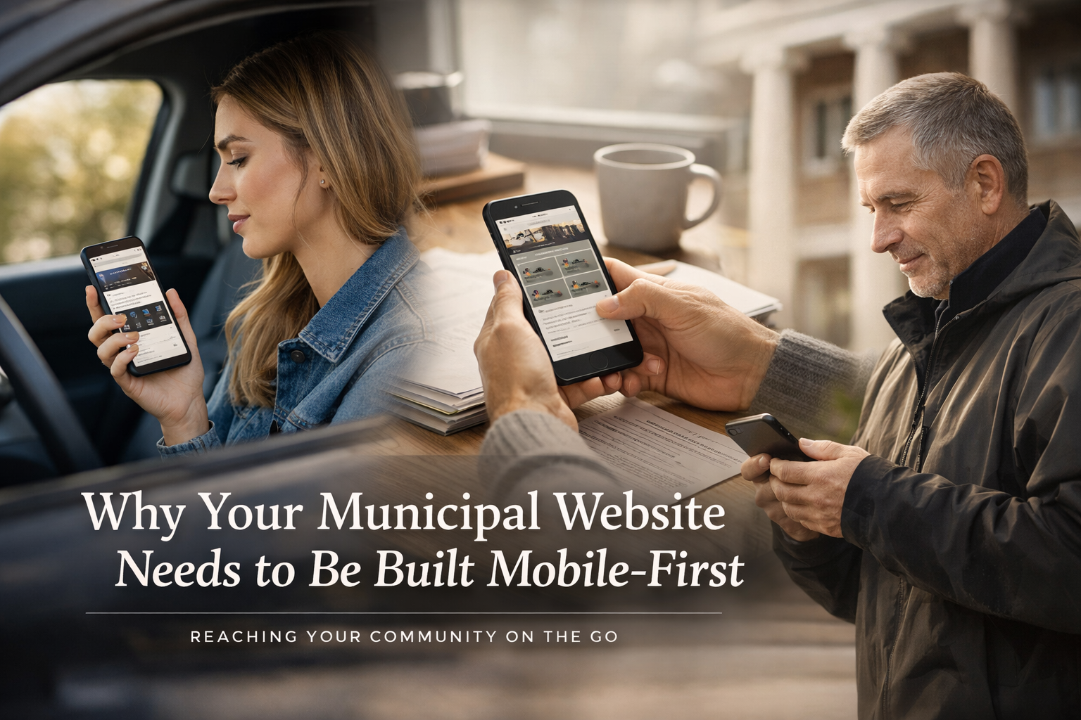
There's a good chance you're reading this on your phone right now. And if you are, you're doing exactly what the majority of your residents do when they need something from their local government — pulling out their phone, opening a browser, and expecting the experience to work.
For most municipal websites in New Jersey, it doesn't.
Not catastrophically. The page loads. You can pinch and zoom and scroll sideways and eventually find what you're looking for if you're patient enough. But "eventually" and "patient enough" aren't how people interact with their phones. They want to tap, scroll, find, and finish. They want the experience to feel like every other app and website they use a hundred times a day. And when your municipal site doesn't deliver that — when it feels clunky, slow, cramped, or confusing on a five-inch screen — residents don't think "this must be a hard technical problem." They think "my town can't even get a website right."
That perception matters. And the gap between what residents expect from a mobile experience and what most municipal websites actually deliver is wider than most local officials realize.
The Numbers Are Not Subtle
This isn't a trend that's creeping in at the margins. Mobile has been the dominant way people access the web for years, and for municipal websites the numbers are often even more skewed toward mobile than the general web average.
Across all websites globally, mobile devices account for roughly 55 to 60 percent of web traffic. But municipal websites frequently see mobile traffic rates of 60 to 70 percent or higher, depending on the community. The reason is straightforward: people interact with their local government website in the middle of their lives — not sitting at a desk with a laptop open. They're in the car looking up the address for the tax assessor's office. They're at the kitchen table trying to find out if recycling pickup is delayed this week. They're standing in their driveway calling up the public works number because a tree just came down on their street. They're at a council meeting trying to pull up the agenda on their phone because nobody printed copies.
These aren't casual browsing sessions. These are people trying to accomplish something specific, quickly, on a small screen, often while doing something else at the same time. The design of your website either helps them do that or gets in their way. There's very little middle ground.
And it's not evenly distributed across demographics. Residents who are lower income, younger, or less likely to have a desktop computer at home are disproportionately dependent on their phones as their primary or only internet device. In communities where a significant portion of the population accesses the internet exclusively through a smartphone — and the data suggests this is true in many New Jersey municipalities, particularly in more economically diverse areas — your municipal website isn't just a mobile experience for convenience. It's a mobile experience by necessity. If the site doesn't work well on a phone, those residents don't have a fallback option. They just don't get the information or the service.
What "Mobile-Friendly" Actually Means — And What It Doesn't
Most municipal web vendors will tell you their platform is "mobile-friendly" or "responsive." And technically, they're probably right. Responsive design — the practice of building websites that automatically adjust their layout based on screen size — has been a standard web development practice for over a decade. If your site was built or redesigned in the last five to seven years, it almost certainly has some degree of responsive behavior.
But responsive design is a spectrum, not a checkbox. There's a massive difference between a site that technically rearranges its elements on a smaller screen and a site that was actually designed to be used on a phone.
The Desktop-First Problem
The vast majority of municipal websites were designed desktop-first. The designer sat at a large monitor, laid out the homepage with a wide navigation bar, a hero image, multiple columns of content, sidebar widgets, and footer links — and then the responsive framework squeezed all of that into a single column for mobile. The content is technically accessible on a phone. But the experience is a mile-long scroll through content that was organized for a completely different format.
Think about what desktop-first design does to a typical municipal homepage. The desktop version might show a three-column layout with quick links on the left, news in the center, and an events calendar on the right. On mobile, those three columns stack vertically. Now the resident has to scroll past the entire quick links section, past the entire news section, past the entire events calendar, past the footer — just to find the piece of information they came for. If what they need is near the bottom of the desktop layout, it could be dozens of screen-lengths down on mobile.
That's not a mobile-friendly experience. That's a desktop experience crammed onto a small screen.
Mobile-First Is a Different Philosophy
Mobile-first design flips the process. Instead of designing for a large screen and then adapting down, you design for the smallest, most constrained screen first — a phone — and then expand the layout for larger screens. This forces you to make hard decisions about priority. When you only have room for a few elements on the screen at any given time, you have to decide what matters most. And for a municipal website, what matters most is usually very clear: residents want to pay a bill, find a phone number, look up a meeting schedule, report a problem, or find out what's happening in their community.
A mobile-first municipal website puts those tasks front and center — large, tappable buttons or links at the top of the homepage, with secondary content available below or through clearly labeled navigation. It doesn't try to replicate the desktop experience on a phone. It creates a phone experience that happens to also work on a desktop.
What's Actually Broken on Most Municipal Mobile Experiences
If you pull out your phone right now and visit your own municipality's website, you'll probably notice some of these issues within the first thirty seconds. They're so common across municipal sites in New Jersey that they might as well be a checklist.
Navigation That Doesn't Work on Touch
Desktop navigation on municipal sites tends to rely heavily on hover states — dropdown menus that expand when you move your mouse over a top-level menu item. On a phone, there is no hover. You either tap something or you don't. When a hover-dependent menu gets translated to mobile, it often behaves unpredictably. Tapping a top-level item might open the dropdown, or it might navigate directly to the top-level page, or it might do nothing at all. Submenus might overlap each other, extend off the edge of the screen, or require tiny precise taps on text that's too small to hit reliably with a finger.
A well-designed mobile navigation uses a hamburger menu or a clearly labeled menu button that expands into a full-screen or slide-out menu with large, tappable items and a logical hierarchy. It doesn't try to replicate a desktop dropdown on a touchscreen.
Text That's Too Small to Read
This one is simple but pervasive. Body text on many municipal sites renders at 14 pixels or smaller on mobile — technically legible if you have perfect vision and hold the phone six inches from your face, but not comfortable for extended reading. Form labels, footer links, and caption text are often even smaller. Residents end up pinching to zoom, which breaks the page layout and makes navigation even more cumbersome.
Mobile-first design uses a base font size of at least 16 pixels for body text, with proportionally larger sizes for headings and proportionally smaller (but still readable) sizes for secondary text. Touch targets — buttons, links, form fields — should be at least 44 by 44 pixels, which is the minimum size Apple and Google recommend for comfortable tapping.
Tap Targets That Are Too Small or Too Close Together
Speaking of touch targets — this is one of the most common usability failures on mobile municipal sites and one of the most frustrating for residents. Links that are too close together, so tapping one accidentally activates the one next to it. Buttons that are too small to hit accurately. Phone numbers displayed as plain text rather than tappable links. Rows of links in a footer that turn into a dense block of tiny text on mobile, where tapping the right one is essentially a guessing game.
WCAG 2.1 AA includes a specific success criterion — 2.5.5 Target Size — that recommends touch targets of at least 44 by 44 CSS pixels. Most municipal sites don't come close to meeting this on mobile, particularly in navigation menus, footer link sections, and sidebar widgets.
Images and Media That Slow Everything Down
Municipal homepages love hero images. Large, high-resolution photos of the town, seasonal banners, photo carousels that auto-rotate through five or six images. On a desktop with a broadband connection, these load in a second or two. On a phone over a cellular connection — especially in areas with inconsistent coverage, which describes parts of many New Jersey municipalities — they can take five, ten, fifteen seconds to load. Some pages never finish loading at all before the resident gives up.
Mobile-first design means optimizing images for mobile by default — compressed file sizes, responsive image techniques that serve smaller files to smaller screens, and lazy loading so images below the fold don't load until the user scrolls to them. It also means questioning whether that auto-rotating carousel — which almost no one interacts with anyway — is worth the performance cost on mobile.
Forms That Are Painful to Complete
Filling out a form on a phone is already more effort than doing it on a desktop. When the form wasn't designed for mobile, it becomes genuinely miserable. Fields that are too narrow, so text gets cut off as you type. Dropdown menus with fifty options that are impossible to scroll through on a touchscreen. Date fields that require you to type a date in a specific format rather than using a mobile-native date picker. Submit buttons that are hidden below the fold. Error messages that appear at the top of the form while you're focused on a field at the bottom, so you don't even know something went wrong.
For municipal websites, forms are critical — contact forms, service requests, permit applications, code enforcement complaints, OPRA requests. If those forms aren't usable on a phone, you're cutting off a primary channel for resident engagement.
PDFs That Are Completely Unusable on Mobile
This deserves its own category because it's arguably the most common mobile failure on municipal sites, and it's the one municipalities are least equipped to address.
Municipal websites are drowning in PDFs. Meeting agendas, minutes, ordinances, budget documents, public notices, permit applications, newsletters, flyers. On a desktop, a PDF opens in a browser tab or a viewer and you can read it reasonably well. On a phone, a PDF opens as a tiny, zoomed-out page that requires constant pinching and scrolling to read. The text isn't reflowable — it doesn't adapt to the screen width — so you're always reading a fraction of a line and then scrolling horizontally to see the rest.
For a resident trying to read the agenda for tonight's council meeting on their phone in the parking lot before the meeting starts, a PDF is effectively useless. And for residents using assistive technology on mobile, an untagged PDF — which is what most municipal PDFs are — is invisible.
Mobile-first thinking means publishing critical information as web content — actual HTML pages that reflow to any screen size — not as PDFs. PDFs still have their place for formal documents that need to be downloaded and printed, but they shouldn't be the default format for information residents need to access quickly on a phone.
The Accessibility Connection
Mobile-first design and accessibility aren't separate concerns — they're deeply intertwined. Many of the same principles that make a website work well on a phone also make it work well for people with disabilities, and many of the barriers that make a site frustrating on mobile are also WCAG compliance failures.
Touch target size is an accessibility requirement under WCAG 2.1. Text resizing without loss of content or functionality is an accessibility requirement. Color contrast — which is harder to achieve on mobile screens viewed in varying lighting conditions — is an accessibility requirement. Keyboard operability, which maps directly to how screen reader users and switch device users navigate on both desktop and mobile, is an accessibility requirement. Content reflow — the ability of content to adapt to different viewport sizes without requiring horizontal scrolling — was added as a new criterion specifically in WCAG 2.1 because of the rise of mobile usage.
If you're planning a website redesign to meet the April 2027 WCAG compliance deadline, building it mobile-first doesn't just improve the experience for the majority of your residents. It also helps you meet multiple accessibility criteria that are directly related to how content performs on small screens.
Conversely, if you're approaching accessibility and mobile as two separate projects — "first we'll make it accessible, then we'll worry about mobile" — you're going to end up doing a lot of the same work twice.
What Good Mobile-First Municipal Design Looks Like
None of this means your municipal website needs to look like a Silicon Valley startup or a flashy consumer app. It means the site should be built around a few core principles that prioritize the mobile experience without sacrificing the desktop one.
Task-First Homepage
The mobile homepage should lead with the tasks residents come to the site to accomplish. Pay a bill. Find a phone number. Report a problem. Check the meeting schedule. These should be large, clearly labeled buttons or links — not buried in a menu, not below a hero image, not mixed in with news items. A resident landing on your homepage on their phone should be able to see and tap the thing they need within three seconds.
Simplified Navigation
Mobile navigation should be a single, clean menu that organizes content by what residents need — not by how your government is structured internally. "I Want To..." is a better navigation model for mobile than a list of department names. Residents don't know which department handles their question. They know what they want to accomplish.
Fast Load Times
A mobile page should load in under three seconds on a typical cellular connection. That means compressed images, minimal JavaScript, no auto-playing video, and no third-party scripts that add seconds to every page load. Google's Core Web Vitals — the performance metrics that also affect search rankings — are measured primarily against mobile performance. A slow mobile site doesn't just frustrate residents. It's also invisible to Google.
Thumb-Friendly Design
The majority of phone users navigate with one hand, using their thumb. The most reachable area of the screen is the bottom center — the hardest area to reach is the top corners. Good mobile design puts the most important interactive elements in the easy-to-reach zone and avoids placing critical buttons or links in spots that require an uncomfortable stretch.
Content That Breathes
Dense blocks of text that are tolerable on a desktop become walls of words on mobile. Shorter paragraphs, more white space, clear subheadings, and content that's been edited for scannability all contribute to a mobile experience that doesn't feel overwhelming. This doesn't mean dumbing down the content. It means formatting it for the way people actually read on a phone — which is to say, they scan first and read second.
Web Content Over PDFs
Wherever possible, publish information as web pages rather than PDF downloads. A web page reflows to any screen size, is searchable, loads faster, is easier to maintain, is more accessible to screen readers, and can be bookmarked and shared more easily than a PDF. Reserve PDFs for documents that genuinely need to be downloaded and printed — formal ordinances, signed resolutions, application forms that require a physical signature.
How to Start Making the Shift
If your municipal website is currently a desktop-first site with responsive behavior bolted on, you don't necessarily need to tear it down and start over — though in some cases that may be the most efficient path. Here are practical steps that can start moving you in the right direction.
Look at Your Analytics
If your site has Google Analytics or a similar tool installed, check the device breakdown. What percentage of your traffic is mobile? What are the most-visited pages on mobile? Where are mobile users dropping off? This data tells you exactly where the mobile experience matters most and where it's currently failing. If you don't have analytics installed, that's the first thing to fix — you can't improve what you don't measure.
Test Your Own Site on Your Phone
This sounds obvious, but a remarkable number of municipal administrators and elected officials have never actually tried to use their own website on a phone. Do it today. Try to find a phone number. Try to navigate to the payment portal. Try to find the agenda for the next council meeting. Try to fill out a contact form. Note every moment where you feel frustrated, confused, or tempted to give up. Those are the moments your residents are experiencing every day.
Prioritize the Top Tasks
You don't have to redesign every page at once. Start with the five to ten tasks that residents perform most frequently on mobile. Make those experiences fast, clear, and easy to complete on a phone. Then expand from there. Incremental improvements to the highest-traffic mobile flows will have a bigger impact on resident satisfaction than a comprehensive redesign that takes eighteen months to launch.
Brief Your Web Vendor on Mobile-First
If you work with a web vendor or platform, make sure they understand that mobile is the primary experience for your residents — not a secondary concern. Ask them what their mobile testing process looks like. Ask them how they measure mobile performance. Ask them whether their design process starts with mobile or adapts to it after the fact. The answers will tell you whether they're approaching the problem the way your residents need them to.
This Is About Who You're Serving
At its core, mobile-first design for municipal websites is about meeting residents where they actually are — which is on their phones, trying to do something specific, probably in a hurry, and probably not in a mood to fight with a website that wasn't built for the device they're holding.
Your website exists to serve your community. Right now, for the majority of your residents, that service is being delivered through a screen that's five inches wide. If the website wasn't designed for that reality, it's falling short of its purpose — no matter how good it looks on the monitor in the clerk's office.
The municipalities that figure this out will see fewer phone calls to the front desk, fewer frustrated residents at council meetings, higher engagement with online services, and a digital presence that reflects the competence and responsiveness of the government behind it.
The ones that keep treating mobile as an afterthought will keep wondering why nobody uses the website.
Frequently Asked Questions
Doesn't Our Current Website Already Work on Phones?
It probably loads on phones, which is not the same thing as working on phones. A responsive website adjusts its layout for smaller screens, but that doesn't mean the experience is good. If residents are pinching to zoom, scrolling through enormous pages to find basic information, struggling to tap the right link in a crowded menu, or giving up on forms that weren't designed for touch input, the site isn't working on mobile — it's surviving on mobile. The difference between surviving and working is the difference between a resident who completes their task and a resident who calls your office instead.
Won't a Mobile-First Design Look Bad on Desktop?
No — and this is one of the most common misconceptions about mobile-first design. Mobile-first doesn't mean mobile-only. It means you start the design process with the mobile experience and then expand and enhance for larger screens. The desktop version of a mobile-first site can be just as visually rich and content-dense as any traditional desktop site. The difference is that the information architecture, the priority hierarchy, and the core user experience were defined with the most constrained environment in mind — which actually tends to produce cleaner, more focused designs at every screen size.
How Do We Know What Our Residents Are Doing on Mobile?
Your website analytics will tell you. Google Analytics and similar platforms break down traffic by device type and show you which pages mobile users visit most, how long they stay, where they drop off, and what paths they follow through the site. If you don't have analytics installed, your web vendor can set that up quickly. The data will almost certainly confirm that mobile is your dominant traffic source and will show you exactly where the mobile experience needs the most improvement.
What About Older Residents Who Use Desktops?
A mobile-first website works beautifully on desktops. Nothing is taken away from the desktop experience — it's enhanced and expanded from the mobile foundation. Older residents who prefer desktops will see a clean, well-organized site with clear navigation and readable text. And it's worth noting that smartphone adoption among older adults has been climbing steadily for years. Many residents over 65 are perfectly comfortable using their phones for everyday tasks and will benefit from a better mobile experience just as much as younger residents.
Can We Just Build an App Instead?
You could, but for most small municipalities, an app is overkill and creates more problems than it solves. A native app requires separate development for iOS and Android, ongoing maintenance and updates, app store management, and the expectation that residents will actually download and install it. A well-built mobile-first website delivers the same experience through the browser without requiring a download, works on every device, and is dramatically cheaper to build and maintain. Unless your municipality has a specific, high-frequency use case that genuinely benefits from native device features — push notifications, GPS integration, offline access — a mobile-first website is the smarter investment.
How Much Does a Mobile-First Redesign Cost Compared to a Traditional Redesign?
For most municipal website projects, the cost difference between a desktop-first responsive design and a mobile-first responsive design is negligible — the overall project scope, content strategy, and development effort are similar regardless of which direction you start from. The difference is in the process and the priorities, not the price tag. If you're already planning a redesign for WCAG compliance before the April 2027 deadline, building it mobile-first adds little to no additional cost while delivering a significantly better experience for the majority of your residents.