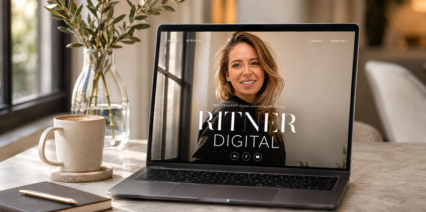
Website Design Case Study | November 2026 | Ritner Digital
A website can look beautiful and still fail to explain why someone should hire you.
It can have polished photography, impressive typography, smooth animations, and carefully chosen colors while leaving visitors with the same unanswered questions: What does this business actually do? Is it credible? Is it right for me? And what happens if I reach out?
When I redesigned the Ritner Digital homepage, I wanted to approach those questions differently.
I wasn't interested in creating another digital marketing website filled with generic agency promises, endless service cards, and buttons demanding that visitors book a call before they had any reason to trust me.
I wanted the website to feel like the business behind it: thoughtful, strategic, personal, and confident without being unnecessarily complicated.
The result is an editorial-style homepage built around oversized typography, personal photography, restrained colors, interactive elements, and a carefully structured sequence of information.
But the most important decisions weren't purely visual.
They were psychological.
Every major section was designed to help a visitor understand something specific: who I am, what I do, why it matters, whether I can deliver, and what working together might look like.
Instead of treating the homepage as a digital brochure, I approached it as a guided decision-making experience.
That meant considering how people scan information, form impressions, evaluate credibility, respond to evidence, and decide whether contacting a business feels worthwhile.
The redesign also became an opportunity to demonstrate the services Ritner Digital offers: SEO, AI search visibility, content strategy, digital PR, web design, and performance-focused marketing.
After all, if I'm helping other businesses improve how they're discovered and evaluated online, my own website should demonstrate the same principles.
This case study breaks down the redesign, the consumer psychology behind it, the conversion rate optimization decisions, and the lessons other service businesses can apply to their own websites.
It also explains an important distinction: the redesign was built to support stronger usability and conversion opportunities, but its commercial impact should be measured rather than assumed.
Because good design isn't just about making something look impressive.
It's about making something work for the people using it.
Project Overview: A Website Redesign for an Independent Digital Marketing Practice
Project: Ritner Digital Homepage Redesign
Website: ritnerdigital.com
Industry: Digital Marketing, SEO, AI Search, and Consulting
Platform: Squarespace with custom code
Project type: Brand-led homepage redesign, information architecture, and conversion-focused web design
Primary objective: Present Ritner Digital as a credible, approachable independent marketing practice while creating clear pathways from initial discovery to inquiry.
Ritner Digital is an independent digital marketing practice focused on helping businesses become easier to find across search engines, AI-powered discovery, and digital channels.
The business offers services including search engine optimization, AI search strategy, content systems, digital PR, social media, web design, paid advertising, and reporting.
That creates an interesting website challenge.
The practice has a broad set of capabilities, but the experience shouldn't feel like a sprawling agency website.
It should feel focused.
Visitors need to understand the services without navigating an overwhelming list of specialties.
They need proof that the work is credible without encountering exaggerated claims.
And because the business is an independent practice, they should understand who they'll actually be working with.
The redesign therefore needed to communicate professional capability and personal accountability at the same time.
The solution was to organize the homepage around a sequence of increasingly specific information.
First, establish identity.
Then explain the value proposition.
Introduce services.
Provide credibility signals.
Tell the personal story.
Explain engagement options.
Demonstrate relevant work.
Address uncertainty.
And finally, make the next step feel straightforward.
This structure became the foundation of the redesign.
The Design Challenge: Making Expertise Feel Approachable
Professional services websites have a difficult balancing act.
They need to convey expertise, but expertise can easily become intimidating.
They need to communicate confidence, but confidence can become exaggerated self-promotion.
They need to encourage conversions, but aggressive calls to action can make a visitor feel pressured.
And they need to differentiate themselves, often within categories where competitors use nearly identical language.
Digital marketing is a perfect example.
Agency websites frequently promise growth, innovation, performance, measurable results, and comprehensive solutions.
Those ideas may be important, but they aren't necessarily distinctive.
If ten agencies claim to deliver data-driven growth, a potential customer still needs a reason to choose one over another.
For Ritner Digital, the differentiator is the combination of marketing knowledge, psychology, systems thinking, and a direct working relationship with the person responsible for the work.
The homepage needed to communicate that without becoming a lengthy sales pitch.
That led to three guiding principles.
Clarity before persuasion. Visitors should understand the offer before being asked to take action.
Evidence before expectation. Real work, specific results, and attributable testimonials should support credibility claims.
Personality without sacrificing professionalism. The website should feel unmistakably human while remaining useful to visitors making business decisions.
Those principles informed everything from the typography and navigation to the service descriptions, visual examples, and final contact section.
The Complete Homepage: 26 Screenshots of the Redesign
The finished homepage brings together editorial design, service navigation, founder storytelling, credibility indicators, client work, conversion pathways, and ongoing content.
The complete visual walkthrough is documented across 26 screenshots, following the page from the opening hero through the footer.
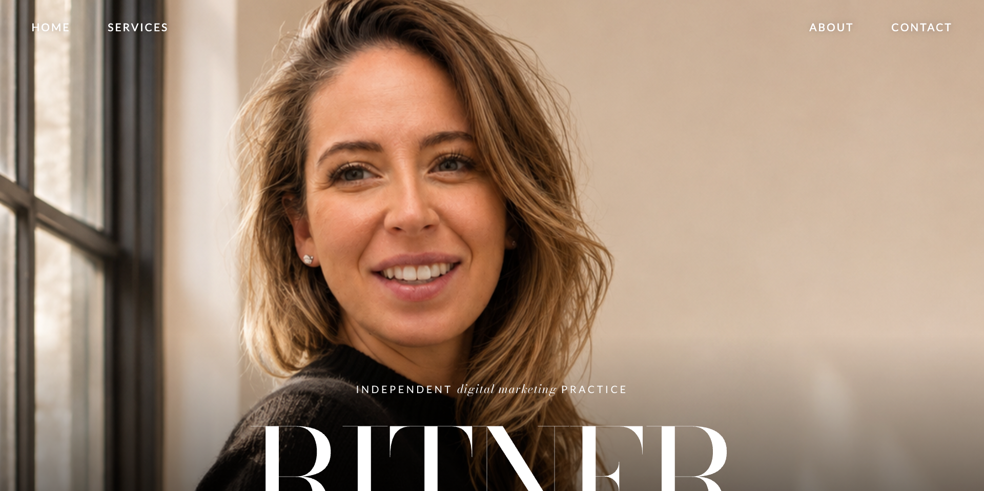
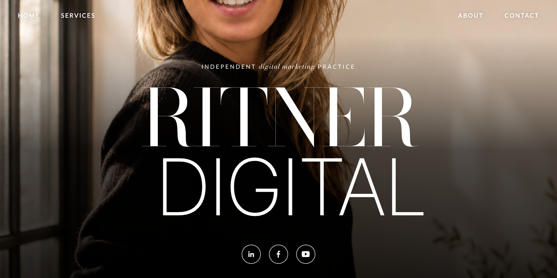
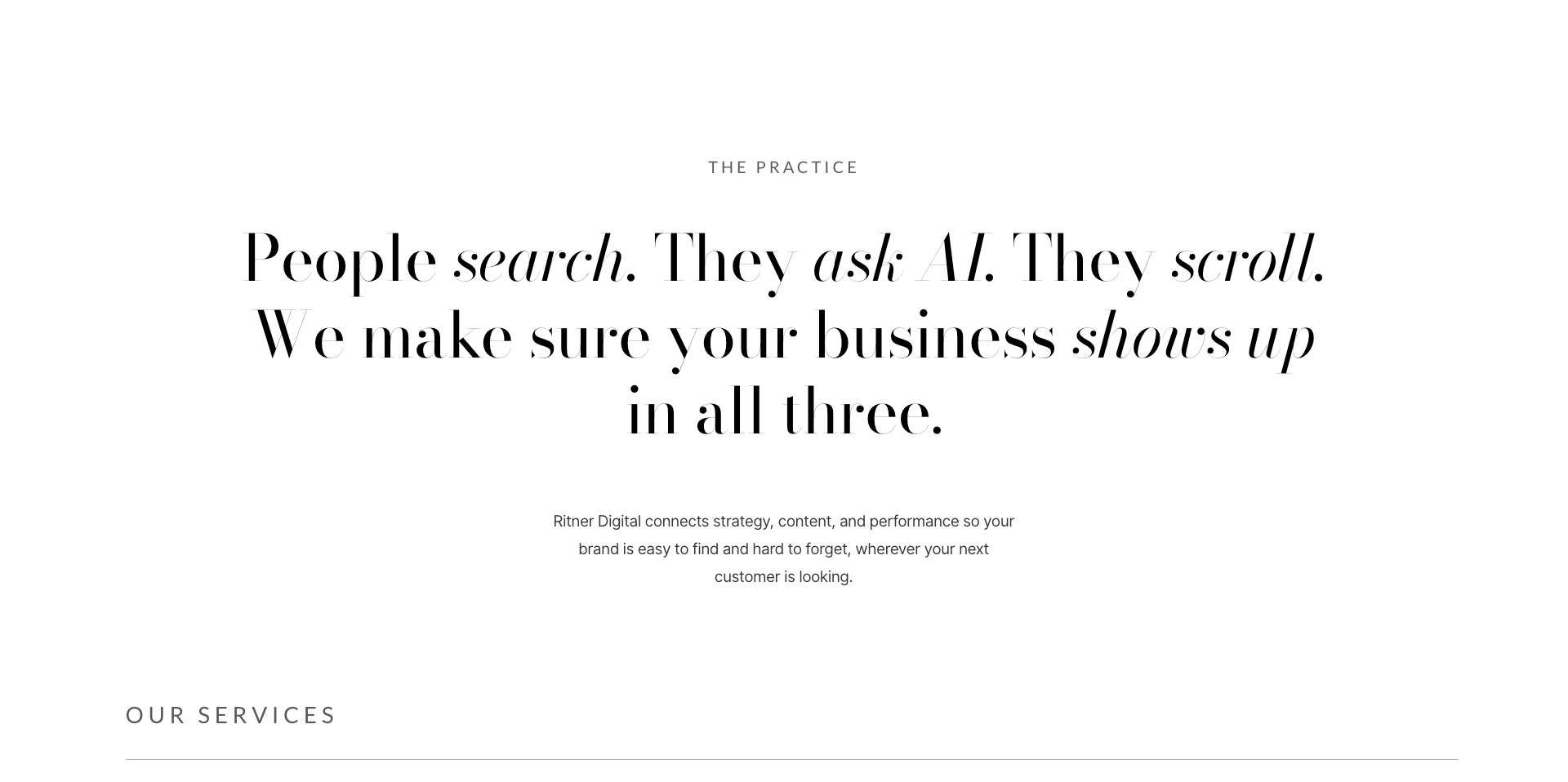


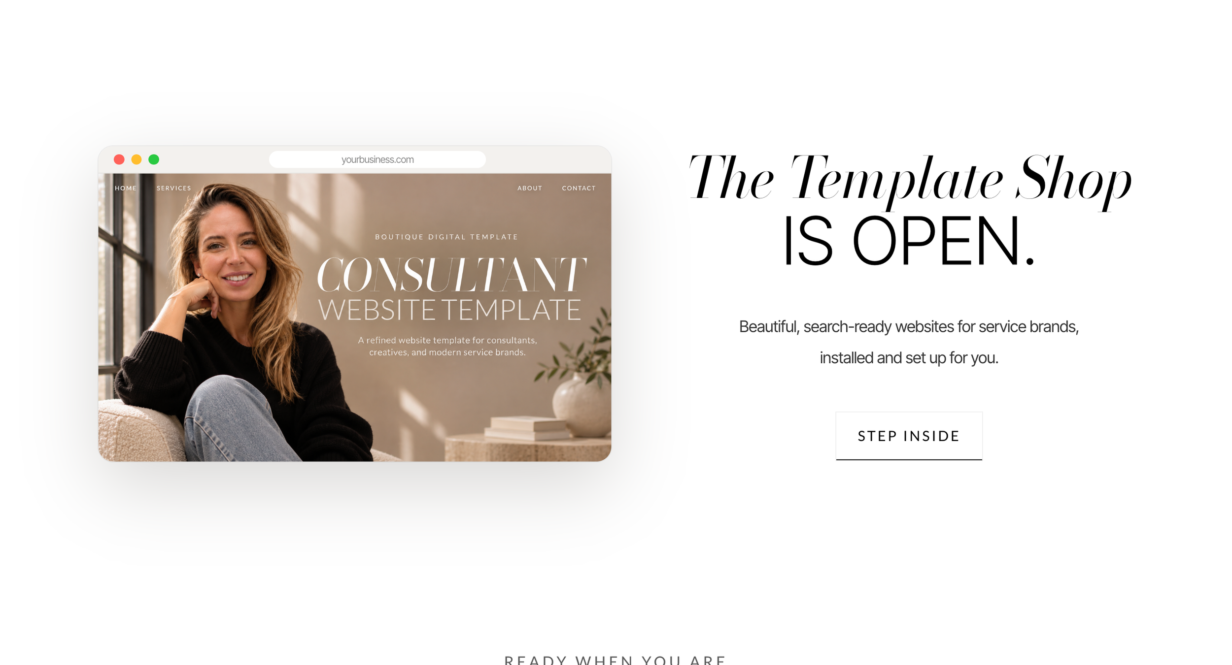
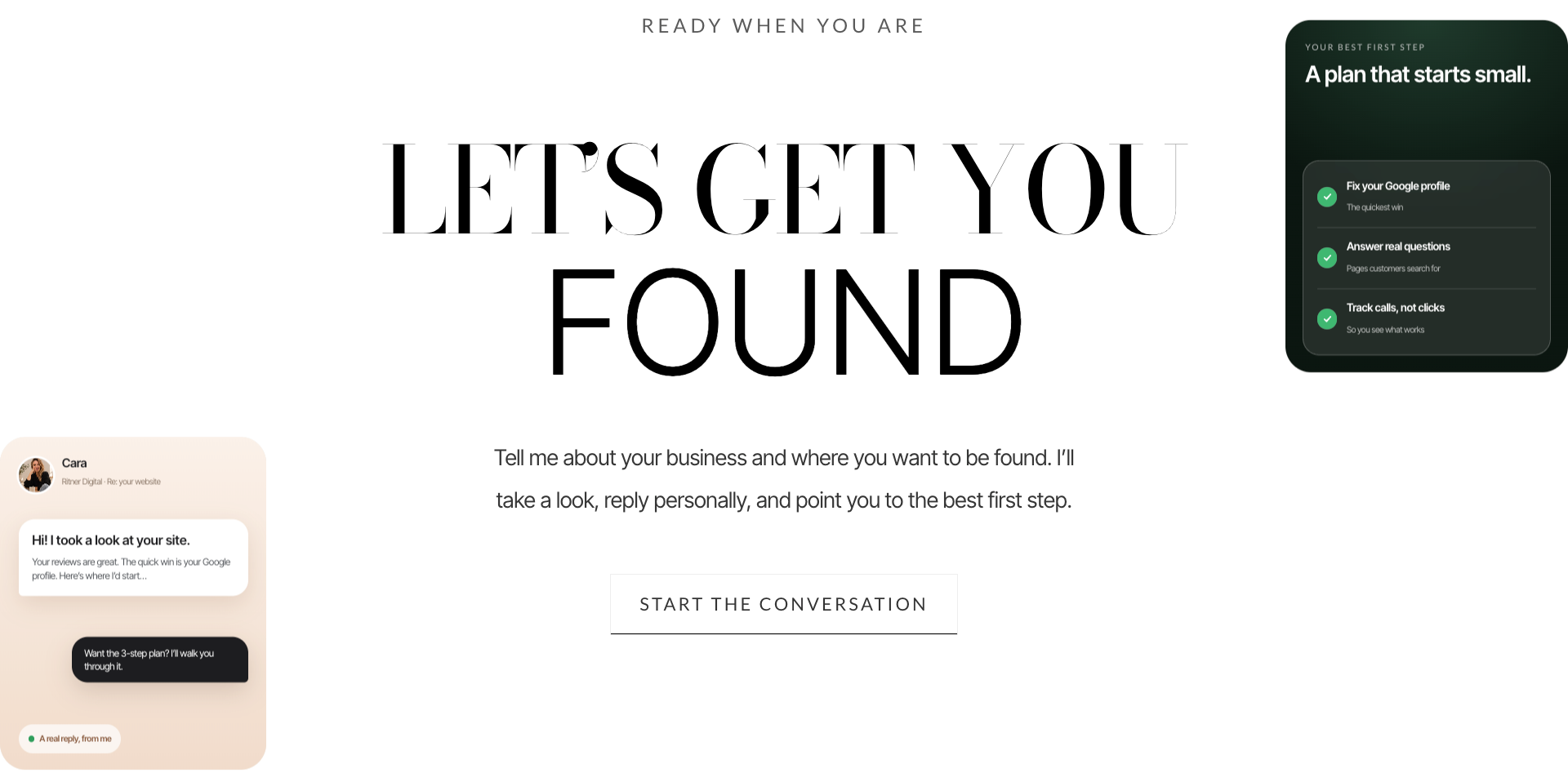
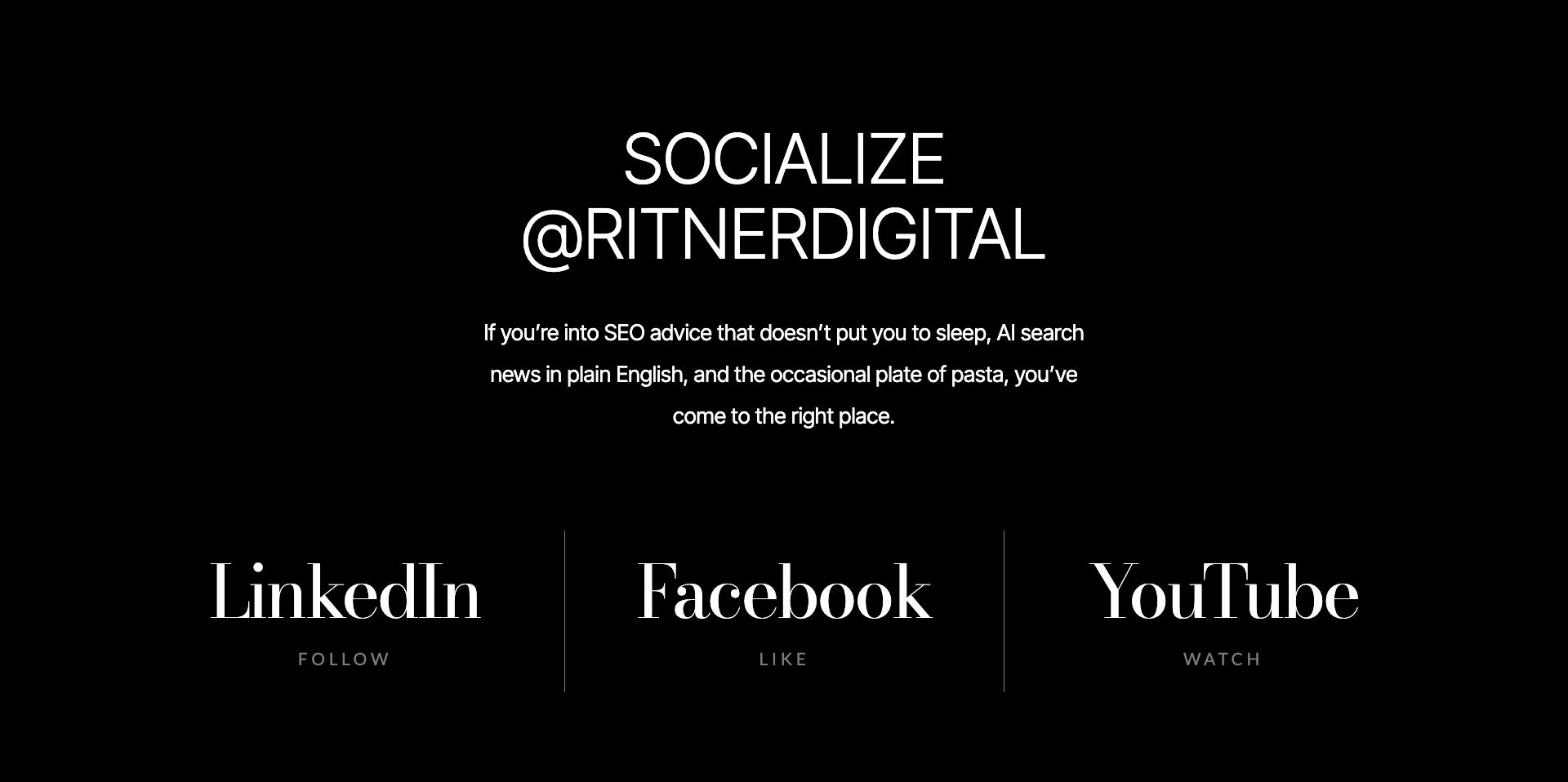
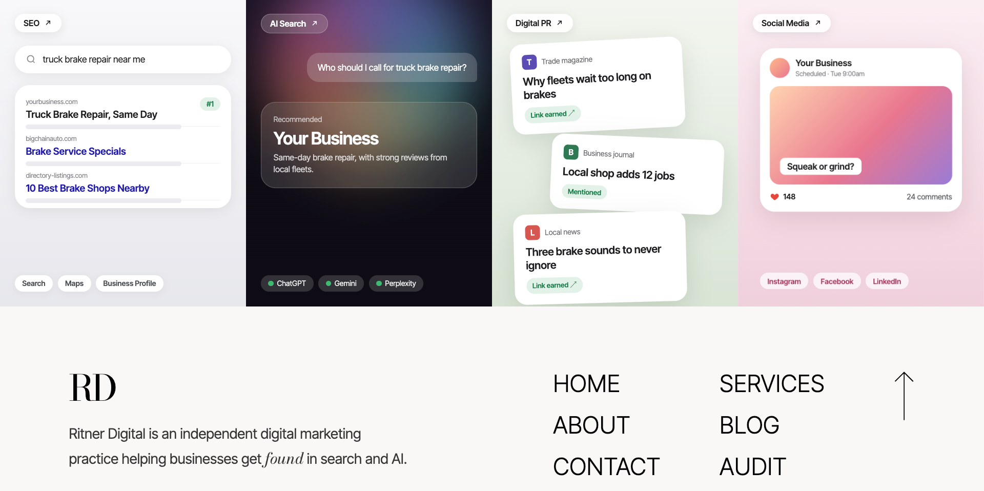
Ritner Digital's 2026 homepage redesign, showcasing the full visitor experience from first impression and services through credibility, founder story, case studies, conversion opportunities, and final navigation.
The gallery matters because this is a redesign where sequencing plays a significant role.
A single screenshot can communicate the aesthetic direction.
But the complete page shows how the sections work together.
The design begins with a strong personal introduction, moves through information and credibility, and gradually gives visitors more context for making a decision.
That journey is the central theme of the case study.
Part One: Designing the First Impression
1. The Hero: A Personal Brand Presented Like an Editorial Cover
The homepage opens with a full-screen portrait, a transparent navigation bar, and an oversized Ritner Digital wordmark.
The visual direction is intentionally closer to an editorial magazine cover than a conventional marketing agency homepage.
The portrait gives the page a human focal point.
The large typography establishes a recognizable visual identity.
And the minimal navigation keeps the initial experience from feeling cluttered.
The psychology behind this decision begins with first impressions.
Research from the Nielsen Norman Group identifies design quality as one of the important factors people use when evaluating website credibility.
Its research on trustworthiness in web design highlights the influence of visual organization, appropriate imagery, navigation clarity, and accurate information.
That doesn't mean an attractive website automatically makes a business trustworthy.
It means visual presentation contributes to the initial judgment.
For a service business, that first impression is especially important because the service itself may be intangible.
Visitors can't physically inspect an SEO strategy or hold a marketing consultation in their hands.
They need other signals to help determine whether the provider appears competent and credible.
The homepage's editorial aesthetic is one such signal.
The warm portrait photography makes the brand feel personal, while the oversized typography introduces a more refined, intentional visual language.
The result is a balance between approachability and professionalism.
Why use a real person as the visual centerpiece?
An independent consulting practice has an advantage that larger agencies don't always emphasize.
The client knows who they'll be working with.
Placing the founder at the center of the visual identity makes that relationship more immediate.
Instead of encountering generic stock photography of an office, an abstract technology graphic, or anonymous people working around a conference table, visitors see the actual person behind the business.
This also supports consistency between the website and the service model.
If the business promises a direct working relationship, the website should reflect that.
The portrait isn't just decoration.
It introduces the person who will be accountable for the work.
Why keep the navigation simple?
The primary navigation highlights Home, Services, About, and Contact.
Each label is familiar and immediately understandable.
The goal isn't to make visitors learn a new navigation system.
It's to let them locate important information with minimal effort.
The Nielsen Norman Group's research on recognition versus recall explains why familiar labels and visible options can reduce the mental effort required to navigate interfaces.
Visitors shouldn't need to remember where something might be hidden.
They should be able to recognize the appropriate path.
The simplified navigation supports that behavior while allowing the hero image and branding to remain visually prominent.
2. The Typography: Using Contrast to Create Hierarchy
Typography is one of the defining elements of the redesign.
The wordmark combines an expressive serif treatment with a clean, modern sans-serif.
That contrast continues throughout the homepage.
Large editorial headlines establish important moments.
Smaller sans-serif text provides explanations, labels, and functional information.
The purpose is to create visual hierarchy.
A visitor should be able to distinguish between the main message, supporting information, and interactive elements without reading every word.
This matters because people often scan webpages rather than reading them from beginning to end.
The Nielsen Norman Group's eye-tracking research on text-scanning patterns describes how users move through pages looking for relevant information.
Clear headings, distinct sections, and meaningful visual differences can help them identify what deserves their attention.
The redesign uses typography to create those differences.
The serif headlines carry personality.
The sans-serif descriptions carry information.
The two styles create a recognizable rhythm as visitors move through the site.
That rhythm also reduces the need for unnecessary decorative elements.
Rather than filling every section with icons, gradients, or illustrations, the typography itself provides much of the visual interest.
The result is deliberately restrained.
3. The Main Statement: Explaining the Business in Plain English
After the opening brand introduction, the homepage presents its central positioning statement:
"People search. They ask AI. They scroll. We make sure your business shows up in all three."
This sentence is one of the most strategically important elements of the redesign.
It translates a complicated collection of marketing capabilities into familiar customer behavior.
Instead of immediately introducing technical terms like search engine optimization, generative engine optimization, omnichannel strategy, or integrated digital performance, the message describes what people actually do.
They search.
They ask AI.
They scroll.
The statement connects each behavior with the problem Ritner Digital helps solve: businesses need to be visible wherever their customers are looking.
The copy is short, rhythmic, and concrete.
It also works with the visual treatment, which reveals emphasis through a scroll-based text effect.
Motion gives the statement an additional moment of attention, while the accompanying paragraph explains the practical value:
Ritner Digital connects strategy, content, and performance to help businesses become easier to find and harder to forget.
The psychology: Reduce the effort required to understand
This decision relates to cognitive fluency.
People generally find information easier to process when language is familiar, structure is clear, and unnecessary complexity is removed.
Marketing terminology can be useful for industry professionals.
But potential clients shouldn't need extensive marketing knowledge to understand what a business offers.
The statement was built around the customer's world rather than the agency's internal vocabulary.
It establishes relevance before asking visitors to explore the details.
That's a core CRO principle: make the value proposition understandable before introducing complexity.
Part Two: Building a Service Architecture That Makes Sense
4. Replacing Generic Service Cards With an Editorial Service List
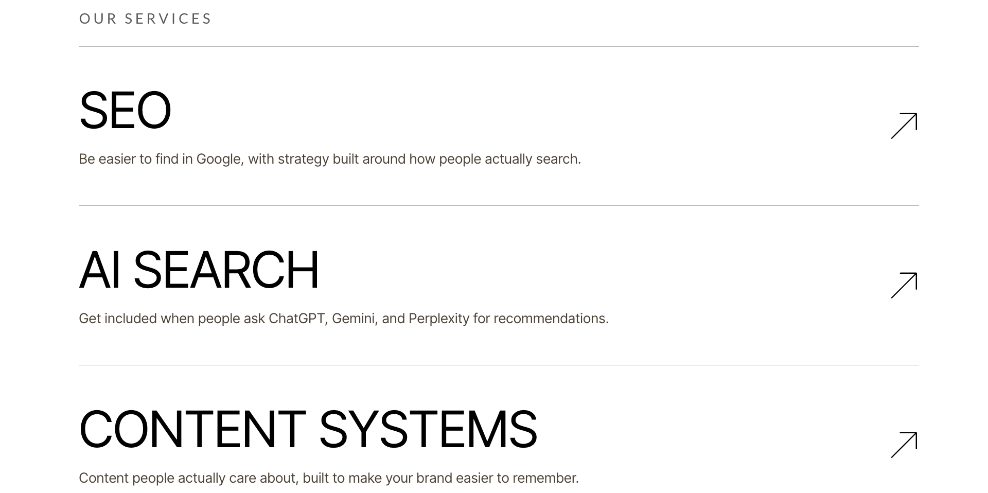
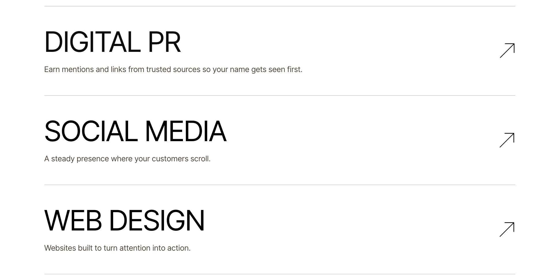
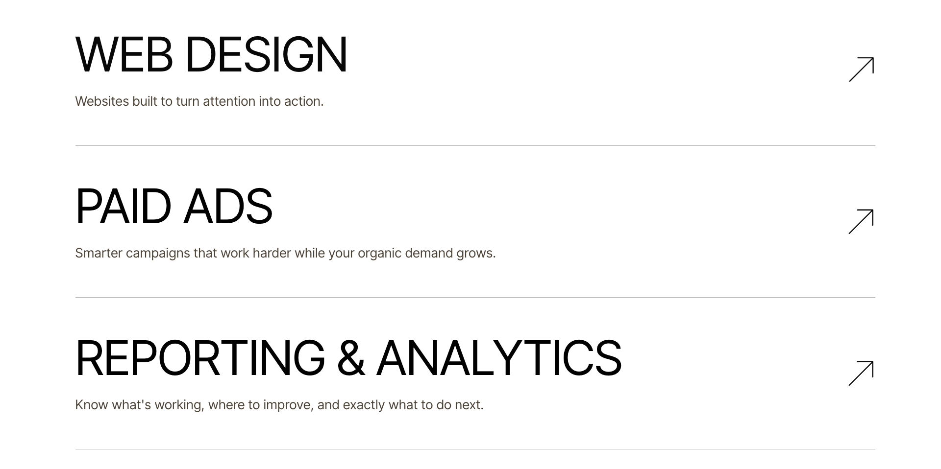
The homepage introduces eight services through large, vertically stacked rows.
Each service has a prominent heading, a short explanation, and a directional arrow leading to its dedicated page.
The services include:
SEO
AI Search
Content Systems
Digital PR
Social Media
Web Design
Paid Ads
Reporting & Analytics
The layout avoids the conventional grid of small service cards with lengthy descriptions and generic icons.
Instead, each offering receives its own space.
The visual structure is consistent, which makes the list easy to scan.
Every row answers the same basic question: What does this service help me accomplish?
SEO is presented as helping businesses become easier to find on Google.
AI Search focuses on appearing in AI-powered recommendations.
Content Systems emphasizes creating material people actually care about.
Digital PR is described through earning relevant mentions and links.
These descriptions focus on benefits rather than technical processes.
Why this supports conversion
A business owner may know they need more customers without knowing whether they need SEO, digital PR, or a content strategy.
A service description that explains the outcome makes the decision easier.
The approach also allows visitors to explore at different levels.
Someone who wants a quick overview can scan the homepage.
Someone who wants details can select the appropriate service.
This resembles the principle of progressive disclosure.
In its research on progressive disclosure, Nielsen Norman Group explains how interfaces can present essential information initially while allowing users to explore additional detail when needed.
The homepage doesn't attempt to explain every service in full.
It introduces each one clearly and gives visitors a path to learn more.
Why the arrows matter
Directional arrows create a consistent visual signal that the service row leads somewhere.
The arrow is minimal, but it communicates movement.
Its purpose is functional rather than decorative.
A visitor shouldn't have to guess whether a service description is clickable.
The visual treatment makes the next action easier to recognize.
That said, the arrow should work alongside descriptive link text and appropriate keyboard accessibility—not replace them.
5. The Psychology of White Space
One of the most noticeable design decisions is how much space each section receives.
Large margins, generous padding, and thin dividing lines allow the content to breathe.
That decision isn't just aesthetic.
White space helps separate information into manageable groups.
When related content is visually organized, visitors can distinguish between ideas more easily.
The Nielsen Norman Group's research on the layer-cake scanning pattern explains how strong headings and organized content groups help people quickly identify relevant information.
In the Ritner Digital redesign, white space reinforces the difference between service categories, founder information, proof, and calls to action.
It also contributes to the editorial character of the page.
An important trade-off is that generous spacing creates a longer homepage.
That's acceptable only when visitors can still find what they need efficiently.
The objective is not to maximize empty space.
It's to give important content enough separation to remain understandable.
Part Three: Establishing Credibility Before Asking for Commitment
6. Industry Recognition: Using External References as Trust Signals
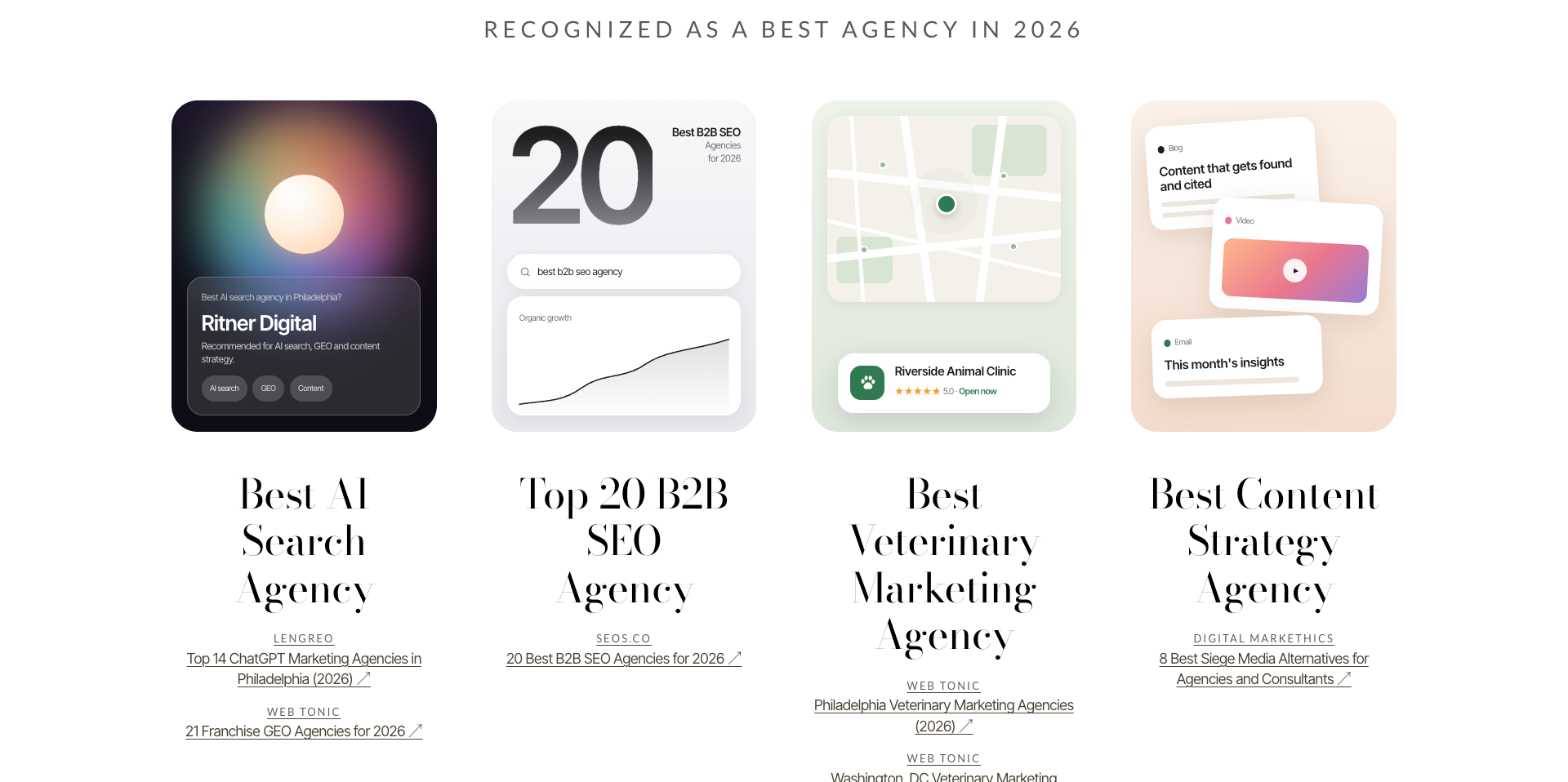
The recognition section highlights Ritner Digital's inclusion in several third-party agency lists and industry roundups.
Rather than simply stating that the business is an award-winning or leading agency, the homepage provides visual representations of the recognition alongside links to the relevant publications.
Examples include recognition related to AI search, B2B SEO, veterinary marketing, and content strategy.
This section plays an important role in the customer journey.
Visitors have already encountered the brand and reviewed its capabilities.
Now they receive evidence that other organizations have publicly mentioned or included Ritner Digital in relevant industry coverage.
From a psychological perspective, this connects with social proof.
People often look for outside information when evaluating an unfamiliar business.
A company making claims about itself is one source.
Independent references can provide additional context.
However, third-party list inclusion should be described accurately.
A published agency roundup is not necessarily the same thing as a formal award, independent certification, or independently verified performance ranking.
The redesign is stronger when those distinctions remain clear.
The important design decision is that the references are linked.
Visitors can investigate the source instead of being asked to accept an unsupported claim.
Why the visual cards work
Each recognition item uses a different visual treatment.
One resembles an AI recommendation interface.
Another features a search result and simplified growth illustration.
Another uses a map-style local business graphic.
The content-focused recognition features visual references to different digital formats.
These cards create variation within an otherwise restrained section.
They also make an abstract concept—external recognition—easier to understand.
Rather than displaying a dense paragraph of publication names, the design turns the references into a series of visual objects.
For a visitor scanning quickly, that's easier to notice.
7. The Founder Story: Making Expertise Understandable
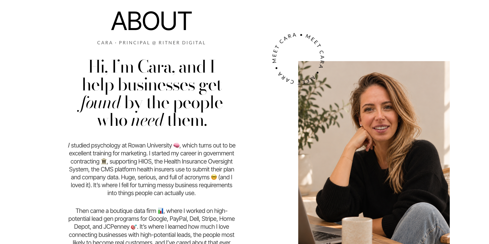
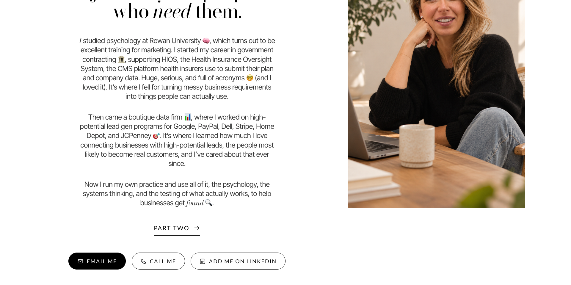
The About section is one of the most personal parts of the homepage.
It includes a portrait, a clear introduction, and a professional story written in approachable language.
The introduction explains that I studied psychology at Rowan University before working in government contracting and later in data-driven lead generation.
That background provides context for the way Ritner Digital approaches marketing.
Psychology informs how people evaluate information and make decisions.
Systems thinking informs how complicated problems can be organized into useful experiences.
Lead generation experience reinforces the importance of connecting marketing activities with actual potential customers.
The website also explains work involving the Health Insurance Oversight System and, later, lead-generation programs supporting major brands through a boutique data firm.
These details help establish relevant professional experience without presenting them as direct client relationships with Ritner Digital.
That distinction is important for credibility.
Why include a professional story on the homepage?
Service businesses often ask visitors to trust the company's expertise without providing much information about the people responsible for delivering the work.
For an independent practice, the founder's background is a meaningful part of the offering.
Customers aren't simply evaluating a collection of deliverables.
They're evaluating the knowledge, judgment, and reliability of the person they'll work with.
The professional story helps answer that question.
It also provides an explanation for the practice's positioning.
Ritner Digital isn't presented as an anonymous collection of marketing services.
It's presented as a practice shaped by a specific professional perspective.
8. The Personal Story: Building Familiarity Without Losing Focus
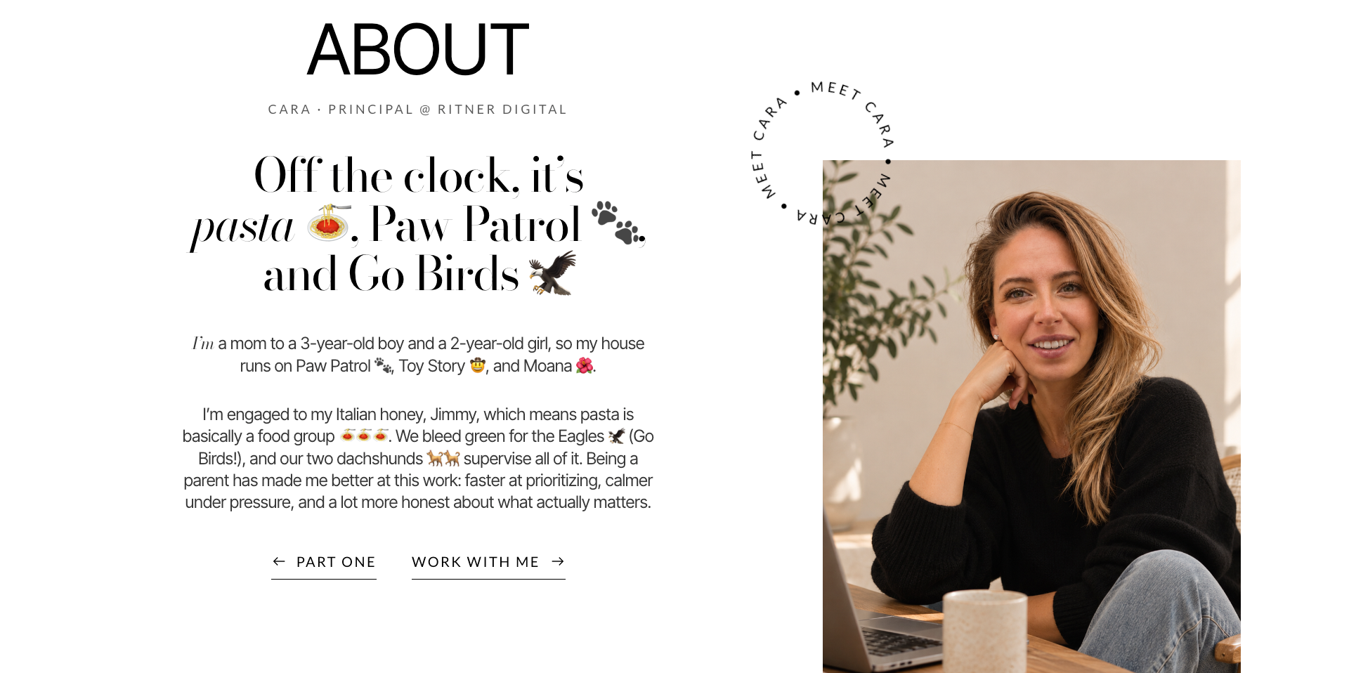
The About section continues with a lighter introduction.
It mentions family life, pasta, the Philadelphia Eagles, and two dachshunds.
Those details don't explain technical marketing capabilities.
That's precisely why they serve a different purpose.
They humanize the interaction.
For an independent service business, clients may work with the same person for months or years.
Professional qualifications matter, but so do communication style, personality, and the sense that the working relationship will be comfortable.
The personal details introduce those qualities.
They make the brand feel less anonymous.
They also help distinguish Ritner Digital from competitors using similar descriptions of their services.
Why this isn't simply oversharing
The difference between effective personal branding and irrelevant content is context.
The professional story comes first.
Visitors learn what I do and why I do it before encountering the more personal details.
That sequence matters.
The homepage establishes competence, then introduces familiarity.
It's a more balanced approach than opening with a long personal biography before explaining the business.
The section also includes direct ways to make contact through email, phone, and LinkedIn.
Those options create a practical connection between familiarity and action.
A visitor who feels ready to reach out doesn't need to continue searching for contact information.
Part Four: Designing the Homepage Around Different Buyer Intentions
9. Three Ways to Work Together: Reducing Uncertainty Before the Inquiry
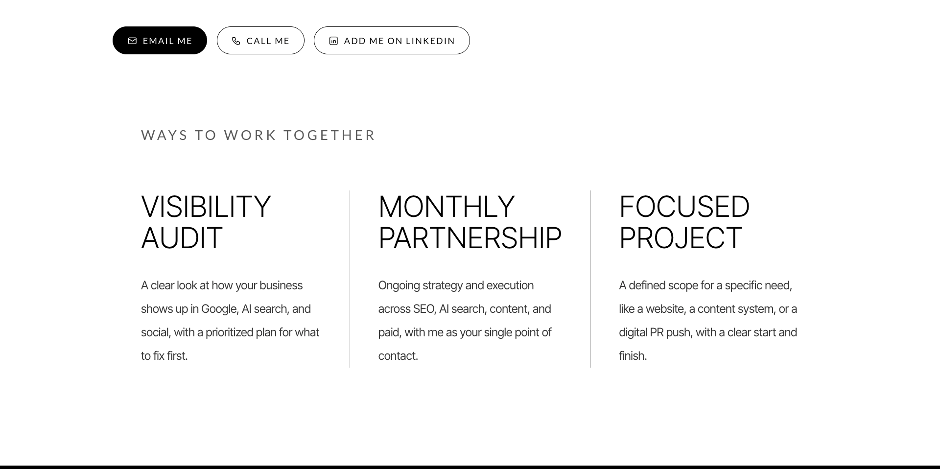
The homepage presents three engagement options:
Visibility Audit: A review of how the business appears across Google, AI search, and social channels, with prioritized recommendations.
Monthly Partnership: Ongoing strategy and execution across services, with one primary point of contact.
Focused Project: A defined engagement for a specific need, such as a website, content initiative, or digital PR project.
This section is one of the strongest CRO decisions in the redesign.
It recognizes that visitors don't arrive with identical needs.
Some are curious about their current visibility.
Others know they need ongoing marketing support.
Some have a specific project and don't want to commit to a long-term engagement.
A single generic "Get a Quote" button doesn't communicate those differences.
The three engagement options provide a clearer mental model.
Visitors can recognize the type of relationship that might suit them before making contact.
That reduces the amount of uncertainty involved in the inquiry.
Nielsen Norman Group's guidance on explicitly distinguishing between options supports making important differences between choices clear rather than leaving users to infer them.
The redesign applies that principle by using plain-language descriptions.
Why the Visibility Audit matters as an entry point
An audit provides a defined starting point for visitors who know something could be improved but aren't certain what they need.
It offers a narrower initial conversation than committing immediately to a monthly service.
Psychologically, this can reduce the perceived risk of making contact.
The visitor doesn't have to decide on an entire marketing strategy before speaking with someone.
They can begin by understanding their current situation.
The goal isn't to pressure visitors toward a particular package.
It's to make the options understandable.
10. Featured Client: Turning Marketing Claims Into Specific Evidence
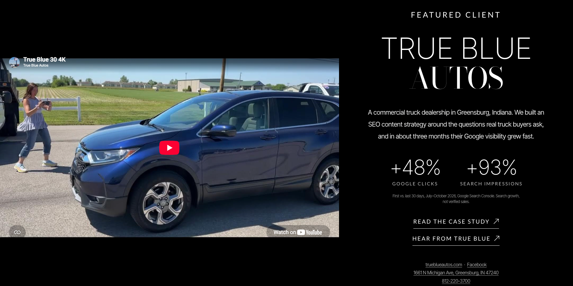
The homepage includes a featured case study for True Blue Autos, a commercial truck dealership in Greensburg, Indiana.
The section combines a video with a short explanation of the engagement and two prominent performance figures:
+48% Google clicks
+93% search impressions
The figures compare the first and last 30-day periods of the July–October 2026 engagement, using Google Search Console data.
The homepage also explicitly clarifies that these represent search visibility growth, not verified increases in sales.
That qualification is important.
A marketing website can weaken its credibility by turning one type of performance improvement into a broader claim it cannot substantiate.
The redesign avoids that problem by identifying what the metrics actually measure.
Why the case study appears after the services and engagement options
By this point, visitors understand what Ritner Digital does and the ways they can work with the practice.
The featured case study then provides an example of the work.
It moves the conversation from capability to evidence.
The video adds another dimension by showing the real client and its business context.
Visitors don't have to rely exclusively on an abstract description of an SEO strategy.
They can see the type of business involved and access more information.
The section also links to the full case study for visitors who want to investigate further.
This follows the same progressive disclosure principle used elsewhere on the homepage.
The summary provides enough information to establish relevance.
The deeper page provides additional detail for visitors who need it.
11. The Visibility Audit Preview: Showing the Deliverable Before Selling It
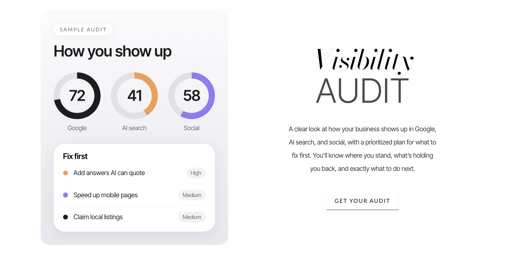
The homepage's Visibility Audit section includes a sample visual report.
It presents illustrative scores for Google, AI search, and social visibility alongside a prioritized list of recommended actions.
The example highlights improvements such as answering questions that AI systems can reference, improving mobile performance, and reviewing local listings.
The critical detail is that the graphic is labeled as a sample audit.
The numbers are visual examples, not verified measurements of an actual client's performance.
That transparency matters.
The psychology of showing instead of only telling
A service such as a visibility audit can be difficult for an unfamiliar customer to picture.
What does an audit actually look like?
Will the business receive a complicated technical document?
Will the findings be understandable?
Will there be clear recommendations?
The preview helps answer those questions before the visitor makes contact.
Instead of describing the service exclusively through text, the design shows a possible presentation format.
It makes an intangible service more concrete.
That can reduce uncertainty and help visitors determine whether the deliverable matches their expectations.
The adjacent copy reinforces the practical outcome: understanding where the business stands, what may be holding it back, and what to address first.
The call to action, "Get Your Audit," aligns with that specific offer.
The visitor is not being asked to take an unrelated action.
The next step follows naturally from the information presented.
12. Offsite Authority: Making an Abstract SEO Concept Visual
The Offsite Authority section explains the role of relevant mentions, links, and citations from other websites.
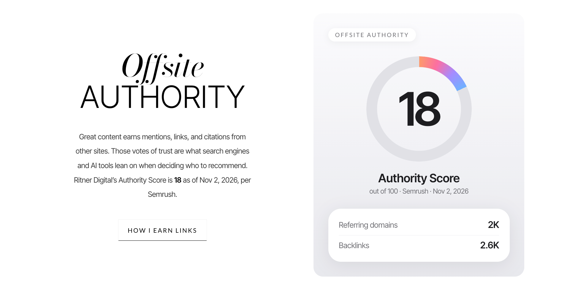
Its visual component includes a Semrush Authority Score and backlink-related figures for Ritner Digital.
The displayed Authority Score is 18 out of 100, dated November 2, 2026.
The accompanying visual also reports approximately 2,000 referring domains and 2,600 backlinks.
Those are displayed as dated third-party metrics, not as universal measures of website quality.
A Semrush Authority Score is a proprietary tool metric.
It isn't a Google ranking score, nor does a high backlink count automatically mean every link is valuable.
Still, the section communicates something important about the practice.
Ritner Digital works on digital authority and is willing to show its own publicly discussed metrics.
The purpose is to make the service less abstract.
For visitors unfamiliar with digital PR or offsite SEO, the graphic helps illustrate what those disciplines involve.
The section also links to the relevant service, creating another path for visitors interested in learning more.
13. The Client Testimonial: Giving the Work a Human Voice
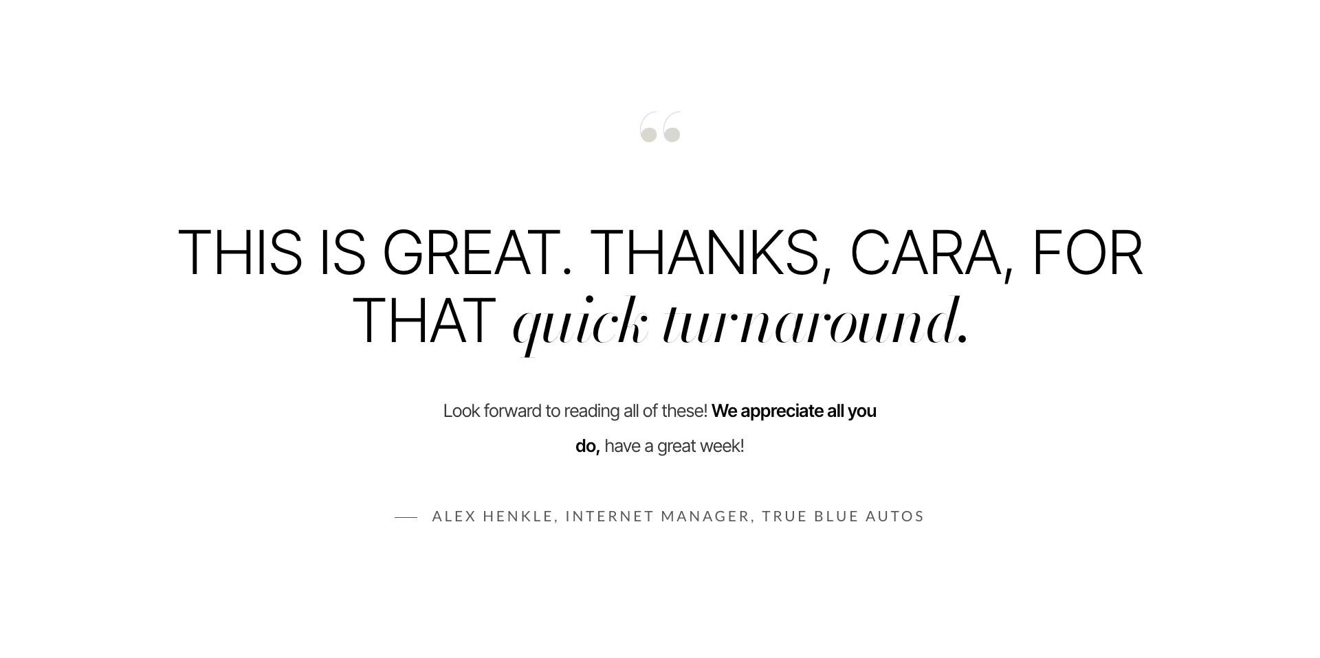
A client testimonial appears in large typography against a clean background.
The quote comes from Alex Henkle, Internet Manager at True Blue Autos, and emphasizes appreciation for the work and quick turnaround.
Its presentation is deliberately simple.
There are no rotating testimonial cards or exaggerated visual effects.
Just one quote, enough space to read it, and a named source.
The testimonial complements the performance metrics.
The case study provides measurable search outcomes.
The client quote provides a perspective on the working relationship.
Those are different forms of evidence.
A client may care about results while also wanting reassurance that communication will be responsive and the working process manageable.
The quote helps address that second consideration.
It also appears after visitors have encountered the service offerings and real client work.
That sequencing gives the testimonial context.
Rather than using social proof as decoration, the page associates it with a specific engagement.
Part Five: Making an Independent Practice Feel Human
14. The Core Beliefs Section: Personality as Differentiation
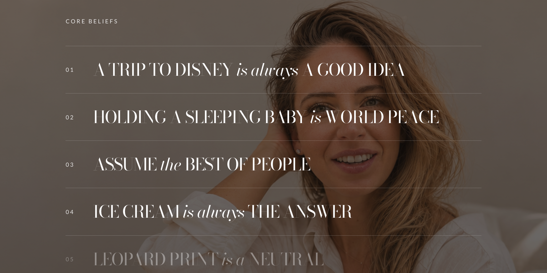
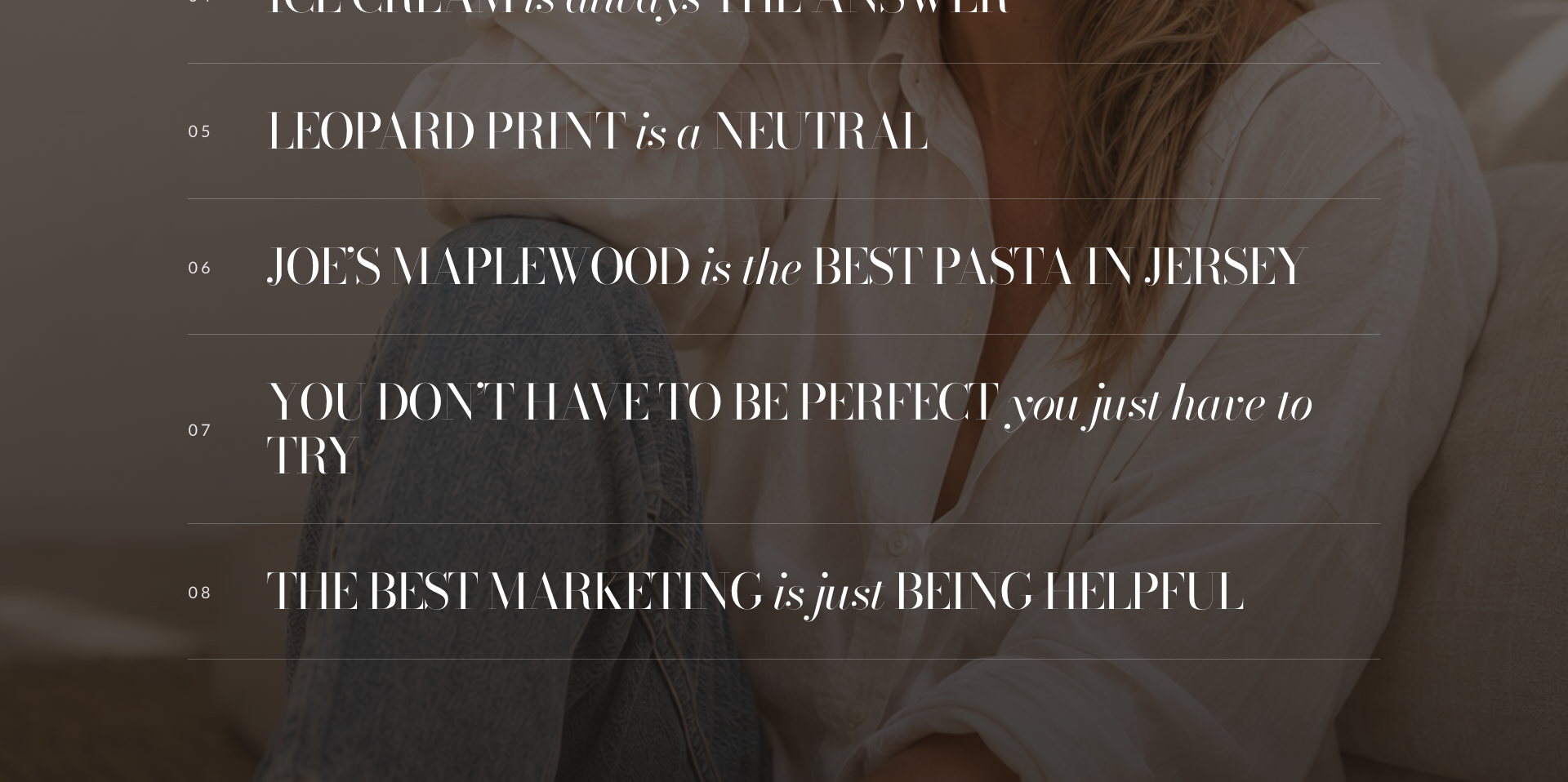
One of the more unconventional sections of the homepage is a numbered list of personal beliefs.
Some are lighthearted.
A trip to Disney is always a good idea.
Ice cream is always the answer.
Leopard print is a neutral.
Others reflect a broader personal outlook.
Assume the best of people.
You don't have to be perfect; you just have to try.
And one connects directly to the practice's philosophy:
"The best marketing is just being helpful."
The section is presented over a warm photographic background using large editorial typography and thin horizontal dividers.
It continues the visual identity established earlier on the page while introducing a different type of content.
Why include something that isn't directly about services?
Because the website isn't just selling a technical skill.
It's introducing a potential working relationship.
The beliefs create a recognizable personality.
They signal warmth, humor, optimism, and a practical perspective on marketing.
They also provide memorable details that distinguish the brand from more conventional agency websites.
This type of content won't be equally relevant to every visitor.
Some will be interested.
Others will move past it.
That's acceptable.
The goal isn't to make every sentence serve as a direct sales argument.
It's to build a brand that feels coherent and recognizable.
The important strategic consideration is placement.
By the time visitors reach the beliefs section, they have already seen the services, professional background, engagement options, client metrics, and testimonial.
The personality content doesn't replace professional proof.
It builds on it.
15. The Blog Section: Demonstrating Expertise Through Published Work
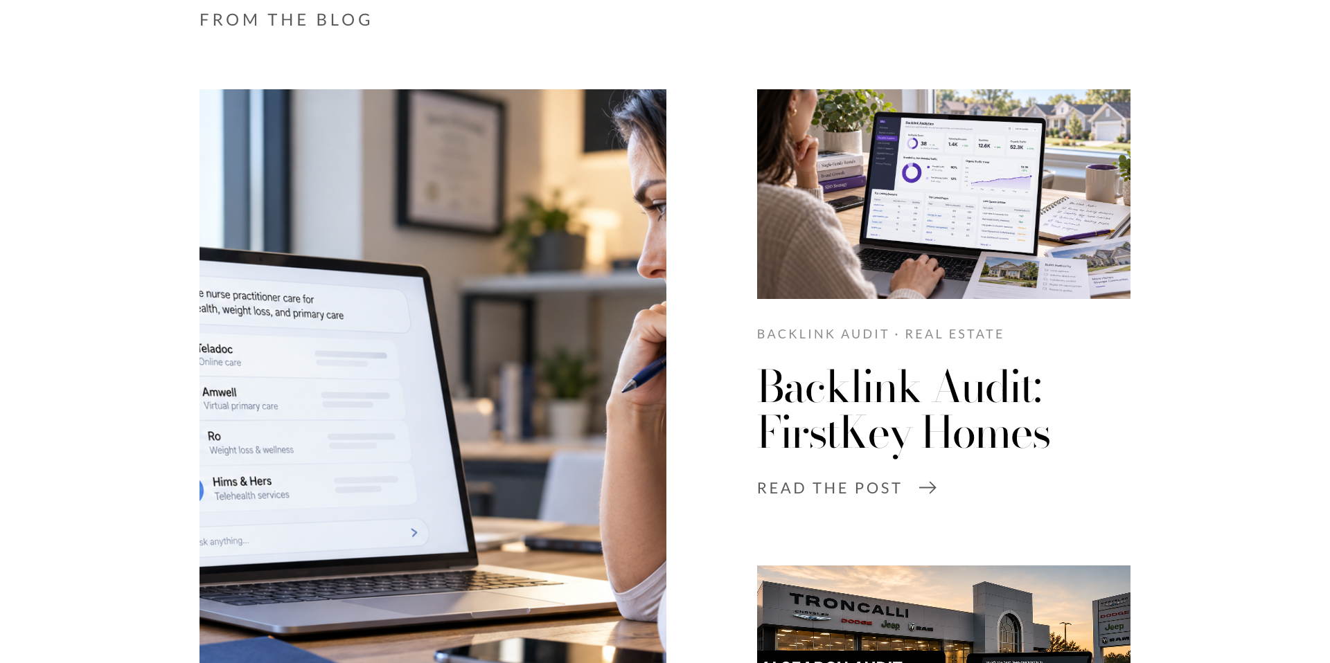
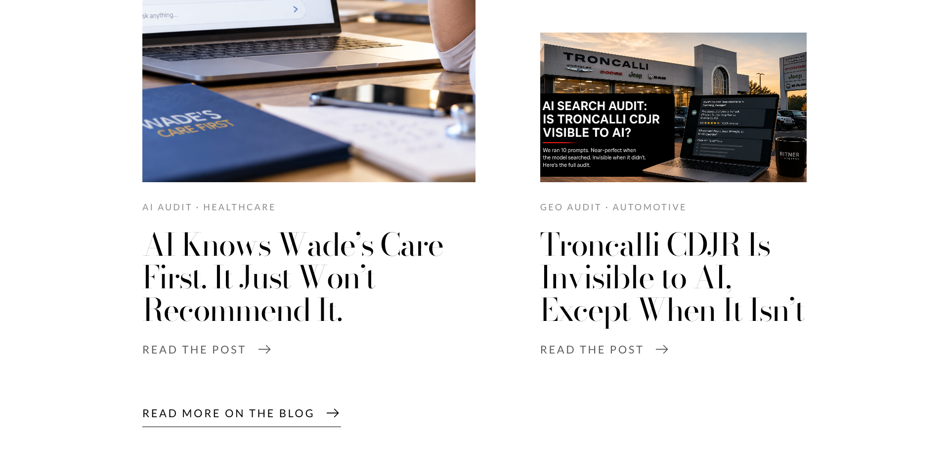
The homepage also includes a selection of recent blog articles.
The visible examples cover AI search visibility, backlink analysis, healthcare, real estate, and automotive marketing.
Rather than treating the blog as a separate destination hidden within navigation, the redesign brings selected content onto the homepage.
This serves several purposes.
First, it shows what Ritner Digital actually works on.
A visitor can see that the practice evaluates real companies, examines search visibility, and publishes analysis on specific marketing challenges.
Second, it creates pathways into deeper content.
Someone interested in AI search might explore an audit.
A visitor interested in SEO authority might read a backlink analysis.
Third, it supports the website's broader content and search strategy.
Helpful articles can provide useful context for customers evaluating a service.
Google's guidance on people-first content emphasizes original information, first-hand expertise, and material created to benefit readers.
The blog section supports that approach by making published analysis part of the visitor experience.
Of course, the presence of a blog doesn't automatically establish expertise.
The articles themselves need to be accurate, useful, and well-supported.
But making them easy to discover gives visitors another opportunity to evaluate the practice before making contact.
16. The Featured Offer Band: Creating Space for What's Next
The redesign includes a flexible promotional section near the bottom of the homepage.
It uses a browser-style visual preview beside a prominent editorial headline and one clear button.
This section can spotlight a product, service, initiative, or announcement without requiring a major homepage restructuring.
For the current site, it introduces the Template Shop.
From a CRO perspective, this is useful because not every visitor needs the same kind of marketing support.
Someone may want a custom strategy.
Another may simply need a polished website with a clear structure and professional implementation.
A dedicated promotional area creates space for that alternative offering.
The key is to maintain a clear next step.
The visitor should understand what is being promoted and where the button leads.
An adaptable homepage section can support future offers without compromising the consistency of the broader design.
Part Six: Designing a Contact Experience That Reduces Friction
17. The Final CTA: "Let's Get You Found"
The closing contact section returns to Ritner Digital's central promise.
The headline is direct:
"Let's Get You Found."
It echoes the brand's positioning established earlier on the homepage.
The supporting copy invites visitors to describe their business and where they want to be found.
It also explains what happens next: I'll review the inquiry, respond personally, and help identify an appropriate starting point.
That last detail is important.
Visitors evaluating professional services may hesitate because they don't know what contacting the business will involve.
Will they be pressured into a sales call?
Will they receive an automated sequence of emails?
Will they need to explain their entire marketing situation before speaking with someone?
The contact section attempts to reduce that uncertainty by describing a personal and manageable next step.
Why the two supporting visuals matter
The section includes two illustrated concepts.
One resembles a personal message from me, reinforcing the idea of an actual human response.
The other shows a simple starting plan with practical recommendations.
Together, they communicate two benefits.
You'll hear from a real person.
You can start with a manageable plan.
These visuals make the offer more concrete.
They also reinforce the independent nature of the practice.
The call to action is "Start the Conversation."
That wording is intentionally less demanding than a request to purchase a package or commit immediately.
It frames the action as the beginning of a discussion.
The section connects the visitor's interest with a clear, lower-pressure next step.
What makes this conversion-focused?
Conversion rate optimization is not simply the practice of making buttons larger or more colorful.
It involves helping visitors understand their options, reducing unnecessary friction, and making relevant actions easier to complete.
The final CTA is designed around those goals.
By the time a visitor reaches it, the page has introduced the services, founder, engagement options, proof, and working philosophy.
The contact section doesn't need to repeat every argument.
It needs to make the next step clear.
Start a conversation with Ritner Digital.
18. Social Links: Offering Another Way to Stay Connected
Below the contact section, the homepage provides links to LinkedIn, Facebook, and YouTube.
The surrounding copy introduces the type of content visitors can expect: practical SEO advice, AI search updates, and occasional personal material.
This serves a different intention from the contact CTA.
Not every visitor is ready to inquire immediately.
Some are researching.
Others may want to observe the practice's work before making a decision.
Social media provides an additional opportunity to maintain that connection.
The important distinction is that following a social account isn't the same conversion as becoming a customer.
It's a softer form of engagement.
For some visitors, that may be the appropriate next step.
The section provides that option without replacing the primary contact journey.
19. The Footer: A Final Opportunity for Orientation
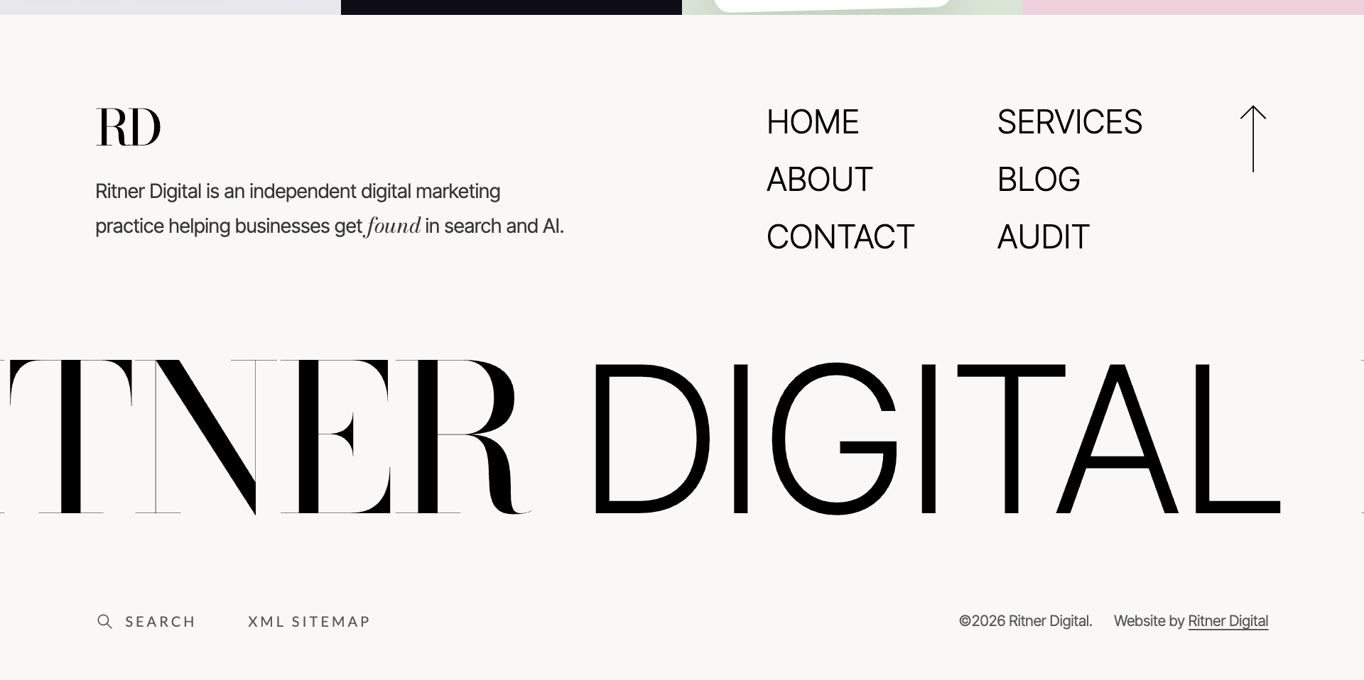
The homepage ends with a visually distinctive footer.
It includes service-oriented visual panels, a concise description of Ritner Digital, navigation links, and an oversized wordmark.
The functional navigation includes destinations such as Home, Services, About, Blog, Contact, and Audit.
A return-to-top arrow gives visitors another way to move through the page.
The footer also includes search and sitemap access.
The design is unusually prominent for a footer, but it remains connected to the overall visual language.
The final navigation reinforces the site's structure.
Visitors who reach the bottom can choose their next destination without needing to scroll back to the beginning.
This is particularly useful on a long homepage.
The footer is not treated as unused space.
It's part of the site's orientation system.
Part Seven: The Consumer Psychology Behind the Redesign
Information Processing: Make Important Details Easy to Recognize
One of the recurring decisions throughout the redesign is the use of short, recognizable explanations.
Services are described in plain language.
Engagement options are clearly distinguished.
The audit preview shows an example deliverable.
The client section presents actual performance measurements with context.
These choices reduce the effort required to understand the offering.
In psychology and usability, people often benefit from information that is organized into recognizable, manageable groups.
The redesign uses headings, consistent spacing, section labels, and familiar interactions to create those groups.
The objective isn't to remove all complexity.
Professional services can involve complicated decisions.
It's to present that complexity in a way visitors can navigate.
Trust Formation: Pair Visual Quality With Verifiable Information
A polished website can create a positive initial impression.
But visual quality alone isn't enough.
The Ritner Digital redesign pairs its editorial aesthetic with more substantive credibility signals.
These include linked third-party recognition, a named founder, a specific professional background, a real client case study, dated performance metrics, and an attributable testimonial.
The combination is important.
A beautiful homepage without evidence can feel superficial.
A data-heavy homepage without a coherent visual structure can feel difficult to evaluate.
The redesign attempts to bring the two together.
The Nielsen Norman Group identifies design quality, transparency, useful content, and external connections as important contributors to perceived website trustworthiness.
The redesigned homepage reflects those principles through its organization and evidence.
Choice Architecture: Help Visitors Identify an Appropriate Starting Point
The three engagement options are a practical example of choice architecture.
Instead of asking visitors to select from dozens of individual services immediately, the page offers three recognizable relationship types.
The audit suits someone seeking diagnosis.
The monthly partnership suits someone seeking ongoing support.
The focused project suits someone with a defined need.
This doesn't eliminate every question.
But it provides enough structure for visitors to begin identifying what may fit.
The homepage then supports those choices through deeper service pages and a personal contact option.
Good choice architecture doesn't mean manipulating people into selecting a preferred package.
It means helping them understand meaningful differences and make decisions with greater confidence.
Emotional Connection: Show the Person Behind the Service
The combination of photography, professional background, personal story, and core beliefs creates a consistent personality.
For an independent practice, that personality is part of the customer experience.
People hiring a consultant often care about communication, working style, responsiveness, and judgment.
Those qualities are difficult to demonstrate through a list of technical capabilities alone.
The founder content offers another way for visitors to assess whether the relationship may be a good fit.
It complements rather than replaces evidence of competence.
Part Eight: Conversion Rate Optimization Isn't Finished at Launch
The Difference Between Conversion Design and Verified Conversion Improvement
One important distinction in this case study is that a conversion-focused design is not automatically a proven conversion improvement.
The redesigned homepage has several elements intended to support conversion:
Clear navigation.
Service-specific paths.
Multiple contact opportunities.
Distinct engagement options.
Relevant client evidence.
A sample deliverable.
And a final CTA that explains what happens next.
These are deliberate design choices.
But their actual effects require measurement.
Without comparable before-and-after data, it would be misleading to claim that the redesign increased conversion rates, reduced bounce rates, or generated more leads.
The redesign's immediate outcome is the completed website experience.
Its commercial performance should be evaluated over time.
What I Would Measure After Launch
Several measurements can help determine how well the redesign supports its objectives.
Qualified inquiries: How many relevant businesses make contact, and how does their suitability compare with earlier periods?
Contact conversion rate: What proportion of eligible visitors complete a meaningful inquiry?
Service-page engagement: Which service categories attract attention, and do visitors proceed to deeper information?
Audit interest: Do visitors engage with the Visibility Audit offering, and does it lead to appropriate opportunities?
Case-study engagement: Are visitors accessing the True Blue Autos case study and related material?
Traffic quality: Which search queries, referrals, and other channels bring potentially relevant customers?
Mobile usability: Can visitors navigate services and complete contact actions comfortably on smaller screens?
Each metric answers a different question.
For example, a higher contact conversion rate may be positive, but it isn't necessarily valuable if the additional inquiries are unrelated to the services offered.
Similarly, lower time on page isn't automatically negative.
A visitor may find the appropriate service and make contact quickly.
The goal is to understand whether the site supports meaningful customer actions.
What I'd Test Next
The redesign also creates opportunities for future experimentation.
Potential tests could compare CTA language, service page structure, or how prominently the three engagement options appear.
The visibility audit preview could be evaluated to see whether visitors understand the example as a sample and whether it helps them decide to inquire.
The site could also be tested with visitors who are unfamiliar with digital marketing terminology.
Can they explain what Ritner Digital does after viewing the homepage?
Can they identify which service is relevant to their needs?
Can they find a clear way to make contact?
Usability testing can reveal friction that analytics alone may miss.
The objective is to make future decisions based on observed behavior rather than design assumptions.
Part Nine: SEO, Accessibility, and Technical Considerations
Building a Search-Ready Website
Visual design and search optimization shouldn't be treated as separate disciplines.
A strong homepage needs to communicate value to people while remaining understandable to search engines.
The Ritner Digital redesign uses a clear service architecture, descriptive content, and links to dedicated service pages.
The template implementation is built on Squarespace with custom code.
The accompanying Consultant Template specifications describe search-ready features including a clear primary heading structure, real page text, descriptive metadata, and image alternatives.
These are useful foundations, although their actual implementation should be reviewed on each published page.
Google's SEO Starter Guide recommends creating useful content, organizing sites logically, and using descriptive links and page information.
A visually sophisticated website shouldn't sacrifice those basics.
That means ensuring major service descriptions exist as accessible text rather than only inside decorative images.
It also means providing useful internal links that help both visitors and search engines discover related pages.
Mobile Design: The Desktop Experience Isn't Enough
The screenshots document the homepage's visual progression, but responsive behavior matters just as much.
A layout that feels spacious and balanced on a large desktop can become difficult to use on a phone if elements don't adapt properly.
The Consultant Template's published specifications describe mobile layouts checked at 390 pixels wide and designed to avoid horizontal scrolling.
That's a useful implementation detail.
However, mobile responsiveness should be tested across more than one device size.
Oversized typography needs appropriate scaling.
Cards and columns need to stack logically.
Buttons need adequate touch targets.
Navigation should remain understandable.
And important information shouldn't disappear simply because the screen is smaller.
The objective is to preserve the design's clarity across devices, not reproduce the exact desktop composition at every width.
Accessibility: Beauty Must Remain Usable
The editorial design uses large typography, image backgrounds, dark overlays, and scroll-based movement.
Those choices create a distinctive experience.
They also introduce accessibility considerations.
Text placed over photography must remain readable.
Decorative animations should not interfere with navigation.
Interactive elements need keyboard access and visible focus states.
The site's reading order should remain logical for assistive technology.
The Web Content Accessibility Guidelines provide established criteria for evaluating accessibility.
For typical body text, WCAG's minimum contrast guidance specifies a ratio of at least 4.5:1, with different criteria for qualifying large text.
That is particularly relevant for white text over photographic backgrounds.
Screenshots alone cannot establish whether every combination passes those standards.
Actual contrast values and rendered states need testing.
The same applies to scroll-triggered effects.
A useful implementation should respect reduced-motion preferences and avoid making essential information dependent on animation.
The website should remain understandable even when motion is limited or unavailable.
Performance: A Beautiful Website Still Needs to Load Efficiently
Large photography, interactive elements, and animated visuals can make a website more engaging.
They can also affect performance if they aren't implemented carefully.
Google's Core Web Vitals guidance identifies three important performance measures:
Largest Contentful Paint, which evaluates loading performance.
Interaction to Next Paint, which measures responsiveness.
Cumulative Layout Shift, which evaluates visual stability.
These metrics provide a practical framework for assessing how the website performs for real users.
For a page like Ritner Digital's homepage, priorities may include appropriately sized images, efficient loading, reserving space for visual components, and avoiding unnecessary layout shifts.
The hero photograph is visually important, but it shouldn't create an unnecessarily slow first experience.
Interactive service visuals should enhance comprehension without blocking essential content.
And animations should remain smooth and controlled.
The screenshots establish the intended visual design.
They don't prove particular Core Web Vitals results, so performance should be measured separately using appropriate tools and field data.
Part Ten: What the Redesign Actually Delivered
The redesign produced a complete, publicly accessible homepage with a distinctive editorial identity and a structured customer journey.
The most important deliverables are visible in the finished site.
A recognizable visual brand.
A clear value proposition connecting traditional search, AI search, and social discovery.
An organized service architecture.
Linked third-party references.
A personal professional introduction.
Three clearly defined ways to work together.
A documented client case study.
A sample audit preview.
An offsite authority section with dated metrics.
An attributable client testimonial.
Personal brand storytelling.
Relevant blog content.
A flexible featured-offer section.
And a closing contact experience.
Together, these elements create a more comprehensive introduction to the practice than a conventional homepage focused only on services and a contact button.
The redesign also demonstrates the relationship between brand strategy and website usability.
The typography, imagery, and layout create the brand experience.
The copy and navigation communicate practical information.
The case study and testimonials provide evidence.
And the contact pathways give visitors appropriate next steps.
These are the tangible outcomes of the project.
The next stage is evaluating how effectively the new experience supports qualified inquiries and business development over time.
What Other Service Businesses Can Learn From This Project
There are several practical lessons from the Ritner Digital redesign.
1. A homepage should answer questions in a useful order
Visitors need to understand what the business does before being overwhelmed with details.
They also need credible information before they are expected to make a decision.
Organizing the page around the customer's evaluation process makes the experience easier to follow.
2. Visual identity should reinforce positioning
Typography, photography, layout, and color influence how a business presents itself.
Those choices should support the nature of the service.
A refined editorial approach works for Ritner Digital because it communicates a personal, design-conscious independent practice.
Another business may need a different visual direction.
The principle is consistency between the promise and the experience.
3. Proof should be specific and honest
Performance figures should include context.
Testimonials should be attributable.
External recognition should link to its source.
Sample graphics should be identified as examples.
Trust is strengthened when visitors can distinguish between documented evidence and promotional illustration.
4. Conversion paths should reflect different customer needs
Some visitors want an audit.
Others need ongoing support.
Some have a defined project.
A website can make those options easier to understand without becoming a complicated pricing catalog.
5. Personality can be a business advantage
People often want to know who they're hiring.
For an independent practice, professional background and personal identity can help customers evaluate that relationship.
The goal isn't to share everything.
It's to provide enough context to make the business feel real.
6. A website should support ongoing content and growth
The homepage isn't a finished marketing strategy by itself.
Service pages, case studies, blog articles, and new offers can continue adding value.
A strong structure makes future content easier to integrate.
7. Design decisions should be measured, not mythologized
A well-designed CTA may be easier to understand.
A clear service list may improve orientation.
A relevant case study may strengthen perceived credibility.
But these remain design hypotheses until actual user behavior supports them.
Measurement is what turns thoughtful design into evidence-based optimization.
Frequently Asked Questions
Why did Ritner Digital redesign its homepage?
The redesign was intended to create a clearer, more personal, and more conversion-focused introduction to the practice.
It brings together service discovery, professional credibility, founder storytelling, client evidence, and contact pathways in a consistent editorial design.
The goal was to make it easier for visitors to understand what Ritner Digital offers and decide whether to start a conversation.
What makes the Ritner Digital website design different?
The homepage uses oversized typography, personal photography, restrained colors, large service rows, and an editorial layout.
It also prioritizes real founder information, relevant client results, sample deliverables, and clearly defined engagement options.
Rather than relying entirely on conventional agency messaging, the design combines professional evidence with a recognizable personal identity.
How does psychology influence the website design?
The redesign applies principles related to information processing, credibility, recognition, decision-making, and uncertainty reduction.
Short service descriptions help visitors understand the offer.
Credibility signals provide external context.
Defined engagement options make choices clearer.
And the contact section explains what visitors can expect after reaching out.
These choices are intended to improve the user experience, although their effects require testing.
What is conversion rate optimization in web design?
Conversion rate optimization, or CRO, involves improving a website's ability to support meaningful visitor actions.
For a service business, those actions may include qualified inquiries, consultation requests, or other relevant contact events.
CRO considers factors such as message clarity, navigation, trust, content relevance, usability, and unnecessary friction.
It is not limited to changing button colors or adding more calls to action.
Why are client testimonials important on a homepage?
Testimonials provide information about other customers' experiences.
They can help visitors evaluate factors that may not be obvious from a service description, including responsiveness, communication, and the working relationship.
However, testimonials should be authentic and accurately attributed.
They are most useful when paired with specific, verifiable information about the business's work.
Does an attractive website automatically generate more leads?
No.
A visually polished website may create a positive first impression, but lead generation also depends on traffic quality, offer relevance, customer demand, messaging, and conversion performance.
A redesign should be evaluated through meaningful business outcomes rather than appearance alone.
The Ritner Digital project was designed to support those outcomes, but no specific conversion uplift is claimed without post-launch evidence.
Why does Ritner Digital use personal photography?
As an independent practice, Ritner Digital is closely associated with the person delivering the services.
Personal photography makes that relationship visible from the beginning.
It helps visitors connect the business with an identifiable professional rather than an anonymous organization.
The photography also supports the website's editorial visual identity.
What is the purpose of the Visibility Audit section?
The Visibility Audit section introduces a defined service for businesses seeking a clearer understanding of their digital discoverability.
It includes a sample visual report showing how findings and prioritized actions might be presented.
The example scores are illustrative, not verified results from a specific client audit.
The section helps visitors understand the potential deliverable before making an inquiry.
Is the redesign optimized for SEO and AI search?
The redesign incorporates search-oriented content structure, descriptive service information, internal linking, and accessible page text.
Its template specifications also describe SEO foundations such as metadata, image alt text, and heading organization.
These practices support discoverability, but no website design can guarantee rankings or AI-generated recommendations.
Search performance depends on many additional factors and should be evaluated over time.
Can the same website design work for another business?
Yes.
The editorial design has been developed into the Consultant Website Template, available through Ritner Digital's Template Shop.
It is intended for consultants, creatives, agencies, and modern service businesses.
The design is customized with the client's branding, content, and imagery rather than being presented as an identical copy of the Ritner Digital website.
What platform is the website built on?
The website is built on Squarespace with custom-coded elements.
This approach combines a manageable content platform with flexibility for distinctive visual and interactive components.
The Consultant Template is offered as a done-for-you installation and management service rather than a downloadable do-it-yourself theme.
What should businesses prioritize when redesigning their websites?
Start with the people the website needs to serve.
Understand what those visitors need to know, what concerns they may have, and what actions they should be able to complete.
Then build the content structure around those needs.
Visual design should reinforce clarity and credibility.
Accessibility, performance, search visibility, and measurement should be considered throughout the process rather than added after the visual design is finished.
The Bottom Line: A Homepage Should Do More Than Look Beautiful
The Ritner Digital redesign was an opportunity to bring several disciplines together.
Brand strategy shaped the visual identity.
Consumer psychology informed the structure.
Content strategy guided the messaging.
SEO influenced how information was organized.
And conversion rate optimization informed how visitors could move from curiosity to contact.
The result is a homepage that introduces the practice through a deliberate sequence.
It tells visitors who I am.
It explains what I do.
It offers evidence of relevant work.
It shows what working together might look like.
And it gives people a clear way to begin.
The editorial typography, large photography, and restrained design create the visual experience.
But the more important objective is helping visitors make informed decisions.
That's the distinction I wanted the website to demonstrate.
Good web design doesn't simply make a business look better. It helps people understand why that business may be right for them.
For an independent practice, that means combining professional credibility with a genuine human presence.
For any service business, it means making the experience clear, useful, trustworthy, and easy to navigate.
And for conversion-focused design, it means treating the launch as the beginning of ongoing measurement and improvement—not proof that every design hypothesis has already succeeded.
Ready to Build a Website That Works as Hard as Your Business?
At Ritner Digital, I approach websites as part of a broader marketing system.
That means connecting visual identity, customer psychology, search visibility, content strategy, and conversion-focused user experiences.
Whether you need a website redesign, a clearer digital strategy, or help turning online attention into qualified inquiries, the starting point is understanding what your customers need to see and do.
Your website should make your business easier to find, understand, and choose.
Contact Ritner Digital to discuss your website or digital marketing project.
Sources and Further Reading
The case study's design descriptions are based on the Ritner Digital homepage and the accompanying 26-image redesign walkthrough. The following external sources provide background on the usability, psychology, accessibility, and SEO principles discussed.
Nielsen Norman Group — Trustworthiness in Web Design: 4 Credibility Factors. Research on visual presentation, transparency, relevant content, and external credibility signals.
Nielsen Norman Group — Text Scanning Patterns: Eyetracking Evidence. Research on how people scan webpages and locate relevant information.
Nielsen Norman Group — The Layer-Cake Pattern of Scanning Content on the Web. Guidance on visual hierarchy, content organization, and descriptive headings.
Nielsen Norman Group — Memory Recognition and Recall in User Interfaces. Research explaining the usability benefits of recognizable information and interface elements.
Nielsen Norman Group — Progressive Disclosure. Guidance on presenting essential information first while making additional details accessible.
Nielsen Norman Group — Explicitly State the Difference Between Options. Research and guidance on communicating meaningful distinctions between choices.
Google Search Central — Creating Helpful, Reliable, People-First Content. Google's recommendations on useful, original, trustworthy website content.
Google Search Central — SEO Starter Guide. Official guidance on website organization, content, and discoverability.
Google Search Central — Core Web Vitals and Search Results. Documentation covering loading performance, responsiveness, and visual stability.
W3C — Web Content Accessibility Guidelines 2.2 Quick Reference. Accessibility standards covering readability, contrast, interaction, and usability.
Ritner Digital — Official Homepage. The published redesign, including service architecture, founder information, client work, and conversion pathways.
Ritner Digital — The Consultant Website Template. Detailed walkthrough of the design's sections, technical features, and reusable implementation.
A Note About the New Ritner Digital Template Shop
The Ritner Digital homepage redesign also inspired the launch of something new.
The Ritner Digital Template Shop is now open.
The same editorial design approach showcased in this case study is available as The Consultant Website Template, created for consultants, creatives, agencies, and service-based businesses looking for a refined, search-ready website.
Built on Squarespace with custom-coded elements, the template brings together expressive typography, founder storytelling, service pages, credibility sections, and conversion-focused calls to action.
And it's not a do-it-yourself download.
I install the design, customize it with your brand and content, handle the setup, and provide ongoing management.
If you like the look and structure of the Ritner Digital website, you can explore the design and see how it could work for your own business.