The "Normal Photo With Text On It" LinkedIn Trend: Why It Works, Why It's Dying, and What to Post Instead
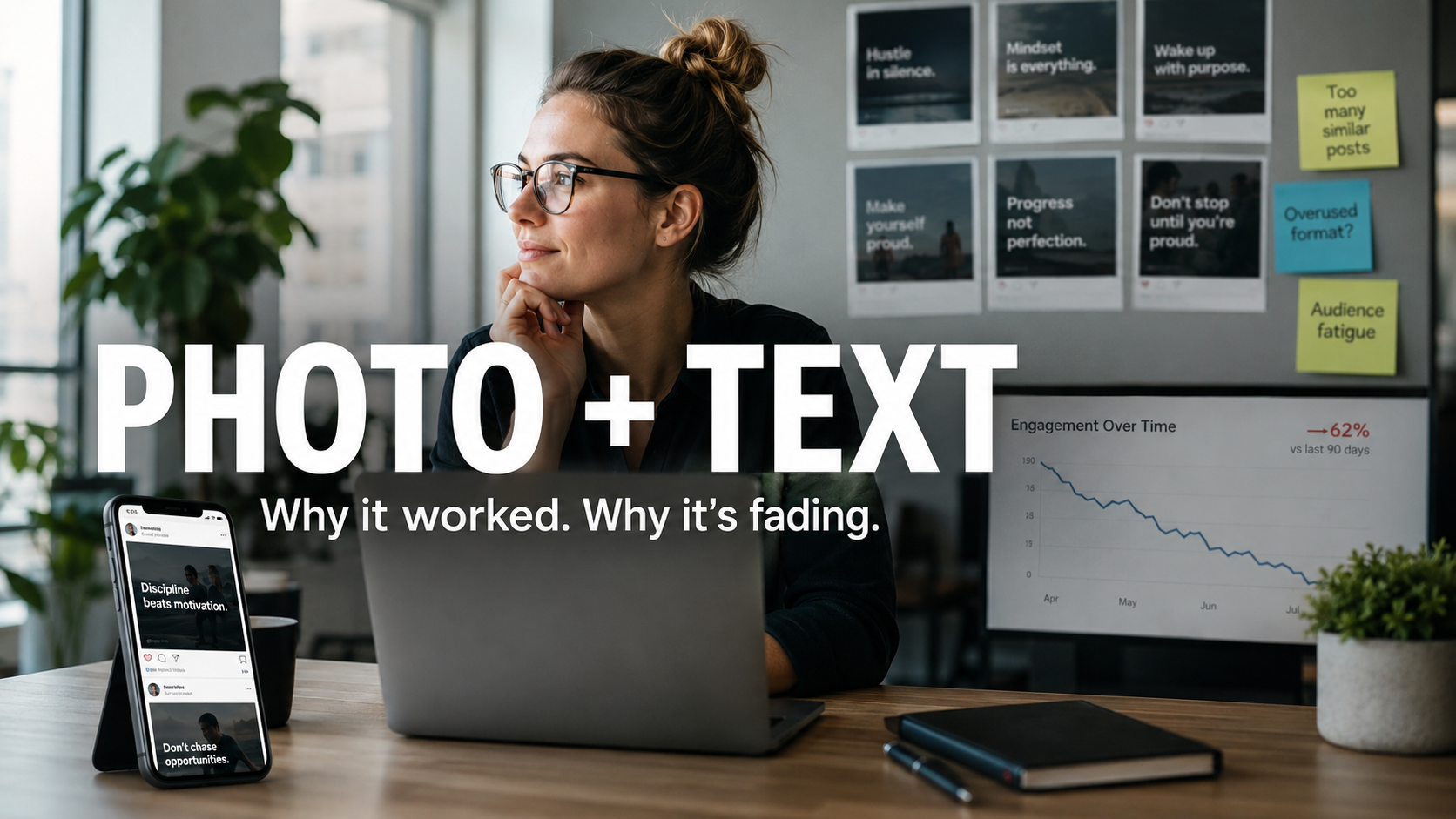
Scroll LinkedIn for thirty seconds and you'll see it. A completely unremarkable photo — someone at their desk, walking through an airport, holding a coffee, staring pensively out a window — with a bold one-liner slapped across it in white text. "I fired my best client last week." "Nobody talks about this part of running an agency." "This mistake cost me $40,000."
No design. No branding. No graphics team. Just a phone photo and a sentence. And for the better part of two years, this format quietly out-performed the polished carousels and branded templates that marketing teams spent hours producing.
This post breaks down why the "normal picture with text over it" format took over LinkedIn, what the engagement data actually says in 2026, why the window on the sincere version is closing, and — most importantly — how to use the mechanic behind the trend without becoming the meme. Because like every format that works, this one is following a predictable lifecycle, and where you enter that lifecycle determines whether the format builds your brand or quietly embarrasses it.
What the Format Actually Is
Let's define it precisely, because "image post" covers a lot of territory and this trend is something specific.
The format: a candid, deliberately un-produced photograph — usually of the poster themselves or their immediate environment — with a short, high-tension text hook overlaid directly on the image. The photo is intentionally mundane. The text is intentionally provocative, vulnerable, or contrarian. The full story lives in the caption below, behind LinkedIn's "...see more" fold.
It's an Instagram Story that wandered onto a professional network. And that visual dissonance — casual format, professional platform — is not an accident. It's the entire engine.
Why It Worked: Four Mechanics Worth Stealing
1. It hijacks the pattern-interrupt
The LinkedIn feed is a wall of two things: long text posts and over-designed branded graphics. A raw phone photo reads as neither. Your brain categorizes it as "a person" rather than "content" before you've consciously processed a single word. This matters because visual processing is dramatically faster than reading — our brains process visuals roughly 60,000 times faster than text, which means the image wins or loses the scroll-stop before your caption ever gets a chance.
That's the same attention math we covered in our Gen Z slang glossary: you have seconds, not paragraphs, to earn the pause. The photo-with-text format is simply that principle weaponized for a professional feed.
2. It puts the hook in un-truncatable real estate
LinkedIn cuts your caption off after roughly two lines. Everything below the fold only gets read if the first line earns the click. The text overlay is a workaround: it places your hook in the single largest, most visible element of the post — full-size, impossible to truncate, readable at scrolling speed. It's a billboard with a "...see more" attached.
There's data behind this. Images with brief text overlays consistently outperform plain photos in engagement metrics, and across social platforms broadly, posts with text overlays get shared 94% more. The overlay isn't decoration — it's hook placement.
3. It manufactures dwell time, which the algorithm converts into reach
Here's the sequence the format engineers: the photo stops the scroll, the overlay text creates an open loop ("fired your best client? why?"), and the reader clicks "see more" to close it. Every step of that sequence is a dwell-time signal, and dwell time feeds distribution. The first 60–90 minutes determine roughly 70% of a post's total reach, and comments are weighted about 15x more heavily than likes — so a format that reliably generates early pauses and "wait, what happened?" comments compounds hard in exactly the window that matters.
This is the same compounding logic that drives everything we build at Ritner — visibility earns engagement, engagement earns trust, trust earns distribution — just running on a 90-minute clock instead of a 12-month one.
4. The mundane photo is a feature, not a bug
This is the part most brands get backwards. A polished, art-directed photo signals advertisement. A slightly awkward candid signals confession. Audiences trained by two decades of content marketing have developed an instinctive promotion detector, and some image types now actively signal "promotion" to both the algorithm and readers — with branded templates and stock photography increasingly falling into that bucket.
We covered this exact mechanic in our slang glossary: it's the aura-farming paradox. The moment effort becomes visible, the effect collapses. JanSport's deliberately awkward, deadpan campaign drove a 385% engagement spike and the highest-grossing month in the company's 57-year history precisely by refusing to look polished. The normal-photo-with-text format is the LinkedIn-native expression of the same insight: un-produced beats over-produced when your audience is fluent in marketing.
The Uncomfortable Part: The Data Has Turned
Now the caveat that most "how to go viral on LinkedIn" posts won't tell you, because we publish the uncomfortable numbers even when they complicate the story — it's kind of our whole thing.
The raw format is past its peak. Per SocialInsider's LinkedIn benchmarks, single-image posts now underperform text posts by roughly 30% in 2026 — a full reversal of the 2024–2025 trend — while carousels pull about 24.4% engagement, nearly 4x the rate of text posts. The photo-with-text-overlay post rode the single-image wave up, and it's riding it back down.
Why did it turn? The same lifecycle that kills every format — and every slang term, as we broke down in our marketer's guide to Gen Z language: niche origin, viral spread, mass adoption, then death or irony. Once every founder, every "thought leader," and every ghostwriting agency adopted the pensive-photo-plus-vulnerable-hook template, the pattern-interrupt stopped interrupting. The format that read as "a person" in 2024 reads as "a LinkedIn strategy" in 2026. Audiences don't just scroll past it — they parody it. The joke version ("me staring at a wall: 'Revenue isn't everything'") now routinely out-engages the sincere version, which is the surest sign a format has entered its ironic phase.
There's a second problem, and it's the one almost nobody in the LinkedIn-growth conversation mentions: text baked into an image is invisible to search. Image text isn't searchable on LinkedIn — and it's equally invisible to the AI engines that increasingly scrape public LinkedIn content for entity and authority signals. If your sharpest one-liner, your best data point, or your positioning statement exists only as pixels, then as far as Google, ChatGPT, and Perplexity are concerned, it doesn't exist. You spent your best material on a format that machines can't read, in an era where being readable and citable by machines is the whole game.
What Still Works: Steal the Mechanic, Not the Template
Here's the distinction that separates brands that ride formats from brands that get buried by them: templates expire; mechanics don't. The pensive-selfie template is dying. The four mechanics underneath it — pattern-interrupt, un-truncatable hook, engineered dwell time, credible informality — are permanent. So here's how to run them in 2026:
1. Data over the photo, not platitudes. The version of this format that still crushes is a normal photo with a specific number on it. Not "consistency is everything" — that's the meme. Instead: "218 clicks. 101K impressions. 90 days. Brand-new domain." A real screenshot-worthy stat over a real candid photo fuses the format's humanity with actual proof, and proof is the one thing audiences haven't built an immunity to. (Those numbers, incidentally, are ours, from our first 90 days — which is exactly the kind of receipt this format was built to carry.)
2. Duplicate every overlay in the caption. Non-negotiable. Whatever text lives on the image must also live in the post text — for LinkedIn search, for accessibility, and for the AI crawlers building their picture of your brand's entity and authority signals. The image is for humans mid-scroll; the caption is for the machines deciding whether you're citable. Feed both. (Alt text, too — accessibility and machine-readability are the same job.)
3. Graduate the winners into carousels. With carousels pulling nearly 4x the engagement of text posts, the smart pipeline is: test hooks as single photo-with-text posts (cheap, fast, one phone photo), then rebuild the proven winners as carousels where slide one is the photo-with-text and slides two through seven deliver the story. You get the format's scroll-stop as your cover and the carousel's engagement rate as your distribution.
4. Respect the production floor even in "casual." Un-produced doesn't mean unreadable. Minimum 1,200px on the long side, text large enough for mobile, high contrast between text and background — the informality should be in the subject, never in the execution. A blurry photo doesn't say "authentic"; it says "careless," and audiences correctly assume you're careless with client work too.
5. Treat LinkedIn posts as the top of a search asset pipeline. Here's the strategic frame most social advice misses entirely: a LinkedIn post has a 48-hour lifespan; a ranked, cited page compounds for years. Every photo-with-text post that performs is validated demand — a hook your market has proven it cares about. The move is to expand that hook into the durable version: a blog post, a data study, a pillar guide that Google ranks and AI engines cite. Social validates; search compounds. Brands that only do the first are renting attention. That's the same trap as burning budget on paid ads that stop the moment you stop paying — a treadmill dressed up as a strategy.
The Bigger Lesson: Format Arbitrage Is a Losing Game
The rise and fall of the normal-photo-with-text post is a case study in how all content formats work now. A format emerges from genuine behavior (people casually sharing phone photos). Early adopters get outsized returns because it reads as authentic. The returns attract imitators. Imitation makes the format legible as a tactic. The moment the audience can name the tactic, the returns collapse — and the parody phase begins. Sound familiar? It's the exact lifecycle we mapped for slang terms, because it is the same lifecycle. Formats are visual slang.
You can play format arbitrage — jump each new format early, extract the returns, jump again. Some creators do this well. But it's a full-time job with a permanent expiration clock, and for most B2B brands it's the wrong game entirely. The right game is the one where returns compound instead of decaying: publish real proof, build authority that both audiences and algorithms verify, and use whatever format is currently working as a delivery vehicle for substance you'd stand behind in any format.
The brands that win the next five years won't be the ones with the best pensive selfies. They'll be the ones that get named when a buyer asks an AI engine who's best — because trends rotate, but citations compound.
Frequently Asked Questions
Why do plain photos with text overlays perform so well on LinkedIn?
Four mechanics: the casual photo pattern-interrupts a feed full of text and branded graphics; the overlay places your hook in un-truncatable space; the open-loop text drives "see more" clicks that generate dwell time; and early engagement in the first 60–90 minutes drives the majority of total reach. The mundane photo also reads as human rather than promotional — a credibility signal polished graphics have lost.
Is the photo-with-text format dead in 2026?
The sincere, template version is fading — single-image posts now underperform text by about 30%, reversing the 2024–2025 trend — and the parody phase has begun. But the underlying mechanics still work. The version that performs now pairs a candid photo with a specific, verifiable data point instead of a vulnerable platitude, and graduates winning hooks into carousels, which pull nearly 4x the engagement of text posts.
Does text on an image hurt my SEO or AI search visibility?
Text baked into an image is invisible to LinkedIn search — and invisible to the AI engines scraping public content for authority signals. The fix is simple: duplicate every overlay line in your caption and alt text so humans get the scroll-stop and machines get the citable, machine-readable signal. Never let your best line exist only as pixels.
Should my B2B brand chase LinkedIn format trends at all?
Use trends as delivery vehicles, not strategy. Formats follow the same lifecycle as slang — emergence, adoption, saturation, parody — so returns from any single format decay on a clock you don't control. Treat high-performing posts as validated demand, then expand those hooks into durable search assets: ranked pages and cited guides that compound for years instead of hours. Social validates; search compounds.
What should I put on the image instead of an inspirational quote?
A specific number, a surprising before/after, or a verifiable claim you can back up in the caption — real Search Console screenshots, real revenue figures, real timelines. Specificity is the last form of pattern-interrupt audiences haven't built immunity to, because it can't be faked at scale. If you wouldn't publish the receipt behind the line, don't put the line on the photo.
Your LinkedIn posts have a 48-hour shelf life. Your search visibility compounds for years. If you want to know how to turn the attention you're earning on social into rankings, AI citations, and pipeline that doesn't reset every Monday — book a free 30-minute strategy call → No pitch. You'll get a real read on where you stand and a clear next step within one business day.