The Psychology of #CCFF00: Why Robinhood's Robin Neon Works
Color is not decoration. It is communication — and in branding, it's often the first thing your audience processes before they read a single word of copy or interact with a single feature.
Robinhood knows this. Their signature accent color, internally called Robin Neon (#CCFF00), is not an accident. It's not a trend they stumbled into. It's a deliberate psychological choice that does specific, measurable work inside one of the most recognizable fintech brands in the world. And once you understand why it works, you'll start seeing the same logic play out across some of the biggest brand identities in sports, tech, fashion, and culture.
But to really understand why #CCFF00 works, you have to go deeper than "it's bright and people notice it." You have to understand what's happening in the human brain when it encounters this color, why the financial services industry made the color choices it did, and how Robinhood's decision to detonate that entire visual tradition was a strategic act of brand warfare dressed up as a design preference.
What #CCFF00 Actually Is
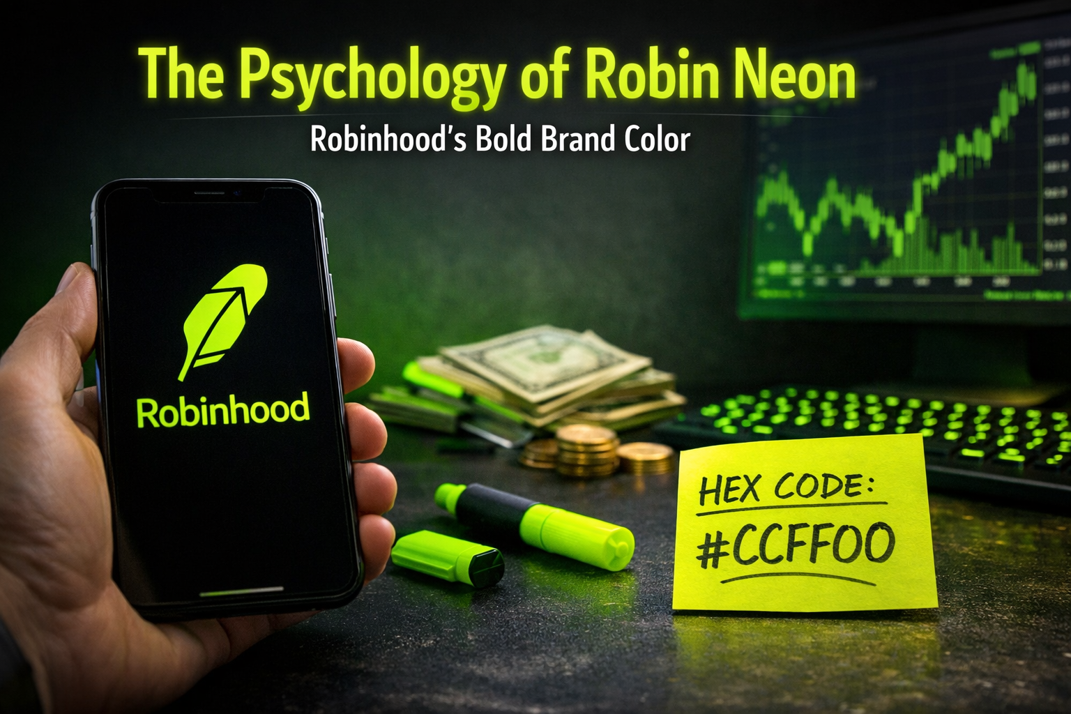
Robin Neon sits at a very specific intersection on the color spectrum. It's not the pure neon green of a Monster Energy can (#39FF14). It's not chartreuse. It's not safety yellow. It's an electric yellow-green — heavily saturated, almost luminescent, with enough yellow in it to feel energetic and optimistic rather than simply aggressive or chemical.
To understand why that specific balance matters, you need a brief primer on how color actually works physically. Color is light. Specifically, color is the portion of the electromagnetic spectrum that the human eye can detect — wavelengths between roughly 380 and 700 nanometers. The yellow-green range sits right around 550 to 570 nanometers, which happens to be the peak sensitivity range for the cone cells in the human retina responsible for daylight vision.
In plain English: the human eye is literally more sensitive to yellow-green light than to any other color. We have more photoreceptors tuned to that frequency. We detect it faster, we process it more vividly, and we find it harder to ignore. #CCFF00 sits almost perfectly in that peak sensitivity zone. When Robinhood puts that color on a screen, they are not just making a design choice — they are exploiting a fundamental feature of human biology.
On modern displays, which are backlit and can push colors to extraordinary saturation levels, #CCFF00 behaves like a color that generates its own light. It appears to pulse slightly. It creates an afterimage when you look away. It demands attention before your brain decides to pay attention. Understanding that this is the foundation everything else is built on is essential to understanding why this color works so well in a mobile-first product context.
A Brief History of Color in Financial Services
To appreciate how radical Robinhood's color choice actually is, you need to understand what it was reacting against.
Traditional financial services — banks, brokerages, wealth managers, insurance companies — converged on a remarkably consistent visual palette over the course of the 20th century. Navy blue. Dark green. Gold and burgundy. Occasionally black. The reasons were partly cultural and partly strategic.
Navy blue communicates authority, stability, and trustworthiness. It's the color of uniforms, of institutional power, of entities that have been around for a long time and intend to keep being around. JPMorgan Chase. American Express. Barclays. VISA. The blue says: we are serious, we are permanent, your money is safe with us.
Dark green communicates wealth, growth, and establishment. It's the color of old money, of country clubs, of leather-bound ledgers. TD Bank. Merrill Lynch. Edward Jones. The green says: we understand prosperity, we've been stewards of it for generations, and we belong in the same conversation as the things you value most.
Gold communicates prestige and exclusivity. It says: not everyone gets access to this. This is for people who have arrived.
These are not arbitrary choices. They are deeply considered, culturally loaded signals that the financial industry developed and reinforced over decades until they became shorthand for the entire concept of "legitimate financial institution." When a consumer saw that palette, they weren't consciously thinking "navy blue equals trustworthy." They were receiving a subconscious signal, built up through hundreds of exposures to banks, brokerages, and advisors, that said: this is a real institution that belongs to the established order of things.
That visual language was incredibly effective for the industry it was designed for. It was also, by design, exclusionary. The palette communicated establishment membership. It said: this is for people who already understand money, who are already comfortable in financial settings, who have already accumulated enough wealth that a conversation with us is worth having.
Which is exactly what Robinhood needed to blow up.
Why Robinhood Chose Robin Neon
Robinhood launched in 2013 with a single, clear positioning argument: the financial system is for everyone, not just the wealthy. Commission-free trading. No account minimums. A mobile-first interface designed to make investing feel as intuitive as social media. The entire product was built around the premise that the gatekeeping of financial markets was artificial, and that technology could dissolve it.
That's a big claim to make. And no matter how well-designed the product was, if Robinhood had launched with the same visual language as Fidelity or Charles Schwab, they would have undermined their own argument before a user opened the app. The colors themselves would have said: we are part of the same system we're claiming to disrupt.
So they made a different choice.
The combination of deep, dark backgrounds — near-black, dark charcoal — with Robin Neon (#CCFF00) as the primary accent color is a visual argument that doesn't require a single word of copy. Every element of it is doing work.
The dark background strips away the white-and-navy cleanliness of traditional finance apps and replaces it with something that feels native to tech, to gaming, to the digital-first aesthetic that a younger generation of investors grew up inside. It's the visual language of a Bloomberg terminal reimagined for someone who also uses Discord.
The neon accent then lands on top of that dark background with maximum contrast and maximum impact. On a dark surface, #CCFF00 doesn't just appear bright — it appears to glow. It feels alive in a way that the same color on white wouldn't. And it communicates, in a single visual gesture, that this is not what came before. This is something new. This is not the brokerage your parents used.
The choice of yellow-green specifically — rather than pure neon green or electric blue or hot pink — is also significant and worth unpacking. Yellow carries deep psychological associations with optimism, opportunity, sunshine, and forward movement. It's the color of new beginnings and positive energy. Green carries associations with money, with go-signals, with growth and positive returns. #CCFF00 sits right at the overlap of both, which means the color is quietly reinforcing the core product promise — your money can grow here, this is a good thing, the future is open — without a single word being spoken.
It's also worth noting what the color is not saying. It's not red, which would carry urgency and anxiety — dangerous associations in a category where market volatility already makes people nervous. It's not a cold blue, which might communicate stability but would also slide back toward the traditional finance aesthetic they were trying to escape. It's not white or pastel, which would feel too soft and consumer-y for a product making a serious argument about democratizing markets. #CCFF00 threads a very specific needle: energetic but optimistic, disruptive but not threatening, modern but not cold.
The Deep Psychology of This Specific Shade
Understanding why #CCFF00 works requires going beyond surface-level color associations and into the actual psychological research on how color affects human behavior, perception, and decision-making.
Arousal and physiological response. Research in environmental psychology has consistently demonstrated that highly saturated colors produce measurably higher levels of physiological arousal than desaturated or neutral tones. Heart rate increases slightly. Attention sharpens. The brain shifts into a more alert, engaged mode. For a financial app whose entire business model depends on users actively engaging with their portfolio — checking balances, making trades, exploring new stocks, monitoring performance — this is not a neutral effect. Higher arousal means more engagement, more time in the app, more actions taken. The color is doing user experience work that no interface copy or button design can fully replicate.
Peak contrast perception. Human vision evolved to detect contrast, not absolute brightness. We notice things that stand out from their environment, not things that are bright in isolation. #CCFF00 on a dark background creates one of the highest contrast ratios possible — the luminance difference between the color and its background is extreme. This means that every CTA button, every positive return indicator, every interactive element rendered in Robin Neon on a dark surface registers almost instantaneously in the user's visual field. The design isn't asking the user to find the important parts of the interface. The color is pointing at them.
Temporal associations and modernity. Colors carry cultural timestamps. Certain shades feel dated in ways that are hard to articulate but immediately recognizable. Earth tones feel like the 1970s. Neons feel like the 1980s — but also like the 2010s and 2020s, when they came back through streetwear, digital art, gaming aesthetics, and social media visual culture. #CCFF00 in particular has strong associations with contemporary digital culture — it appears in Discord servers, in gaming setups, in hypebeast sneaker colorways, in TikTok visual trends. For an audience of younger, digitally native investors, the color signals cultural fluency. It says: we know what world you actually live in.
Positive valence in financial contexts. This one is subtle but important. In financial interfaces, color is heavily freighted with specific meaning — green means up, red means down. This is so deeply ingrained that users process it before they read the numbers. Robin Neon being green-dominant means that its presence in the interface carries an implicit positive valence. Even in neutral contexts — navigation elements, CTAs, loading indicators — the color is subliminally associated with positive market movement. Every interaction with the app is subtly colored, literally and psychologically, by that association.
Memorability and distinctiveness. Cognitive science research on brand memory consistently shows that unusual, unexpected stimuli are more memorable than expected ones. This is called the von Restorff effect — items that stand out from their surroundings are disproportionately likely to be remembered. #CCFF00 is unusual enough in the financial services context that it creates a strong memory trace. Users don't confuse Robinhood's visual identity with anyone else's, because no one else in the category is using that color. That distinctiveness compounds over time into brand equity that is extremely difficult for competitors to replicate.
Other Brands Playing in the Same Color Space
Robinhood isn't alone in understanding what electric yellow-green can do. Several other major brands have staked out territory in this part of the spectrum, each for related but distinct reasons.
Nvidia has watched its green become one of the most culturally significant brand colors of the last five years, as the company went from being known primarily to gamers to becoming the defining company of the AI era. Their green — slightly deeper and less yellow than Robin Neon — communicates raw performance, technological edge, and power. As Nvidia's market capitalization soared past $3 trillion and their GPUs became the infrastructure of the AI revolution, that green was suddenly everywhere — in data centers, in developer communities, in financial news. The color now carries connotations of the future itself.
Spotify operates at a slightly more mint-adjacent version of electric green, but the psychological argument is similar. Launched into a music landscape dominated by iTunes' silver-and-white sterility, Spotify's green immediately communicated something different — alive, contemporary, for people who actually care about music rather than just organizing files. It's been remarkably consistent since launch, and that consistency means the color now does significant brand recognition work on its own, without any other visual cues needed.
Sprite has made electric lime the centerpiece of a major recent rebranding push, moving away from its previous blue-and-green palette toward a more aggressive, neon-forward identity. The explicit target is Gen Z — an audience that grew up with #CCFF00-adjacent colors as part of their digital visual vocabulary. The message is: this is not your parents' lemon-lime soda.
Liquid Death uses electric lime as a recurring accent in an identity that is deliberately punk, irreverent, and anti-category. In a world where water brands compete on softness, purity, and mountain imagery, Liquid Death's aggressive color palette — including sharp yellow-greens — is a sustained visual joke and a serious brand argument at the same time. The color signals that everything about this brand is intentionally not what you'd expect.
Razer took electric green further than almost any other brand and in doing so helped define an entire subculture's visual language. The gaming peripheral company's signature green — pushed to near-neon saturation — became synonymous with high-performance gaming setups, RGB lighting culture, and the aesthetic of serious competitive gaming. It's now almost impossible to see that shade of green in a tech context without some part of your brain registering "gaming." Razer didn't just use a color. They colonized it.
Jordan Brand and sneaker culture have used lime and electric yellow-green as recurring accent colors in some of their most culturally significant releases. The "Electric Green" Air Jordan colorways, various Nike Volt editions, and collaborative pieces from brands like Off-White have embedded this color family deeply into sneaker culture, where it signals rarity, cultural currency, and an awareness of what's happening at the intersection of fashion and sport.
Hi-vis safety equipment is worth mentioning not as a brand but as a cultural touchpoint that shapes the color's psychological reception. The specific yellow-green of safety vests, construction equipment, and emergency gear is this color's direct ancestor, and those associations — this is the color of things you are not supposed to miss, this is the color of importance and urgency and visibility — don't disappear when the color appears on a fintech app or a sneaker. On some level, the brain still registers the same message: pay attention, this matters, you should not look away from this.
The Competitive Moat of Color Ownership
One of the most underappreciated aspects of Robinhood's color strategy is the competitive moat it creates. Color ownership — the degree to which a specific brand owns a specific color in the minds of consumers within a category — is a form of brand equity that is extraordinarily difficult and expensive to displace once established.
Consider what it would cost a competitor to enter the fintech space today and try to use #CCFF00. They could do it technically — there's no trademark protection on most colors outside of very specific contexts — but they would immediately be read as imitating Robinhood. Every user who saw that color would think of the incumbent. The color would work against the new entrant rather than for them. The only way to compete on color is to own a different color, which means the available spectrum of ownable, high-impact colors in any given category shrinks with every brand that successfully plants a flag.
Robinhood planted their flag early and applied it consistently. That consistency is the key. Color equity is not built by choosing a great color — it's built by choosing a defensible color and then applying it relentlessly, across every touchpoint, for long enough that the color becomes inseparable from the brand in consumer memory. Robinhood has been doing that for over a decade.
What This Means for Your Brand
You don't need to use #CCFF00 to apply these lessons. What Robinhood demonstrates is a set of principles that transfer to any brand and any category.
Own something specific. Robinhood didn't pick "green." They picked a specific, particular, named green with a hex code and an internal brand name. The more specific your color, the more ownable it is. Vague color choices — "a blue" or "kind of green" — can't be owned. Specific choices can.
Use color to make an argument. Robin Neon is not decoration. It's an argument against the visual language of traditional finance. Before you pick a color, identify what argument your brand needs to make in your specific category — and then find the color that makes that argument most efficiently and memorably.
Understand your category's visual conventions — and decide deliberately whether to follow or break them. Most brands pick colors that look like their competitors because it feels safe and credible. Sometimes that's the right call. Often it's a missed opportunity to occupy visual whitespace that your competitors have left open. Robinhood saw that the entire financial services industry had converged on the same palette and made the strategic decision to be the exception. That decision is now worth more than any individual marketing campaign they've ever run.
Contrast creates attention. Part of why Robin Neon works so well is the dark background it lives against. The contrast ratio is extreme and deliberate. The same color on white would read very differently — brasher, more aggressive, less premium. Environment matters as much as the color itself. Don't evaluate your brand color in isolation. Evaluate it in the context it will actually appear in.
Consistency is the whole game. The most important color decision you can make is not the initial selection — it's the commitment to apply it consistently across every touchpoint over a long enough period that the color starts to carry meaning independently of anything else. Color equity is earned through repetition. There are no shortcuts.
Color is one of the most powerful and most underutilized tools in a brand's arsenal. Most businesses pick something they like, or something their designer suggested, or something that looked good on the mood board, and then move on without thinking deeply about what argument they're making or whether it's the right one.
The brands that build lasting recognition treat every color decision like the strategic argument it actually is — because your audience is reading that color whether you intended them to or not. They are making judgments about your trustworthiness, your modernity, your category membership, and your personality based on a single hex value before they've read your headline or clicked your CTA.
Robinhood's Robin Neon is a masterclass in that kind of intentionality. One color, doing an enormous amount of work, across an entire decade of brand building.
That's what great color strategy looks like.
Ritner Digital helps businesses build brand identities and digital presences that actually convert. Get in touch.
Frequently Asked Questions
What is Robin Neon?
Robin Neon is Robinhood's internal name for their signature accent color, #CCFF00 — an electric yellow-green that appears throughout their app, marketing materials, and brand identity. It's one of the most distinctive and strategically considered colors in fintech, chosen specifically to contrast against the conservative navy and dark green palette that has dominated traditional financial services for decades. The name itself is a nod to the brand — Robin, as in Robinhood, and Neon, because the color behaves like it's generating its own light on a screen.
Why did Robinhood choose such an unconventional color for a financial brand?
Because unconventional was the point. Robinhood's entire positioning argument is that the financial system should be accessible to everyone, not just the wealthy and the already-initiated. The visual language of traditional finance — navy, dark green, gold, marble — communicates exclusivity and institutional gatekeeping by design. Robinhood needed a color that made the opposite argument: that this is different, this is open, this is for you. #CCFF00 does that in a single visual gesture, before a user reads a word of copy or clicks a single button.
What does #CCFF00 communicate psychologically?
Several things simultaneously. The yellow-green range of the visible spectrum is where the human eye has its highest concentration of photoreceptors, meaning it's the color range humans are most physiologically sensitive to — we detect it faster and find it harder to ignore than almost any other color. Beyond pure visibility, the yellow component communicates optimism, opportunity, and forward movement. The green component signals growth, positive returns, and go-signals. The high saturation communicates energy, modernity, and disruption. Together, the color makes a coherent psychological argument that maps almost perfectly onto Robinhood's brand promise: investing is exciting, accessible, and going somewhere good.
Does the dark background Robinhood uses matter, or is it just an aesthetic preference?
It matters enormously, and it's not just aesthetic. #CCFF00 on a dark background creates one of the highest contrast ratios possible in digital interface design. The luminance difference between the color and its background is extreme, which means every element rendered in Robin Neon — CTAs, positive return indicators, interactive elements — registers almost instantaneously in the user's visual field. The dark background also does its own psychological work, communicating tech-nativeness, sophistication, and a deliberate departure from the clean white interfaces of traditional finance apps. The two choices are inseparable and each makes the other work better.
What other major brands use colors in the Robin Neon family?
Several, each for related but distinct reasons. Nvidia's green communicates raw technological performance and has become culturally associated with the AI era. Spotify's electric green communicates modernity and a love of music over the sterile silver-and-white of iTunes. Sprite has recently leaned into neon lime to appeal to younger audiences. Razer colonized electric green so thoroughly that it's now synonymous with high-performance gaming culture. Jordan Brand and Nike have used lime and electric yellow-green in some of their most culturally significant sneaker releases. And hi-vis safety equipment — the direct ancestor of this color family — has hardwired the association between yellow-green and "this is something you should not miss" into human visual processing.
Can any business use a neon or electric color effectively?
Not every brand should, and context is everything. High-saturation colors like #CCFF00 work best when a brand is explicitly positioned around disruption, energy, modernity, or accessibility — and when the category they're operating in has a conservative, muted visual landscape they can contrast against. They tend to work poorly when a brand needs to communicate tradition, long-term stability, or ultra-high-end luxury. A neon accent on a wealth management firm aimed at ultra-high-net-worth clients would read as unserious. The same color on a fintech app aimed at first-time investors is a strategic masterstroke. The color isn't the variable — the fit between the color and the brand's positioning is.
How is color equity built, and how long does it take?
Color equity is built through two things: specificity and consistency over time. You have to choose a color that is specific and distinctive enough to be ownable — not "a blue" but a particular, named, hex-coded blue that no one else in your category is using. And then you have to apply it consistently across every touchpoint — your website, your app, your social media, your advertising, your packaging, your physical spaces — for long enough that the color starts to carry meaning independently of any other brand element. For most brands, meaningful color equity takes three to five years of consistent application at minimum. Robinhood has been doing it for over a decade, which is why the color now does significant recognition work entirely on its own.
Does color actually affect conversions and business outcomes, or is this mostly theoretical?
It's well documented in the research and in real-world testing. Color affects click-through rates, time on page, purchase decisions, and brand recall in measurable ways. CTA button color relative to its background has been shown to meaningfully impact conversion rates across thousands of A/B tests in e-commerce and SaaS contexts. Color also affects perceived product quality and willingness to pay — the same product in different colored packaging is consistently rated differently by consumers. None of this means color is the whole equation, but it's never a neutral variable, and treating it as one is a significant missed opportunity.
What's the most common mistake brands make with color?
Picking a color they like instead of a color that makes the right argument. Most brands start with aesthetic preference — the founder's favorite color, whatever looked good on the mood board, whatever the designer presented first — rather than starting with the strategic question of what psychological and cultural argument this color needs to make in this specific category for this specific audience. The second most common mistake is inconsistency. A great color choice applied inconsistently builds no equity. The brands that win on color are the ones that pick something defensible and then apply it relentlessly, everywhere, for years.
How do I know if my current brand color is working?
The simplest test: remove your logo and company name from a piece of your marketing. Does the color alone — combined with your overall visual style — tell someone it's yours? If yes, you've built real color equity. If your color could belong to any of your competitors, or to no one in particular, you have work to do. A more rigorous test is to show your brand color to customers and prospects without any other context and ask what brand comes to mind. If the answer isn't you, that's a data point worth taking seriously.
Want to build a brand identity that does this kind of work? Let's talk.