Funeral Home Web Design Should Make the Intangible Tangible: How Cards, Icons, Interactive Tools, and Better UX Can Show Families What They Are Really Paying For
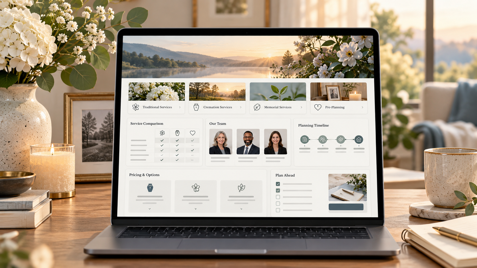
There is a fundamental marketing problem facing funeral homes that has very little to do with whether their website looks modern.
The most valuable things a funeral home provides are often the hardest things to display on a screen.
A family can see the building.
They can see the hearse.
They can see the casket.
They can see the cremation price.
They can see how many Google reviews you have.
But they cannot immediately see:
The phone call you answer at 2:00 in the morning.
The paperwork they never knew existed.
The coordination happening between the funeral home, church, cemetery, clergy, florist, veteran's organization, newspaper, crematory, and extended family.
The director who realizes a daughter is overwhelmed and slows the conversation down.
The staff member making sure Grandma's jewelry is handled correctly.
The decades of experience that allow a funeral director to identify a problem before the family even knows there is one.
The ability to coordinate twenty moving parts without allowing the grieving family to feel like there are twenty moving parts.
The reassurance of hearing:
“We’ll take care of that.”
Those things are enormously valuable.
They are also intangible.
And that creates one of the biggest digital challenges in funeral home marketing:
How do you make something people cannot see feel real before they have experienced it?
That is where good funeral home web design becomes much more than choosing colors, fonts, and photographs.
Design can turn invisible value into something visible.
A card can turn an abstract service into a specific benefit.
An icon can make a complicated process easier to understand.
A timeline can show the work happening behind the scenes.
An interactive comparison can help a family understand the difference between direct cremation and cremation with a service.
A staff profile can make “family owned” mean something more than a sentence in the footer.
A carefully designed “What Happens Next?” section can reduce anxiety at the exact moment someone needs direction.
Good web design does not merely make a funeral home look better.
It can make the value of a funeral director easier to understand.
And in an era where families increasingly begin online, that may be one of the most important jobs a funeral home website has.
Price Is Easy to Make Tangible
Imagine two funeral home websites.
The first says:
Direct Cremation — $1,295
There is a button underneath:
Start Arrangements
The customer understands that immediately.
There is a service.
There is a price.
There is an action.
Now imagine another funeral home's homepage says:
Compassionate Care When You Need It Most
That may be completely sincere.
It may accurately describe the funeral home.
But what did the visitor actually learn?
What is compassionate care?
What does the funeral home do differently?
What happens when I call?
What is included?
Why does one cremation option cost more than the $1,295 option I just saw somewhere else?
What does a funeral director actually handle?
The first website made its offer tangible.
The second described a feeling.
That does not mean traditional funeral homes should turn themselves into ecommerce websites.
It means they need to become much better at translating intangible service into visible evidence.
Ritner Digital has previously written about this challenge in the direct-cremation era: price is immediately understandable online, while much of a funeral director's value remains invisible unless the website deliberately communicates it. Ritner Digital | AI Search & SEO Agency
That is ultimately a design problem as much as it is a copywriting problem.
Families Are Already Using Funeral Home Websites
This is not a theoretical concern.
The National Funeral Directors Association's 2025 consumer research found that almost 74% of consumers had visited a funeral home's website. Common reasons included finding an obituary, looking for price information, researching funeral planning, and reviewing funeral or memorial service options. Nearly half of respondents who had planned a funeral or memorial service had visited a funeral home's website during the process. National Funeral Director's Association
At the same time, digital does not mean families suddenly want to navigate everything alone.
NFDA found that nearly 30% of families were completing arrangements entirely online, but 44.4% said they would not feel confident planning without funeral-director assistance. Among consumers who planned online, almost 48% still needed help from a funeral director. NFDA Content
That creates an enormous opportunity for website design.
The website does not have to replace the funeral director.
It should begin doing what a good funeral director already does:
Reduce uncertainty.
Organize complexity.
Explain choices.
Make people feel that there is a path forward.
And visually communicate that somebody competent is going to guide them through it.
A Funeral Home Website Should Answer an Emotional Question
The obvious question a funeral home website answers is:
What services do you offer?
But the deeper question is:
Can I trust you to take care of this?
That is not something you answer with one paragraph.
Trust is accumulated through signals.
The clarity of the page.
The photographs.
The language.
The way options are explained.
The visibility of staff.
The ease of finding a phone number.
The way prices are framed.
The reviews.
The details.
The absence of confusing jargon.
The fact that the site works properly on a phone.
The feeling that somebody anticipated what the visitor would need next.
This is why web design is not decoration.
The interface itself becomes evidence of how the organization thinks.
If the website is disorganized, unclear, outdated, difficult to read, and hard to navigate, a visitor may reasonably wonder whether the experience behind the website will feel the same way.
If the website makes a complicated subject feel calm and understandable, the opposite can happen.
That is what design can accomplish.
The Card Is One of the Most Powerful Tools in Funeral Home Web Design
Cards are everywhere in modern websites because they solve a simple problem:
They turn a large amount of information into understandable pieces.
For a funeral home, this is especially useful because families are often trying to understand unfamiliar choices under stress.
Instead of giving someone six paragraphs explaining service options, imagine a section containing four clear cards:
Traditional Funeral
For families who want a viewing, funeral ceremony, and burial.
Viewing or visitation
Funeral service
Transportation
Cemetery coordination
Personalized memorial options
Explore Traditional Funerals →
Cremation With a Viewing
For families who want time together before cremation.
Private or public viewing
Funeral or memorial service
Cremation afterward
Urn and memorial options
See Cremation With a Service →
Direct Cremation
For families looking for the simplest cremation option.
Transfer into our care
Required permits and paperwork
Cremation
Return of cremated remains
Understand Direct Cremation →
Celebration of Life
For families who want a personalized gathering centered on memories.
Flexible location
Music and photos
Personalized ceremony
Before or after cremation or burial
Plan a Celebration of Life →
The information did not fundamentally change.
The presentation did.
Now the visitor can see the choices.
That matters.
Cards Make Options Feel Like Options Instead of a Wall of Funeral Terminology
Funeral directors use terms every day that families may encounter only once or twice in their lives.
Disposition.
Interment.
Committal.
Visitation.
Direct cremation.
Memorialization.
A website that places those terms into long paragraphs assumes the visitor is ready to decode them.
A well-designed card can pair the professional term with the explanation.
For example:
Direct Cremation
Simple cremation without a viewing or funeral beforehand.
Immediately, the unfamiliar phrase becomes understandable.
This is one of the places where good design and good communication become inseparable.
The design organizes the information.
The copy translates it.
Together, they reduce friction.
Icons Can Make Invisible Work Visible
Icons can be dismissed as decorative.
Used poorly, they are.
Used strategically, they can help people understand the scope of what a funeral home actually handles.
Imagine a section titled:
What We Handle So Your Family Doesn't Have To
Then eight simple icon cards:
📄 Permits & Paperwork
We coordinate required authorizations and documentation.
🏛 Cemetery Coordination
We communicate with the cemetery and coordinate timing and logistics.
⛪ Church & Clergy
We work with your parish, pastor, priest, rabbi, celebrant, or other faith leader.
🇺🇸 Veterans Honors
We help eligible families coordinate military honors and available benefits.
🌸 Flowers & Vendors
We help keep outside vendors and service details coordinated.
📰 Obituary Support
We help prepare and publish obituary information.
🚗 Transportation
We coordinate the movements required throughout the arrangements.
📞 Family Communication
We help make sure everyone understands what is happening and when.
Now think about what has happened psychologically.
The phrase:
“Full-service funeral care”
was intangible.
Eight cards made it specific.
Suddenly, the family begins to understand that part of what they are paying for is the removal of eight separate problems from their shoulders.
That is the entire concept:
Make invisible labor visible.
Show the Work the Family Never Sees
This could become one of the most powerful sections on a funeral home website.
Most families have no idea how much happens behind the scenes.
So show them.
Not in a self-congratulatory way.
In an educational way.
Imagine an interactive section titled:
What Happens Behind the Scenes After You Call Us
The family taps through a timeline.
Step 1 — We Answer
A funeral director is available to help you understand what needs to happen immediately and what can wait until tomorrow.
Step 2 — Your Loved One Comes Into Our Care
We coordinate the transfer respectfully and explain what happens next.
Step 3 — The Paperwork Starts
We begin gathering the information needed for permits, death certificates, authorizations, benefits, and other documentation.
Step 4 — We Coordinate the Details
Church.
Cemetery.
Crematory.
Clergy.
Military honors.
Newspaper.
Flowers.
Transportation.
Family schedules.
Step 5 — We Prepare the Service
The space, timing, personalization, photographs, music, prayer cards, livestream, and other details come together.
Step 6 — We Stay With the Family
We guide the family through the service itself and help manage the details they should not have to think about that day.
A visitor has now experienced a simplified version of the funeral home's operational expertise.
Before seeing that timeline, they may have thought:
Funeral home = building + casket + hearse.
Now they understand:
Funeral home = coordinator + guide + administrator + facility + logistics team + ritual expert + human support.
That is a much stronger value proposition.
Use a “Before, During, and After” Framework
Another useful design pattern is turning funeral care into three visual stages.
Before the Service
Arrangement guidance
Transfer into care
Authorizations
Death certificates
Obituary assistance
Church and cemetery coordination
Personalization planning
During the Service
Family guidance
Guest coordination
Service management
Clergy coordination
Livestreaming
Procession management
Military honors when applicable
After the Service
Cremated-remains guidance
Keepsake options
Additional death certificates
Grief resources
Administrative questions
Memorial planning
Suddenly, the funeral home does not look like a venue someone rents for three hours.
It looks like a service organization supporting the family across an entire process.
That is exactly the kind of intangible value a website needs to make concrete.
Design Can Make “Family Owned” Mean Something
Many funeral home websites say:
Family Owned and Operated
Those words have become so common that they can disappear into the page.
The design should prove the claim.
Instead of simply placing those words under the logo, build an interactive family history.
1952
Frank Rossi Opens the Funeral Home
A photograph.
Two sentences about why he started the business.
1978
The Second Generation Joins
Another photograph.
A short story.
2006
The Third Generation Returns Home
Who they are.
Why they entered funeral service.
Today
The Same Family Still Answers the Call
Real photographs of the people working there now.
Now "family owned" is not a slogan.
It is visible evidence.
Ritner Digital has argued for a similar approach in funeral-home content strategy: ownership, local history, and the people behind the business should be made explicit rather than relying on broad language such as "compassionate care." Ritner Digital | AI Search & SEO Agency
That is exactly what good web design does.
It transforms claims into proof.
Turn Staff Bios Into Trust Cards
The staff page may be one of the most underused pages on a funeral home website.
A generic staff page often looks like:
Headshot.
Name.
Title.
Two-sentence biography.
There is nothing wrong with that.
But remember what the family actually wants to know:
Who is going to answer my call?
Who will meet with my mother?
Who is going to take care of my father?
Is this person experienced?
Will this person understand our traditions?
A better staff card could communicate:
Michael Rossi
Licensed Funeral Director | Third Generation
20+ years serving South Philadelphia families
Catholic funeral planning
Veterans services
Cremation arrangements
Italian-American traditions
“My job is to make sure the family never feels like it has to figure everything out alone.”
Then:
Meet Michael →
That is not simply a biography.
It is an introduction.
The person becomes part of the value proposition.
Reviews Should Be Designed Around What They Prove
Five stars alone are useful but incomplete.
The best funeral-home reviews frequently contain extremely powerful statements:
“They treated my father like family.”
“They answered every question.”
“We never felt rushed.”
“They handled things we didn't even know needed to be handled.”
“My mother looked beautiful.”
“They made the worst week of our lives manageable.”
“We called at 1 a.m. and someone actually answered.”
Those statements should not simply disappear into a carousel titled Testimonials.
Design the testimonial around what it proves.
For example:
What Families Remember
GUIDANCE
“We had never planned a funeral before. They walked us through everything.”
AVAILABILITY
“Someone answered the phone in the middle of the night and immediately put us at ease.”
DETAIL
“They remembered things we had mentioned once during arrangements and incorporated them into the service.”
CARE
“They treated our mother like she was their own.”
Now the reviews are no longer merely praise.
They are evidence supporting four specific components of the funeral home's value.
The Website Can Visually Explain the Difference Between “Cheap” and “Simple”
One of the biggest design opportunities involves service comparisons.
A customer looking at cremation may see:
$995 direct cremation
and:
$5,500 funeral with cremation
Without context, the difference appears to be:
Same result. One costs $4,505 more.
That is a difficult comparison for a traditional funeral home to win.
But perhaps the services are not comparable at all.
An interactive comparison table can explain the difference honestly.
The goal is not to make direct cremation look bad.
For some families, it is the right choice.
The goal is to stop pretending completely different experiences are interchangeable because they all eventually involve cremation.
Good design makes the distinction visible.
Interactive Tools Can Help Families Understand Their Own Preferences
Funeral planning is filled with choices.
The problem is that families may not know which choices exist.
Instead of handing them a giant menu, the website could ask a few gentle questions.
What Kind of Service Feels Right for Your Family?
Would you like family and friends to have an opportunity to see your loved one?
Yes
No
Not sure
Would you like a gathering before or after cremation?
Before
After
Both
We're not sure yet
Is a religious service important to your family?
Yes
No
Possibly
Would you prefer a more traditional or informal gathering?
Traditional
Informal
A combination
At the end:
Based on your answers, you may want to explore:
Cremation With a Viewing + Memorial Service
Then provide information—not a hard sell.
That type of interactive tool does something a static webpage cannot do as easily.
It helps the family organize its own thoughts.
That is an extension of the funeral director's role.
A “What Do I Do Now?” Tool Could Be More Valuable Than the Homepage Hero
Imagine somebody's father dies at home at 1:13 a.m.
They visit the funeral home website.
What do they actually need?
Probably not:
Serving Families With Dignity Since 1948
That information can matter later.
Right now they need:
Has a Death Just Occurred?
Then three large options:
At Home
At a Hospital or Care Facility
Away From Home
Tap At Home.
Now the page explains:
If the death was expected and hospice is involved, contact hospice first.
If the death was unexpected, contact emergency services.
Once the appropriate medical authority has been notified, call us.
We are available 24 hours a day.
We will explain exactly what happens next.
And then a large:
Call Us Now
button.
That is web design being useful.
No animation required.
No fancy effect.
Just the right information, in the right order, at the right moment.
Great Funeral Home UX Reduces Cognitive Load
There is another reason this matters so much in funeral service.
People using the website may be grieving, tired, distracted, older, unfamiliar with technology, or handling multiple urgent responsibilities simultaneously.
W3C's accessibility guidance notes that clear layouts, predictable navigation, visible headings, descriptive labels, and consistent interfaces help people—including those dealing with cognitive challenges, limited familiarity with websites, or distraction—find information and complete tasks more easily. W3C
That guidance is especially relevant to funeral homes.
A funeral home website should probably not be the place for:
Tiny gray text.
Hidden navigation.
Experimental interfaces.
Ten-second intro animations.
Constantly moving elements.
Mystery buttons.
Forms with fifteen unexplained fields.
Huge walls of copy.
Design trends that make people hunt for basic information.
Someone planning a funeral should not need to solve your website.
Accessibility Is Part of Compassionate Design
Funeral-home audiences naturally span generations.
That makes digital accessibility especially important.
W3C notes that older web users may experience changes in vision, motor control, hearing, concentration, and short-term memory. Its guidance recommends practices such as readable text, clear navigation, predictable interfaces, useful headings, properly labeled forms, and sufficient ability to resize text. W3C
These are not merely compliance issues.
They are hospitality issues.
If the website says:
We care for every family
but a 79-year-old widow cannot read the service descriptions because the designer thought 13-pixel light-gray type looked elegant, the design has contradicted the message.
If the contact form is impossible to navigate with a keyboard, that matters.
If an icon carries important meaning but has no text equivalent, that matters.
If the service-selection interface only works with precise mouse movements, that matters.
Good funeral home web design should communicate care through the interface itself.
Cards and Icons Should Simplify Content—Not Replace It
There is an important warning here.
The answer is not to turn every funeral home website into 200 icons.
A card without meaningful copy is decoration.
An icon without a label can create confusion.
An interactive animation that hides essential information can create accessibility and SEO problems.
The visual design should support the information, not replace it.
A good service card uses:
Icon + clear heading + plain-language explanation + logical action.
For example:
🔥 Cremation Options
Simple cremation, cremation with a viewing, or a memorial service afterward. We'll explain the differences and help you choose what fits your family.
Compare Cremation Options →
The flame icon helps recognition.
The words provide meaning.
That combination works.
Interactive Content Still Needs to Be Understandable to Search Engines
This is where web design, SEO, and AI search intersect.
A visually beautiful interactive experience is not particularly useful for organic visibility if all of the meaningful information is buried somewhere search systems cannot reliably access or understand.
Google recommends well-structured content and emphasizes creating websites that provide a strong overall page experience, including good mobile display and clearly distinguishable primary content. Google for Developers
Structured data can also provide search engines with explicit information about a business and its content. Google's LocalBusiness documentation explains how businesses can communicate information such as business details and hours through standardized markup. Google for Developers
So a funeral home website might visually display a beautiful card that says:
Available 24/7
while the underlying site also clearly communicates:
The business name.
Telephone number.
Address.
Service area.
Opening hours.
Funeral services.
Cremation services.
Staff information.
Organization relationships.
The interface serves the human.
The underlying structure serves both humans and machines.
That is modern web design.
Design for Google, AI Search, and Humans at the Same Time
A funeral home should not have:
One website for SEO.
Another experience for families.
And a third body of content for AI.
The same underlying information can serve all three when it is designed properly.
Imagine a page called:
What Happens When Someone Dies? A Step-by-Step Guide
For the human visitor, it includes:
A visual timeline.
Cards.
Icons.
Expandable FAQs.
Clear call buttons.
A downloadable checklist.
For Google, it contains:
A strong title.
Logical headings.
Useful explanatory copy.
Internal links.
Structured business information.
For AI search systems, it provides:
Specific questions.
Clear answers.
Plain language.
Explicit context.
Verifiable business information.
Expert authorship.
That is what an integrated digital strategy looks like.
The website does not merely rank.
It communicates.
Think of Every Website Component as a Translation Device
This is perhaps the easiest way to approach funeral home web design.
Every component should translate something intangible into something understandable.
“We're experienced.”
Becomes:
A timeline showing 75 years of family ownership.
“We handle everything.”
Becomes:
Eight cards showing exactly what gets handled.
“We offer personalized services.”
Becomes:
A gallery of actual personalization options.
“We are here for you.”
Becomes:
A persistent 24/7 call button and explanation of what happens when somebody answers.
“We understand veterans.”
Becomes:
A veterans-services card showing honors, flag coordination, cemetery assistance, and benefit guidance.
“We understand Catholic families.”
Becomes:
A visual guide showing viewing → funeral Mass → procession → cemetery or cremation.
“We are compassionate.”
Becomes:
Real staff photographs, family stories, reviews, clear explanations, patient language, and frictionless navigation.
“We make things easier.”
Becomes:
A simple timeline explaining the next 72 hours.
That is how intangible value becomes tangible.
A Website Can Show the Family the Experience Before They Experience It
This is one reason photography and interactive elements are so valuable.
Most families have never planned a funeral.
They do not know what the arrangement room looks like.
They may not know what the chapel looks like.
They may wonder about parking.
Accessibility.
Bathrooms.
Seating.
Where children can go.
Whether the space feels old-fashioned or welcoming.
Whether a large family will fit.
Whether a small service will feel awkward.
You can answer those questions visually.
An interactive facility page could include:
Chapel — Seats 120
Private Family Room
Street-Level Accessible Entrance
On-Site Parking
Children's Area
Livestream Available
Coffee & Gathering Area
Then photographs of each.
Now the building stops being something a family has to imagine.
The environment becomes familiar before they arrive.
That can reduce uncertainty.
A Virtual Tour Can Make a Physical Funeral Home Feel Less Intimidating
Funeral homes are unusual businesses because many people actively avoid entering one until they have to.
That means the first visit can carry anxiety independent of grief.
A thoughtful virtual tour can help.
Not a flashy commercial video.
A simple guided experience.
This is where you enter.
This is where arrangements usually take place.
This is our main visitation room.
This is the family room.
This entrance is wheelchair accessible.
This is where parking is located.
The message underneath all of that is:
You will know what to expect.
Expectation reduces uncertainty.
That is a form of value.
Show Personalization Instead of Saying “Personalized”
Personalized funeral service is another phrase that has become almost invisible through repetition.
Every funeral home says it offers personalized services.
Show it.
Create cards for examples:
Photo & Video Tributes
Favorite Music
Memory Tables
Sports & Hobby Displays
Custom Prayer Cards
Military Honors
Favorite Foods
Personalized Processions
Livestreaming
Custom Floral Themes
Then show respectful examples.
A family can now visualize what personalization means.
Before, it was an adjective.
Now it is a menu of possibilities.
Create a “What Matters to Your Family?” Experience
This could become one of the strongest interactive components on the site.
Instead of forcing the visitor to understand funeral-industry service packages, start with the family.
What Matters Most to You?
Choose any that apply:
☐ Giving everyone a chance to say goodbye
☐ Keeping things simple
☐ Keeping costs predictable
☐ Following our religious tradition
☐ Having the service feel personal
☐ Allowing relatives to participate remotely
☐ Having a place for people to gather
☐ Cremation
☐ Burial
☐ We're not sure yet
Then return relevant educational options.
Notice what this does.
It begins with values, not products.
That feels much closer to how a funeral director would guide a conversation.
Technology is being used to humanize the experience rather than automate the humanity out of it.
Do Not Turn Funeral Planning Into an Ecommerce Checkout Unless That Is What the Family Wants
Interactive design can go too far.
Just because something can be automated does not mean it should be.
NFDA's consumer research is particularly useful here.
Consumers are clearly embracing online funeral planning, but many continue to want direct professional guidance. Nearly one-third preferred a hybrid model combining online planning with funeral-director consultation. NFDA Content
That suggests the best funeral home websites should allow multiple paths.
I want to talk to someone now.
I want to understand my options first.
I want to begin arrangements online.
I am planning ahead.
Do not force every visitor through the same funnel.
A grieving daughter at 2 a.m. and a 67-year-old preplanning his own service six months in advance are not having the same experience.
The website should recognize that.
Mobile Design May Matter More Than the Desktop Version
Picture the actual context.
Someone receives a phone call.
They sit at the kitchen table.
They open their phone.
They search.
They compare three funeral homes.
They are not necessarily sitting at a desktop computer looking at your beautiful 27-inch homepage.
This is why mobile-first design is particularly important.
Ritner Digital's web-design approach emphasizes mobile UX, information architecture, clear calls to action, forms, wireframing, and conversion paths rather than treating a website as purely visual artwork. Ritner Digital | AI Search & SEO Agency
For a funeral home, the mobile experience should make certain things almost impossible to miss:
Call 24/7
A Death Has Occurred
Obituaries
Directions
Service Options
Pricing
Begin Arrangements
Nobody should have to pinch, zoom, or search through a hamburger menu to figure out how to call a funeral home after a death.
Even the Contact Form Can Communicate Care
Compare these forms.
Form A
Name
Email
Phone
Message
Submit
Versus:
How Can We Help?
What best describes your situation?
○ A death has occurred
○ We are expecting a death soon
○ I am preplanning
○ I have a question about an existing service
○ Something else
Who would you prefer us to contact?
Name
How should we reach you?
○ Call me
○ Text me
○ Email me
Is there anything you'd like us to know before we contact you?
Message
If a death has just occurred and you need immediate assistance, please call us 24/7 at [number].
That form feels different.
The technology barely changed.
The thinking did.
W3C's accessibility guidance specifically recommends clear labels, instructions, logical form structure, and understandable feedback because forms can otherwise be cognitively difficult for many users. W3C
Designing the form around the visitor's situation improves both usability and tone.
The Homepage Should Make the Funeral Home Understandable in Seconds
A funeral home homepage does not need to tell the entire company story above the fold.
It needs to orient the visitor.
Imagine:
Here When Your Family Needs Us
Family-owned funeral and cremation care serving South Philadelphia since 1952. Available 24 hours a day.
A Death Has Occurred | Explore Funeral Options
Then directly underneath:
How We Can Help
Four cards.
Funeral Services
Cremation
Preplanning
Veterans Services
Then:
Not Sure What You Need?
Tell us what has happened. We'll explain the next step.
Then the interactive guidance.
That experience is very different from a homepage whose first 1,000 pixels contain:
A full-screen photograph.
A vague slogan.
A paragraph about dignity.
No phone number.
No clear indication of what to do.
Beauty and usefulness are not opposing goals.
But usefulness needs to win.
What Good Funeral Home Design Does to the Economics of the Decision
This is ultimately about more than aesthetics.
When everything valuable about the traditional funeral home remains invisible, the family compares what it can see.
And often what it can see is:
$1,095.
$1,495.
$6,500.
Without context, the cheapest number has an enormous advantage.
Design creates context.
The $6,500 service can visually demonstrate:
The viewing.
The gathering space.
The coordination.
The staff.
The funeral ceremony.
The church.
The procession.
The paperwork.
The memorial materials.
The livestream.
The personalization.
The family support.
The aftercare.
Now the customer is no longer comparing:
$1,095 vs. $6,500.
They are comparing:
one experience vs. another experience.
They may still choose the simpler one.
That is okay.
The goal of good funeral home marketing should not be manipulating people into spending more.
The goal is giving families enough information to understand what they are choosing.
The Website Should Also Make Simplicity Feel Respectable
This works both ways.
Traditional funeral homes should not design their cremation pages as if direct cremation is the disappointing option.
If the website makes the basic cremation option visually inferior, families will notice.
Give it dignity.
Explain it clearly.
Show exactly what is included.
Then show optional additions.
Simple Cremation
Everything required for a respectful cremation.
Then optional cards:
Add a Private Goodbye
Add a Memorial Gathering
Add an Urn
Add a Livestreamed Memorial
Add Memorial Stationery
That does not pressure the family.
It shows flexibility.
The funeral home becomes useful regardless of how much ceremony the family wants.
Good Design Also Creates Better Content for SEO and AI Search
This is where Ritner Digital's approach to funeral-home websites becomes broader than a redesign.
A card titled:
Can We Have a Viewing Before Cremation?
can link to a complete article.
The article can rank in Google.
Its answer can potentially be surfaced by AI search systems.
The service page can link back to it.
An FAQ can summarize it.
Now one design component becomes part of a larger information architecture.
The same happens with:
What Happens When Someone Dies at Home?
How Much Does Cremation Cost?
What Should I Wear to a Viewing?
What Does a Funeral Director Actually Do?
Can Catholic Families Choose Cremation?
What Veterans Benefits Are Available?
The website becomes a connected system of answers rather than a digital brochure.
That is where web design, SEO, content strategy, and AI visibility begin working together.
Why Ritner Digital Thinks About Funeral Home Web Design Differently
Ritner Digital's web-design philosophy is built around the idea that a website should produce an outcome, not simply look impressive.
Its current design process emphasizes research, wireframes, information architecture, mobile usability, forms, conversion paths, SEO-ready structure, accessibility, analytics, and testing in addition to visual design. Ritner Digital | AI Search & SEO Agency
For funeral homes, that philosophy becomes especially important.
Because the business is unusually intangible.
You are not primarily selling an object.
You are selling competence.
Guidance.
Presence.
Coordination.
Trust.
Tradition.
Personalization.
Reassurance.
And the removal of burdens during one of the hardest periods in somebody's life.
A generic website template cannot automatically identify those things.
Someone has to ask:
What does this funeral home actually do that families do not understand?
Then:
How do we make that visible?
Maybe the answer is copy.
Maybe it is a card.
Maybe it is an interactive timeline.
Maybe it is photography.
Maybe it is a family-history component.
Maybe it is a service comparison.
Maybe it is an FAQ.
Maybe it is a planning tool.
Maybe it is an entirely new navigation structure.
That is strategy.
Frequently Asked Questions
Why is web design especially important for funeral homes?
Funeral-home services contain a large amount of intangible value. Families often cannot see the coordination, expertise, availability, and guidance occurring behind the scenes.
Good web design can make those benefits understandable through clear information architecture, service cards, process timelines, reviews, staff profiles, comparisons, photographs, and interactive tools.
NFDA research also shows that funeral-home websites are already an important part of how consumers research and plan services. National Funeral Director's Association
What should a funeral home homepage include?
At minimum, visitors should quickly understand who the funeral home serves, where it operates, how to get immediate help, and which services are available.
Prominent access to 24/7 contact information, obituaries, immediate-need guidance, funeral services, cremation, preplanning, directions, and pricing information can make the site significantly easier to use.
The exact hierarchy should be based on the funeral home's customers and services rather than a generic template.
Are cards good for funeral home websites?
Yes, when they make complicated information easier to understand.
Cards can be especially effective for displaying service options, benefits, staff, personalization choices, veterans services, FAQs, locations, or the tasks a funeral director handles.
Each card should still contain meaningful text rather than relying exclusively on an icon or image.
What interactive features work well for funeral homes?
Useful possibilities include service-comparison tools, "What Happens Next?" timelines, funeral-planning questionnaires, virtual facility tours, pricing explainers, personalization selectors, preplanning workflows, and immediate-need guidance.
Interactivity should simplify decisions rather than add novelty.
Should a funeral home website have a lot of animation?
Usually, restraint makes sense.
Movement should serve a purpose.
A subtle transition that helps someone understand a timeline may be useful. Large autoplay videos, excessive motion, or interactions that make information difficult to locate can work against usability.
W3C accessibility guidance also notes that some users can be distracted by movement and should have the ability to pause or stop moving content. W3C
How important is accessibility for funeral home websites?
Extremely important.
Funeral homes serve people across generations, including many older adults and people with disabilities.
W3C guidance emphasizes readable text, consistent navigation, understandable labels, accessible forms, keyboard support, and predictable page organization. W3C
Accessibility is not separate from good funeral-home UX. It is part of it.
Can a funeral home website be modern without feeling cold?
Absolutely.
Modern design does not have to mean minimalist technology-company aesthetics.
A funeral home can use modern navigation, mobile design, cards, interactive tools, accessibility, and clear typography while retaining photography, family history, local culture, religious tradition, and a warm visual identity.
The goal is modern usability, not generic modernity.
Should funeral home pricing be displayed visually?
Service comparisons and pricing cards can help families understand how options differ.
The most important thing is context.
A price should be accompanied by a clear explanation of what is included and what distinguishes one type of service from another.
Good visual design can help families compare options without making the experience feel like purchasing a commodity.
How does funeral home web design affect SEO?
Site architecture, mobile usability, navigation, content hierarchy, internal links, technical performance, and crawlability all intersect with SEO.
Google recommends an overall strong page experience and clear, accessible primary content. Structured data can also give Google explicit information about local businesses. Google for Developers
A well-designed funeral home website should therefore be planned with SEO from the beginning rather than optimized after the design is already finished.
How does web design affect AI search?
AI-search visibility still depends heavily on understandable information.
Interactive pages should have clear underlying text describing services, questions, answers, people, locations, and expertise.
Visual presentation helps the family understand the content, while semantic structure and clear written information help search and AI systems interpret it.
The best website serves both audiences simultaneously.
Why use Ritner Digital for funeral home web design?
Ritner Digital approaches funeral-home websites as a combination of strategy, UX, content, SEO, local search, accessibility, conversion design, and AI visibility.
The goal is not simply to produce a prettier funeral-home website.
It is to understand what makes the funeral home valuable and design a digital experience that makes that value visible to families before they ever walk through the door.
Your Funeral Home’s Most Valuable Work Is Probably the Work Nobody Sees
That is the opportunity.
The direct-cremation company can show a price.
You can show more.
You can show the person who answers the phone.
You can show what happens during the first 24 hours.
You can show what the funeral director coordinates.
You can show how a viewing differs from direct cremation.
You can show the options available to families.
You can show your history.
You can show your people.
You can show your facility.
You can show your traditions.
You can show your process.
You can show reviews organized around the things families value most.
You can show what “personalized” actually means.
You can show what “full service” actually includes.
You can show what “family owned” actually means.
And you can use cards, icons, timelines, comparison tools, photographs, interactive experiences, and clear language to turn those invisible advantages into things a family can understand in seconds.
That is what good funeral home web design should do.
Not decorate the business.
Explain the business.
Not make compassion look trendy.
Make care visible.
Not overwhelm families with everything you know.
Organize what they need to know next.
Not replace the funeral director.
Bring the funeral director's guidance onto the screen before the first call happens.
Make the Value of Your Funeral Home Visible
Ritner Digital helps funeral homes combine web design, SEO, content strategy, local search, accessibility, and AI-search visibility into a digital experience that communicates what makes the business worth choosing.
If your current website says your funeral home provides compassionate, personalized service but does not actually show families what that means, there is an opportunity to make the intangible tangible.
Your families already feel the difference once they work with you. Your website should help them understand that difference before they call.
Talk to Ritner Digital about your funeral home website and digital strategy →
Sources
NFDA's 2025 Consumer Awareness & Preferences research examines how families are increasingly using funeral-home websites and online planning while continuing to value direct professional guidance. NFDA Content
NFDA: Americans Embrace Digital Funeral Planning While Still Seeking Professional Guidance
The W3C Web Accessibility Initiative provides guidance on clear layouts, navigation, readable content, forms, and design considerations for older users and people with disabilities. W3C
W3C: Developing Websites for Older People
Google Search Central explains how overall page experience and structured business information can support websites in search. Google for Developers
Google: Understanding Page Experience
Ritner Digital's existing funeral-home strategy examines the challenge of making the otherwise invisible value of funeral directors understandable in an increasingly price-driven and digital market. Ritner Digital | AI Search & SEO Agency
Ritner Digital: Funeral Home Marketing in the Direct Cremation Era
Ritner Digital's web-design and UX services emphasize information architecture, mobile-first design, accessibility, conversion paths, wireframing, SEO-ready structure, and usability rather than treating website design as decoration alone. Ritner Digital | AI Search & SEO Agency
Ritner Digital Web Design Services