Squarespace Lets You Edit Desktop and Mobile Separately and We Are Not Okay With How Underrated This Is
Squarespace's split desktop and mobile editor is one of the most powerful features in the website builder market right now and almost nobody is talking about it with the enthusiasm it deserves. Not tech blogs. Not YouTube tutorials. Not the small business owners who are still wrestling with why their beautiful desktop site looks like a ransomed hostage on a phone screen.
We are here to fix that. Consider this blog our formal declaration that Squarespace's dual editor experience is genuinely, legitimately, screaming-from-the-rooftops excellent — and that if you're not taking full advantage of it, you're leaving a significant amount of website performance on the table.
First, Let's Talk About the Problem Every Website Has
Here's a scenario that plays out thousands of times a day across every industry.
A small business owner spends weeks — maybe months — getting their website exactly right on desktop. The spacing is perfect. The hero image is stunning. The text hierarchy is clean and deliberate. The call to action button sits exactly where it should. They preview it one more time on their laptop, feel genuinely proud, and hit publish.
Then they pull out their phone.
The hero text is enormous. The spacing that looked elegant on a 1440-pixel display looks suffocating on a 390-pixel screen. The carefully arranged grid has collapsed into a vertical stack that makes no visual sense. The button that was perfectly positioned on desktop is now buried below the fold on mobile, requiring a scroll that most visitors won't bother making.
This is not a Squarespace problem. This is a responsive design problem that every website platform grapples with. Responsive design — the approach where a single layout automatically adjusts to fit different screen sizes — is a genuine engineering achievement, but it has a fundamental limitation: automatic adjustments are not the same as intentional design decisions. A layout that reflows automatically to fit a phone is not the same as a layout that was designed for a phone.
Squarespace understood this. And they built something that addresses it directly.
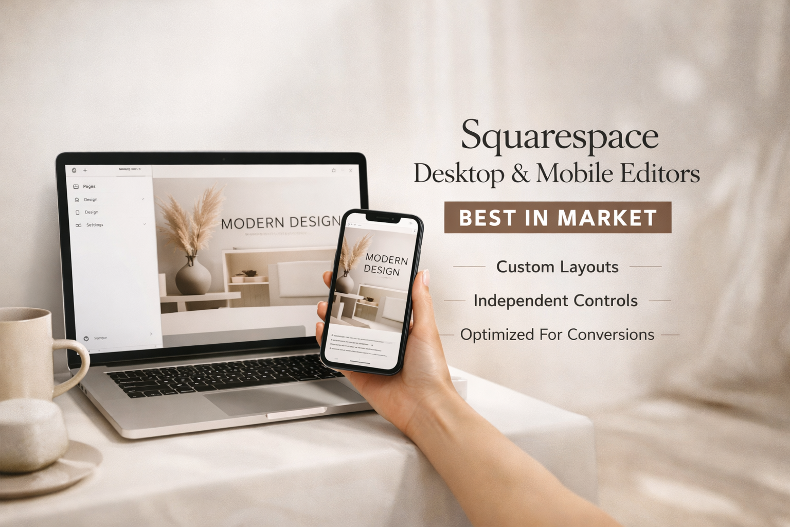
What the Squarespace Dual Editor Actually Does
In Squarespace, you have two distinct editor views: desktop and mobile. They share the same content — the same text, the same images, the same pages — but they allow you to make independent design decisions for each experience.
What does that mean in practice? It means you can:
Reorder sections differently on mobile than on desktop. On desktop, maybe your testimonials section sits below the fold after a long hero and a features grid. On mobile, where attention is shorter and scrolling behavior is different, you might want testimonials higher up — closer to the top, building trust faster. You can do that. Without touching the desktop layout at all.
Show or hide elements by device. Some content that makes sense on desktop — a wide decorative image, a multi-column text layout, a complex data table — simply doesn't translate to mobile. You can hide those elements on mobile and show simplified alternatives instead. Conversely, you can show mobile-specific elements — a prominent tap-to-call button, a condensed navigation, a sticky CTA bar — that don't appear on desktop. This is not a workaround. It's a deliberate design tool.
Control spacing independently. Padding and margin adjustments on desktop do not automatically carry over to mobile. You can dial in the exact spatial relationships you want on each device independently. This alone solves about forty percent of the "my mobile site looks wrong" problems we see when clients come to us with existing sites.
Adjust typography by device. Font sizes that work beautifully on a large monitor can feel either microscopic or overwhelming on a phone. Squarespace lets you set type sizes independently for desktop and mobile, which means your heading hierarchy can be calibrated for readability on each screen without compromising either experience.
Rethink your image presentation per device. Images behave differently on different screen sizes. A wide landscape photo that anchors a desktop hero section might need to be cropped, replaced, or repositioned entirely on mobile. The dual editor gives you that control.
Why This Is Actually a Big Deal
To appreciate why this matters, it helps to understand what most website builders are doing instead.
The standard approach — across WordPress themes, Wix, Webflow in certain configurations, and most template-based builders — is responsive design with limited override capability. The platform makes automatic decisions about how your layout reflows on smaller screens, and you have varying degrees of ability to intervene. Sometimes the automatic decisions are good. Often they're not. And the tools for fixing them are usually clunky, inconsistently applied, and require either custom CSS or a willingness to fight the platform.
What Squarespace has built is different in philosophy. Instead of "here's one design that we'll automatically adapt," it's "here's your desktop design, and here's your mobile design — you control both." The underlying content is shared, but the presentation layer is independent. That's a fundamentally more honest way to approach the reality that desktop and mobile are not the same experience and shouldn't be treated as if they are.
The result, when used well, is websites where the mobile experience feels as intentional as the desktop experience. Not squeezed. Not reflowed. Designed.
The Mobile Editor Is Not an Afterthought. It's a First-Class Experience.
One of the things we want to be specific about is how good the mobile editor interface itself actually is — not just the capability it gives you, but the experience of using it.
The mobile editor in Squarespace gives you a phone-sized preview directly in the editor interface. You're not toggling to a separate preview mode and then toggling back to make changes. You're editing in context — seeing exactly what your mobile visitor sees as you make adjustments in real time. The drag-and-drop section reordering works cleanly. The show/hide toggles are clearly labeled and easy to find. The spacing controls are the same ones you're already using on desktop, just applied independently.
This matters because the best design tool in the world is useless if it's frustrating to use. A powerful feature buried in a confusing interface is a feature most people will give up on after one session. Squarespace has made the mobile editor approachable enough that a small business owner who is not a professional web designer can actually use it effectively — and that is not a low bar to clear.
What This Means for Your Business Specifically
Let's get concrete about why this translates to real business outcomes and not just aesthetic satisfaction.
Mobile traffic is not a secondary consideration. For most Philadelphia businesses and small businesses generally, mobile devices account for more than half of all website traffic. In some industries — restaurants, retail, local services, hospitality — that number is significantly higher. Your mobile experience is, statistically, the primary experience for most of your visitors. Treating it as an automatic derivative of your desktop design is a mistake with measurable consequences.
Mobile conversion rates are directly affected by mobile design quality. A visitor on a phone who encounters a confusing layout, text that's hard to read, buttons that are hard to tap, or a form that's painful to fill out on a small screen will leave. Not because they're not interested. Because the experience told them not to bother. The Squarespace dual editor removes the excuse for poor mobile UX. The tools are there. The question is whether you're using them.
Google cares about mobile. Google's ranking algorithm is mobile-first. It evaluates your website primarily based on the mobile version of your pages. A site with a strong desktop experience and a poor mobile experience is not a site with a strong SEO foundation — it's a site with a problem. Deliberately designing your mobile experience in Squarespace's mobile editor is both a UX decision and an SEO decision.
First impressions happen faster on mobile. The three-second rule — the window in which a visitor decides whether your site is worth their time — is even more compressed on mobile, where attention is shorter and competing stimuli are greater. A mobile experience that feels designed, fast, and clear earns those three seconds. One that feels like an automatic reflow of a desktop layout does not.
The Squarespace Editor on Desktop Is No Slouch Either
We've been focused on the mobile editor because it's the underappreciated one, but let's not shortchange the desktop editing experience — because it's genuinely excellent in its own right.
The Squarespace desktop editor is one of the most intuitive visual editing interfaces in the website builder market. Section-based layout with drag-and-drop flexibility. Style controls that apply globally or locally depending on what you need. A design panel that gives you system-wide control over fonts, colors, spacing, and button styles without requiring you to touch every element individually. Real-time preview that shows you exactly what you're publishing before you publish it.
For small business owners who want control over their website without hiring a developer for every change, it's a genuinely empowering interface. For web designers and developers building sites for clients, it's fast enough to prototype quickly and flexible enough to execute sophisticated layouts without fighting the platform.
The combination of a desktop editor this good and a mobile editor this capable is, frankly, best in market for the template-builder category. We'll stand behind that claim.
Where Most People Go Wrong With Squarespace
Having said all of that, we see a consistent pattern with clients who come to us after building their own Squarespace sites: they built a desktop site and called it done.
They never opened the mobile editor. Or they opened it once, saw that things looked roughly okay, and assumed "roughly okay" was the standard to aim for. They didn't reorder sections for mobile scroll behavior. They didn't hide desktop-specific decorative elements that were cluttering the mobile experience. They didn't adjust their type sizes for readability on a small screen. They didn't add a tap-to-call button that makes it frictionless for a mobile visitor to contact them.
The result is a Squarespace site that's performing at maybe sixty percent of its potential — on the device that more than half of their visitors are using. That's a significant gap. And it's an entirely fixable one.
This Is Exactly Why You Should Work With a Squarespace Design Agency That Actually Knows What It's Doing
Here's the pitch, and we're going to make it directly.
Building a Squarespace site yourself is genuinely possible. The platform is designed to be approachable, and there are small business owners who do it well. But building a Squarespace site that fully leverages the desktop and mobile editor independently — with deliberate design decisions on both, optimized for performance, conversion, SEO, and accessibility — is a different project entirely.
Ritner Digital builds Squarespace websites for businesses across Philadelphia, New Jersey, and beyond. We don't use the mobile editor as an afterthought. We design for both screens from the start — treating the desktop experience and the mobile experience as two distinct design challenges that share content but require their own thinking.
That means section order that's calibrated for how mobile visitors actually scroll and decide. Type hierarchies that are readable and proportional on every screen size. Show/hide logic that removes desktop clutter from mobile without removing content that matters. Tap targets that are sized appropriately for fingers, not cursors. Forms that are actually pleasant to fill out on a phone. CTAs that are visible without scrolling on mobile because we put them where they need to be.
It also means the full Ritner Digital service stack applied to your Squarespace site — SEO built in from the start, GEO considerations baked into your content architecture, photography that makes your real-image experience shine on every device, branding and graphic design that carries consistently across desktop and mobile, and CRM integration that makes sure the leads your optimized mobile experience generates don't fall through the cracks.
Frequently Asked Questions
Can you really design desktop and mobile separately in Squarespace?
Yes, and it's one of the platform's most powerful features. Squarespace gives you independent control over section order, element visibility, spacing, and typography for desktop and mobile. The underlying content — text, images, pages — is shared, but the presentation decisions for each device are yours to make independently. This is fundamentally different from purely responsive design, where a single layout is automatically reflowed for smaller screens.
Does editing the mobile view in Squarespace affect the desktop view?
Content changes — editing text, swapping images, adding or removing sections entirely — affect both views because the content is shared. But design decisions made in the mobile editor — reordering sections, hiding elements, adjusting spacing and type sizes — apply only to the mobile experience and do not affect your desktop layout. This is the key feature: shared content, independent presentation.
Is Squarespace good for mobile SEO?
Squarespace has a strong technical foundation for mobile SEO — fast load times, clean code, responsive structure, and SSL by default. The mobile editor takes it further by allowing you to deliberately optimize the mobile experience rather than relying entirely on automatic responsive behavior. Since Google uses mobile-first indexing — evaluating your site primarily based on the mobile version — having a thoughtfully designed mobile experience in Squarespace is both a UX and SEO advantage.
Should I hire someone to build my Squarespace site or do it myself?
It depends on what you're trying to accomplish. Squarespace is approachable enough for a motivated small business owner to build a functional site. But a site that fully leverages both the desktop and mobile editors, is optimized for SEO and conversion, integrates with your CRM, and reflects a deliberate brand identity requires a level of expertise and time investment that most business owners don't have. If your website is a meaningful part of how you generate business — and for most businesses it is — the ROI on professional design is significant.
What makes Ritner Digital's approach to Squarespace design different?
We treat desktop and mobile as two distinct design challenges from the start — not one design with a mobile version added at the end. We build Squarespace sites with SEO, GEO, conversion optimization, accessibility, and brand consistency built in from the ground up. And we offer the full service stack — photography, branding, CRM integration, paid ads, email, social media — so your Squarespace site isn't a standalone project but part of a coordinated marketing strategy.
Does Squarespace support accessibility standards?
Squarespace provides a reasonable accessibility foundation — semantic HTML, keyboard navigation support, and alt text fields for images. Building a fully WCAG 2.1 AA compliant site on Squarespace requires deliberate decisions in the design and content process — proper heading hierarchy, sufficient color contrast, descriptive alt text, accessible forms, and careful use of show/hide functionality that doesn't hide content from assistive technologies. We build with these considerations as standard practice, not optional extras.
How do we get started with Ritner Digital on a Squarespace project?
Reach out and tell us about your business and what you're looking to accomplish. We'll have an honest conversation about where you are, what a well-built Squarespace site could do for your business, and what working together would look like. No pressure, no template proposals. Just a real conversation.