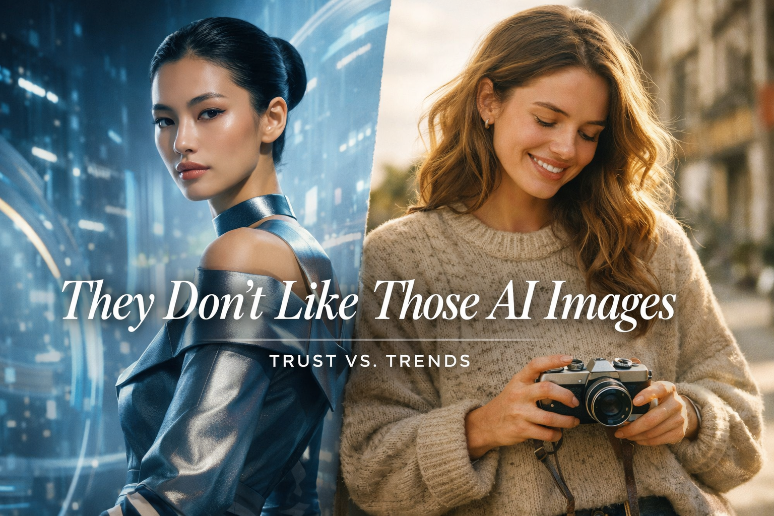
They Don’t Like Those AI Images
You’ve probably heard it from a client recently.
Or maybe you are the client.
“Yeah… we don’t really like those AI images.”
Cue the awkward pause.
Because on one side of the internet, brands are going full throttle on AI visuals—hyper-polished, surreal, impossibly perfect. And on the other side? Companies clinging lovingly to slightly awkward stock photos from 2016 like they’re family heirlooms.
So what gives?
The Great Image Divide
Right now, brands are quietly sorting themselves into two camps:
Camp A: “Let’s Go Full AI”
These brands are embracing AI-generated images like it’s the future (because… it is).
They love:
Clean, stylized visuals
Perfect lighting that never existed
Imagery built exactly for their message
AI images are fast, flexible, and scalable. No licensing headaches. No “same stock photo as your competitor” problem. And when done right, they look fresh, modern, and intentional.
For tech companies, startups, and forward-looking brands, AI visuals signal:
innovation, efficiency, and momentum.
Camp B: “That Feels… Fake”
Then there’s the other side.
These brands see AI images and think:
“Too polished”
“Too uncanny”
“Feels like a crypto ad”
They’d rather stick with:
Real people
Slightly imperfect lighting
Stock images that feel human, even if they’re a little dated
Why? Because for them, authenticity beats aesthetics.
Old-school stock photos (or real photography) signal:
trust, familiarity, and relatability.
And in industries like healthcare, education, nonprofits, or local services? That matters.
The Real Takeaway (Spoiler: It’s Not AI vs. Stock)
This isn’t about which image type is “better.”
It’s about what your audience believes when they see it.
AI images can scream cutting-edge — or artificial
Stock photos can feel authentic — or stuck in the past
The wrong choice doesn’t just look bad.
It sends the wrong message.
And that’s where brands get tripped up.
The Smart Brands Are Doing This Instead
The brands winning right now aren’t blindly choosing sides. They’re asking better questions:
What does our audience trust?
What visual style aligns with our brand voice?
Where does polish help—and where does it hurt?
Sometimes that means AI on landing pages and real photography on About pages.
Sometimes it means skipping AI entirely.
Sometimes it means blending both so seamlessly no one notices.
That’s not playing it safe.
That’s playing it smart.
Final Thought
If your visuals feel “off,” it’s probably not because AI is bad or stock is outdated.
It’s because the imagery doesn’t match the story you’re trying to tell.
And that’s fixable.
Want visuals that actually work for your brand?
At Ritner Digital, we help brands choose design systems, imagery, and creative strategies that feel intentional—not trendy for trend’s sake.
If you’re stuck between “too fake” and “too boring,” let’s fix that.
👉🏼 Talk to Ritner Digital and let’s make your brand look like itself—on purpose.
FAQs
Why do some people hate AI-generated images?
Because some of them deserve it. Early (and lazy) AI visuals can feel uncanny, over-polished, or emotionally flat. When images don’t look like real life—or don’t match a brand’s tone—people instinctively distrust them.
Do AI images hurt brand authenticity?
They can—but only if authenticity is part of your brand promise. If your audience values transparency, human connection, or real-world experience, overly slick AI visuals can feel like a mismatch.
Why do stock photos sometimes feel more “real”?
Because they’re imperfect. Slightly awkward poses, real lighting, and human expressions signal familiarity. Even if the image is staged, it still reads as human—and our brains like that.
Are stock images outdated now?
Not automatically. Bad stock images are outdated. Thoughtfully chosen stock photos can still work—especially when they align with your brand voice and audience expectations.
Which industries should avoid AI images?
There’s no hard rule, but industries built on trust—like healthcare, education, nonprofits, and local services—tend to be more cautious. Their audiences often prioritize relatability over visual innovation.
Which industries benefit most from AI visuals?
Tech, SaaS, startups, and future-forward brands often thrive with AI imagery. For them, modern visuals reinforce innovation and speed—two things their audience already expects.
Is it better to pick one style and stick to it?
Consistency matters—but flexibility matters more. Many strong brands mix AI visuals, stock photography, and custom design depending on context. The key is making it feel intentional, not random.
How do I know what my audience prefers?
If you’re guessing, that’s the problem. Audience research, brand positioning, and performance data should guide the decision—not personal taste or whatever’s trending on LinkedIn this week.
Can Ritner Digital help us figure this out?
That’s kind of our thing. Ritner Digital helps brands choose visuals that support their message, their audience, and their goals—without chasing shiny objects or clinging to the past.
Related Reads
〰️
Related Reads 〰️

Are Trifold Brochures Worth the Cost in 2026?
Trifold brochures used to be a marketing staple — but in 2026, are they still worth the investment? With printing costs rising and digital dominating, we break down the real pros, cons, and when testing a more traditional marketing approach might actually give you an edge.
How to Export a Canva Image With a Transparent Background
That awkward white box ruining your Canva design isn’t a glitch—it’s a setting. Here’s how to export Canva images with a transparent background the right way, plus the mistakes almost everyone makes.
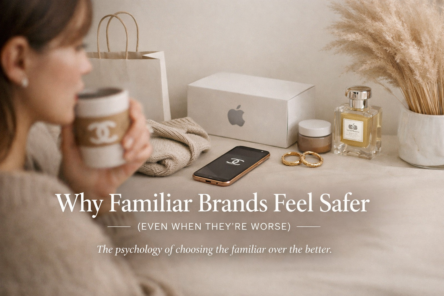
Why Familiar Brands Feel Safer (Even When They’re Worse)
We’ve all stuck with a brand that disappointed us—slow shipping, bad UX, or frustrating support—simply because it felt familiar. This post breaks down the psychology behind why consumers trust known brands over better alternatives, how familiarity lowers perceived risk, and what challenger brands can do to win anyway.