Designing for the Worst Day of Someone's Life
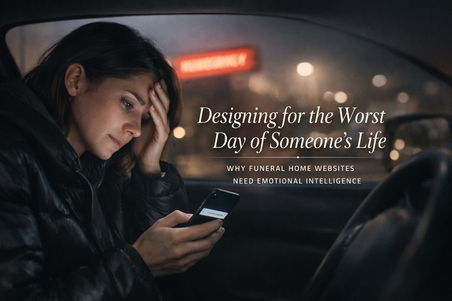
At 2:47 AM, a woman in her mid-forties is sitting in a hospital parking lot. Her father died twenty minutes ago. She's already called her brother. She's already cried. Now she's doing what people do in 2026 when they don't know what to do next — she's picking up her phone and searching.
"Funeral homes near me."
What she finds in the next three minutes will shape one of the most significant financial and emotional decisions she'll make this year. She'll scan a few websites. She'll form impressions in seconds. She'll make a choice — or she'll narrow her options to two or three — based almost entirely on how those websites make her feel during a moment when she's exhausted, overwhelmed, grief-stricken, and trying to hold herself together long enough to figure out what happens next.
This is the user your website is designed for. Not the person browsing casually on a Tuesday afternoon. Not the industry colleague checking out your facility. Not the pre-planning prospect who has all the time in the world. The person who matters most to your business — the person who needs you right now — is someone in crisis. And most funeral home websites are designed as if that person doesn't exist.
This piece is about what it means to design for that person. Not the technical specifications — the responsive breakpoints, the CMS requirements, the SEO strategy. Those matter, but they're not what we're talking about here. We're talking about the human experience of using a funeral home website at the worst moment of someone's life, and what it takes to make that experience feel like help instead of another obstacle.
The State of Mind You're Designing For
Grief does specific things to cognition. This isn't poetic license — it's neuroscience. Understanding what happens to a person's brain when they're in acute grief is essential to designing an experience that serves them rather than frustrating them.
Acute grief narrows attention. The brain's capacity to process information shrinks significantly under emotional distress. A person who can normally evaluate a complex menu of options, scan a page of dense text, and make comparative judgments can't do those things as effectively when they're grieving. They're not stupid. They're overwhelmed. Their cognitive bandwidth is consumed by the emotional weight of what just happened, and there's less of it available for everything else.
Decision-making capacity is reduced. Grief impairs executive function — the mental processes responsible for planning, evaluating options, and making complex decisions. A person in acute grief can make decisions, but the number of decisions they can handle, and the complexity of each one, is diminished. Every unnecessary choice the website presents is a tax on a system that's already running on fumes.
Short-term memory is affected. Grieving people frequently report difficulty retaining new information. They read something, move to the next page, and can't remember what they just read. They start a task, get distracted by a thought or an emotion, and lose their place. A website that requires someone to hold multiple pieces of information in mind while navigating between pages is asking something that a grieving person may not be able to give.
Emotional sensitivity is heightened. Everything lands harder. A stock photo that would be mildly annoying on a normal day can feel offensive during grief — the too-perfect family, the obviously staged embrace, the sunset that someone chose because it tested well. Language that's slightly off — too clinical, too salesy, too casual — registers as a violation of the seriousness of the moment. The person is emotionally raw, and the website is touching an open wound whether it knows it or not.
Time perception is distorted. Minutes feel like hours. The urgency is real but the sense of what's urgent versus what can wait is scrambled. A person in acute grief may feel that everything needs to happen right now, or they may feel paralyzed and unable to start anything. The website's pacing — how it sequences information, how it creates a sense of "here's what to do first" — either helps regulate that distortion or amplifies it.
This is who's using your website. Not a calm, rational consumer doing research. A human being in one of the most disorienting emotional states a person can experience. Every design decision on your site either helps them or makes things harder.
What Calm Looks Like on a Screen
The single most important thing a funeral home website can do is feel calm. Not somber. Not cold. Not clinical. Calm — the way a good funeral director's voice is calm when they sit down with a family. Steady. Unhurried. Warm but not sentimental. Clear without being blunt.
Translating that quality into a digital experience is a design challenge, but it's not a mystery. Calmness on a screen comes from a few specific design choices.
Generous white space. When the page has room to breathe, the person using it can breathe too. Cluttered pages — packed with links, banners, sidebars, calls to action, widgets, and competing visual elements — create a sense of chaos that mirrors and amplifies the chaos the person is already feeling. White space isn't wasted space. It's the visual equivalent of a pause in conversation. It gives the eye somewhere to rest and the mind a moment to process before moving on.
A restrained color palette. This doesn't mean the site has to be gray and white. It means the palette should be limited, harmonious, and used consistently. One or two primary colors, a neutral background, typographic contrast that guides the eye without shouting. Avoid high-saturation colors that vibrate on screen. Avoid the temptation to add accent colors for visual interest — interest isn't what the person needs. Clarity is.
Typography that prioritizes readability. Large body text — 18 pixels minimum, ideally larger. Generous line height. Comfortable line length. A typeface that's clean, legible, and unobtrusive. Not decorative script. Not ultra-thin modern sans-serif that looks elegant but strains the eyes. A typeface that you don't notice — because the moment someone notices the typeface, they've stopped reading the words.
Slow, intentional pacing. The website shouldn't try to say everything at once. Each page should have one clear purpose and enough content to fulfill that purpose without overwhelming the reader. If the page is about what to do immediately after a death, it shouldn't also be about pre-planning and grief resources and the history of the funeral home. One thing at a time. Let the person absorb it. Then offer the next thing.
Quiet imagery. If you use photographs, they should be real, they should be relevant, and they should be quiet. Not dramatic. Not emotionally manipulative. Not stock photos of actors pretending to grieve. Photographs of your actual facility — the chapel, the grounds, the entrance. Photographs that give the person a sense of what they'll encounter when they arrive. Or no photographs at all on certain pages, because sometimes the most respectful design choice is to let the words do the work without visual noise.
No auto-playing anything. No background music. No video that starts without being asked. No animations that move without being triggered. Auto-playing media isn't just an accessibility violation — it's an assault on a person who's in a fragile emotional state and didn't consent to having sound or motion forced on them. This should go without saying, but funeral home websites are one of the last places on the internet where auto-playing music still persists. It needs to stop.
Information Architecture as an Act of Care
How information is organized on a funeral home website isn't a design decision in the abstract. It's a decision about whether a person in crisis can find what they need.
Most funeral home websites organize information the way the funeral home thinks about itself: services, about us, pre-planning, obituaries, resources, contact. This structure makes sense internally. It doesn't make sense to the person sitting in the hospital parking lot at 2:47 AM.
That person doesn't know the industry's terminology. They don't know the difference between "at-need" and "pre-need." They may not know the difference between a funeral and a memorial service. They may not know whether they want burial or cremation. They definitely don't want to browse through pages of content trying to figure out where their situation fits in the funeral home's organizational scheme.
What they need is a path. One clear entry point that says: someone has just died, and you don't know what to do. Start here.
That page — the crisis landing page, for lack of a better term — is the most important page on a funeral home's website. It should be reachable from the homepage in one click. It should be prominent — not buried under a dropdown, not competing with twelve other navigation items, not disguised under industry jargon. It should be the first thing the website offers, because it addresses the most urgent need of the most important visitor.
What belongs on that page is straightforward: the immediate steps a family needs to take, in order, with clear guidance on what happens next. If the death occurred at a hospital, here's what happens. If it occurred at home, here's what to do. You don't need to make any decisions right now. Here's how to reach us when you're ready. If you want to call right now, here's the number — and someone will answer.
That's it. No pitch. No packages. No pricing. Not yet. The first interaction should be purely about helping the person orient themselves. Everything else comes after they've caught their breath.
From there, the information architecture should unfold in a natural sequence — mirroring the order in which a family actually moves through the process, not the order in which the funeral home thinks about its services. After the immediate crisis comes the arrangement conversation. After the arrangement conversation come the choices — type of service, merchandise, personalization. After the choices comes the logistical detail — when, where, how.
Each step should feel like the next step, not like a random page in a catalog. And at each step, the design should reinforce the same message: you're in the right place, we'll help you through this, and you don't need to figure it all out right now.
The Language of Crisis Care
The words on a funeral home website do as much work as the design — sometimes more. And the gap between how the funeral industry typically writes about itself and how families experience the need for funeral services is enormous.
Industry language creates distance. "Pre-need arrangements." "At-need services." "Memorialization options." "Merchandise selection." "Decedent." These terms are precise within the industry. They're alienating to a family that just lost someone. They signal that the website was written for funeral professionals, not for the people funeral professionals serve.
Overly sentimental language creates a different kind of distance. "Your loved one's final journey." "Celebrating a life beautifully lived." "Honoring precious memories." This language isn't wrong, but when it's everywhere — when it's the default voice of the entire website — it starts to feel performative. It reads like the funeral home is telling the family how to feel about their loss rather than helping them navigate it. Grief is not one thing. Not every death is a "celebration of life." Not every family wants to hear about "precious memories" when they're still in shock.
The right tone lives in the space between clinical and sentimental. It's direct without being cold. Warm without being saccharine. It treats the reader as an adult who is going through something hard and needs clear, honest information delivered with compassion.
Some practical guidelines:
Use the words families use. "Someone has died" instead of "at-need." "Planning ahead" instead of "pre-need." "Choosing cremation" instead of "cremation memorialization options." If a real person wouldn't say it in conversation, it doesn't belong on the website.
Be specific and concrete. "You don't need to make any decisions tonight. When you're ready, call us at [number] and we'll guide you through the next steps" is more helpful than "We're here to help you through this difficult time." The first sentence tells the person exactly what to do. The second says nothing.
Acknowledge the difficulty without dramatizing it. "This is a lot to take in. Here's what you need to know right now, and the rest can wait" validates the person's experience without performing empathy. It says: we understand, and we're going to make this manageable.
Reduce the word count. Every page should have less text than you think it needs. A person in crisis reads in fragments. They scan. They look for the one piece of information they need right now. Dense paragraphs get skipped. Short, clear statements get read. The design principle is the same as the emotional one: don't overwhelm.
Write calls to action with care. "Get started with your arrangements today" is a fine call to action for a pre-planning page. It's a terrible one for a page aimed at someone whose parent just died. "Call us when you're ready — we'll answer any time" respects the person's emotional state and their autonomy. The phrasing might seem like a small thing. It isn't. In a state of grief, every word registers.
Reducing Cognitive Load as a Design Ethic
Cognitive load is a concept from information design that describes the amount of mental effort required to use a system. In the context of a funeral home website, reducing cognitive load isn't a design preference — it's an ethical obligation. The people using your site have the least cognitive capacity available at the moment they need it most.
Every element on the page that isn't helping the person accomplish their immediate task is adding cognitive load. Every decision you ask them to make that isn't necessary right now is adding cognitive load. Every visual distraction, every competing link, every piece of information that belongs on a different page but got included here because someone thought it might be useful — cognitive load.
Reducing it means making hard editorial choices.
Limit navigation items. A funeral home website doesn't need twelve items in the primary navigation. Five or six, carefully chosen, covering the core pathways a visitor needs. The rest can live in a footer or a secondary menu. When navigation is simple, the person doesn't have to decide where to go — the options are few enough that the right one is obvious.
One call to action per page. If the page is about what to do when someone dies, the call to action is "call us." Not "call us" and "schedule an arrangement" and "view our services" and "download our planning guide." One action. The one that matters most for the person reading that specific page at that specific moment.
Progressive disclosure. Don't show everything at once. Present the essential information on the surface and let the person choose to go deeper when they're ready. Accordion sections, "learn more" links, and step-by-step wizards are tools for progressive disclosure — they keep the page calm on the surface while making detail available on demand.
Don't ask for information you don't need. If there's a contact form, ask for a name, a phone number, and an optional message. Don't ask for an address, an email, a preferred service type, a budget range, and a time preference. Every field on a form is a decision the person has to make. In a state of grief, fewer decisions is always better.
Maintain visual consistency. When every page follows the same layout patterns, the same typography, the same color usage, and the same spatial relationships, the person develops a mental model of how the site works. They don't have to re-learn the interface on every page. Consistency reduces the cognitive effort of navigation, which leaves more bandwidth for processing the actual content.
The Mobile Experience as a Moral Question
More than half the people who visit a funeral home website will do so on a phone. Many of them will be doing it in a hospital room, a nursing home, a car, or a living room — somewhere that isn't a desk, at a moment that isn't convenient. The mobile experience of a funeral home website isn't a technical consideration. It's a question of whether you're there for people when they actually need you.
A funeral home website that doesn't work on a phone has abandoned the person in the hospital parking lot. It doesn't matter how beautiful the desktop experience is. If the text is too small to read on a phone, if the navigation requires precision tapping on a tiny hamburger icon, if the phone number isn't clickable, if the page takes ten seconds to load over a cellular connection — the person leaves. And they don't come back.
Mobile design for a funeral home should prioritize three things above all else.
The phone number should be tappable from every page. This seems basic. On many funeral home websites, it isn't. The person in crisis should be able to call the funeral home in one tap from anywhere on the site. The phone number should be in the header, visible without scrolling, styled as a button or a link, and functional. No person in acute grief should have to memorize a phone number from the screen and manually dial it.
Touch targets should be large and well-spaced. Fingers aren't precise, especially when hands are shaking. Buttons, links, and navigation elements need to be large enough to tap without accidentally hitting something else. The WCAG standard is 44x44 pixels minimum. For a funeral home website, bigger is better.
Content should be scannable without scrolling through walls of text. On a phone, a paragraph that looks reasonable on desktop becomes a wall. Break content into shorter sections. Use headings that tell the person what each section contains so they can jump to what they need. Make the most important information visible immediately, without requiring the person to scroll past a hero image, a mission statement, and a welcome message to find it.
Accessibility as Care, Not Compliance
We've written extensively in this series about web accessibility from a compliance perspective — WCAG standards, ADA obligations, DOJ deadlines. All of that applies to funeral home websites. But in this context, accessibility isn't primarily about compliance. It's about care.
Funeral homes serve elderly people. They serve people with disabilities. They serve people who are temporarily impaired by grief, lack of sleep, medication, and emotional shock. The accessibility principles that serve people with permanent disabilities — clear visual hierarchy, keyboard navigability, screen reader compatibility, sufficient color contrast, readable text size — also serve people in crisis. The design principles overlap almost completely.
A website with sufficient color contrast is easier to read when your eyes are swollen from crying. A website with clear heading structure is easier to navigate when your brain is foggy from grief and lack of sleep. A website with a simple, logical layout is easier to use when your cognitive capacity is diminished by emotional distress. A website that works with a keyboard is usable by someone whose hands are shaking too much for precise mouse movements.
Designing for accessibility and designing for crisis are, in practice, the same discipline. The person who benefits from an accessible website and the person who benefits from a crisis-sensitive website are often the same person — and even when they're not, the design decisions that serve one serve the other.
This reframe matters because it connects the work to something funeral directors already understand instinctively: the impulse to take care of people. A funeral director doesn't provide accessible facilities because the ADA requires it. They provide them because their families need them. The website should reflect the same instinct. Accessibility isn't a regulation to comply with. It's an extension of the care that defines what funeral service is.
What the Experience Should Feel Like
If the design is right — the pacing, the language, the visual calm, the information architecture, the mobile experience, the accessibility — the person using the website should feel something specific. Not happy. Not impressed. Not wowed by the design. They should feel held.
That's the word funeral directors use when they describe what they do at their best. They hold the family. They create a space where the family can fall apart and be caught. They handle the logistics so the family can handle the grief. They provide structure when everything feels structureless.
A good funeral home website does the same thing, through a different medium. It says: we know this is hard. We know you're overwhelmed. Here's what to do next. We're ready when you are. You don't have to figure this out alone.
It doesn't try to sell. It doesn't try to impress. It doesn't try to win a design award. It tries to help. And in the gap between what most funeral home websites are and what they could be — in the gap between an obstacle and an act of care — there's an enormous opportunity for funeral homes that are willing to take their digital presence as seriously as they take every other dimension of the service they provide.
The families you serve deserve a website that treats them the way you treat them when they walk through your door. Right now, for most funeral homes, the website is the weakest link in an otherwise strong chain of care. It doesn't have to be.
Frequently Asked Questions
We're Funeral Directors, Not Designers. How Do We Evaluate Whether Our Website Is Serving Families Well?
The most direct way is to look at your site through the eyes of the person in the hospital parking lot. Open it on your phone. Ask yourself: if I didn't know anything about this funeral home and I just lost someone, would this site help me? Can I figure out what to do in the first thirty seconds? Can I find the phone number in one tap? Does the site feel calm, or does it feel cluttered? Is the language clear, or is it full of industry terms? Does it tell me what to do next, or does it just tell me about the funeral home? You don't need design expertise to answer these questions. You need the same instinct you use when a family walks through your door — the ability to read the room and respond to what they need.
Does Emotional Design Mean the Website Can't Also Be Informative?
Not at all — in fact, the most emotionally intelligent design is also the most informative. The distinction is in sequencing and prioritization. A website designed for someone in crisis leads with the most immediately useful information and progressively reveals more detail as the person is ready for it. A website designed without that awareness dumps everything on every page and leaves the visitor to sort through it. Emotional design isn't about withholding information. It's about presenting the right information at the right moment, in a way that the person can actually absorb given their emotional state.
Should Our Website Address Pricing, or Does That Feel Too Transactional for a Crisis Moment?
Pricing should absolutely be on your website — but placement and framing matter. The crisis landing page isn't the place for a price list. But a clearly accessible pricing page, linked from the main navigation and written in straightforward language, serves families well. Anxiety about cost is one of the most common sources of stress for families making funeral arrangements, and transparent pricing on the website reduces that anxiety before the arrangement conversation begins. The framing should be informational, not promotional. "Here's what our services include and what they cost" communicates respect. Burying pricing or forcing families to call for numbers communicates the opposite — even when that's not the intent.
Auto-Playing Music Is Part of Our Brand. Is It Really That Big a Deal?
It's a significant issue, and the recommendation is unequivocal: remove it. Auto-playing audio is a WCAG accessibility violation. It disrupts screen readers. It startles users who aren't expecting it. It forces someone who may be in a quiet hospital room or sitting in a car to scramble for the mute button or close the tab entirely. It's one of the most frequently cited complaints about funeral home websites in consumer research. And functionally, it takes a person who came to your site for help and immediately puts them on the defensive. If music matters to your brand, offer it as an option the visitor can choose to play — never as something forced on them.
How Long Does It Take to Redesign a Funeral Home Website With These Principles?
A thoughtful redesign — one that includes user research, content strategy, emotional design, accessibility compliance, and proper testing — typically takes three to six months from kickoff to launch. The timeline depends on the complexity of the site, the volume of content, and how quickly decisions are made on the funeral home's side. Rushing the process to get it done in six weeks usually produces a site that looks different but doesn't function differently — the same problems in a new skin. The care that goes into serving families well in person should go into serving them well online, and that takes time. The investment is worth it.
Related Reads
〰️
Related Reads 〰️

Why Most Contractor Websites Don't Convert (And What to Do Instead)
You're good at what you do. Your customers say so. But your website sits there generating almost nothing — and it's not because contractor websites can't convert. It's because most contractor websites are built like brochures instead of sales tools. Here's what's actually wrong, what homeowners are looking for when they land on your site, and how to build a website that works as hard as you do.

Your Homepage Has ~5 Seconds to Work. Here’s How to Win Them.
Your website homepage has one job: convince visitors they’re in the right place. In this guide, we break down what should be on your homepage, best practices that actually convert, and a simple outline you can steal.
Why Most Dental Practice Websites Lose Patients Before the First Appointment
A potential patient finds your practice online, lands on your website, and leaves within 10 seconds. Not because the dentistry is bad — because the website is. Here's what's costing dental practices patients they'll never know they lost, and how to fix it.