Your Homepage Has ~5 Seconds to Work. Here’s How to Win Them.

Your website homepage has one job:
convince someone they’re in the right place.
That’s it. Not tell your life story. Not flex every service you’ve ever offered. Not win a design award (although… nice bonus).
If a visitor can’t quickly answer “What do you do, who is it for, and why should I care?” — they’re gone.
So let’s break down what should be on your homepage, best practices that actually work, and a simple outline you can follow (without overthinking it).
First, a hard truth
Most homepages fail because they’re written for the business owner… not the visitor.
Too vague:
“We provide innovative solutions for modern brands.”
Too crowded:
12 sections, 3 pop-ups, 47 CTAs.
Too quiet:
Beautiful design, zero clarity.
Your homepage should feel less like a brochure and more like a confident introduction.
What every homepage needs (no exceptions)
1. A clear value proposition (above the fold)
This is the most important real estate on your site.
In one sentence, answer:
What do you do?
Who is it for?
What outcome do they get?
Good example:
“We help service-based businesses turn more website visitors into leads.”
Not-so-good example:
“Elevating digital experiences through strategy and design.”
If someone lands on your site half-asleep with one eye open, they should still get it.
2. A strong primary CTA
Don’t make people guess what to do next.
Pick one main action:
Book a call
Get a quote
View services
Download something useful
Then make it obvious, visible, and repeated naturally throughout the page.
Pro tip: “Learn More” is the beige of CTAs. Be specific.
3. Social proof (aka: “Can I trust you?”)
People want receipts.
This can be:
Client logos
Short testimonials
Case study stats
Certifications or partnerships
You don’t need a wall of praise — just enough to say, “Others trusted us. It worked.”
4. What you actually do (without the fluff)
List your core services in plain English.
Not:
“Holistic brand ecosystems”
Yes:
“Web design, SEO, and conversion-focused strategy”
Keep it skimmable. If someone has to decode it, they won’t.
5. Why you’re different
This is where you earn attention.
Answer:
Why choose you instead of the next option on Google?
What’s your approach?
What do you do better, faster, or smarter?
This isn’t about being louder — it’s about being clearer.
6. A human touch
People buy from people.
Show:
Your face
Your team
Your philosophy
Your personality
Even one short “About” section can build connection and credibility fast.
Best practices (that actually move the needle)
Clarity beats cleverness
You can be witty after you’re clear.Design supports the message
Pretty doesn’t matter if it doesn’t convert.Mobile-first always
Most visitors are on their phone. Act accordingly.One goal per section
Each block should answer one question or prompt one action.Less scrolling, more intention
Long pages are fine. Long and confusing pages are not.
A simple homepage outline you can steal
Here’s a clean, proven structure:
Hero Section
Clear headline, supporting subhead, primary CTASocial Proof
Logos, testimonials, quick statsWhat You Do
Services or solutions overviewHow You Help / Your Process
Simple steps, benefits-focusedWhy You
Differentiators, approach, valuesAbout / Human Element
Faces, story, credibilityFinal CTA
One last clear next step
Final takeaway
Your homepage doesn’t need to say everything.
It needs to say the right things, in the right order, to the right person.
If your homepage feels outdated, unclear, or just isn’t converting the way it should — it’s probably not a traffic problem. It’s a messaging one.
👉🏼 Ritner Digital helps businesses reimagine their homepages with clarity, strategy, and conversion in mind. If you’re ready to turn your homepage into a real growth tool, reach out — we’d love to help.
FAQs
Why is my homepage so important anyway?
Because it’s your digital first impression — and you don’t get a redo.
Most visitors decide whether to stay or leave in 5–10 seconds. A strong homepage builds trust, explains what you do, and nudges people to take action. A weak one sends them back to Google.
What should be on my homepage?
At a minimum:
A clear value proposition
One primary call-to-action
Social proof (testimonials, logos, results)
A simple overview of your services
A human element (yes, real people)
If your homepage can’t answer “What do you do and why should I care?” quickly — it needs a refresh.
How long should a homepage be?
Long enough to do its job — no longer.
Some audiences need a quick scroll. Others want more detail before converting. The goal isn’t fewer sections; it’s intentional sections. Every part of your homepage should earn its spot.
Should my homepage focus on SEO or conversions?
Both. This is not a “pick a side” situation.
A good homepage balances:
Search-friendly structure and keywords
Clear messaging and conversion paths
If you rank but don’t convert, traffic is wasted. If you convert but no one finds you… same problem.
How often should I update my homepage?
If it’s been more than 12–18 months, it’s probably time.
You should also update when:
Your services change
Your audience evolves
Your messaging feels vague or outdated
Your traffic is solid but leads aren’t
Your business grows. Your homepage should too.
What’s the biggest homepage mistake you see?
Being vague in the name of sounding “professional.”
Visitors don’t want buzzwords — they want clarity. The brands that win are the ones that say exactly what they do, who they help, and what happens next.
Do I really need testimonials on my homepage?
Short answer: yes.
Longer answer: still yes.
Social proof reduces friction and builds trust fast. Even one or two strong testimonials can make the difference between someone clicking away or booking a call.
Can I keep my current design and just update the copy?
Sometimes — and that’s actually common.
If the structure works but the messaging doesn’t, a strategic copy refresh can go a long way. If both are fighting you… then it’s redesign time.
How do I know if my homepage isn’t working?
Look for these red flags:
High traffic, low conversions
People asking basic questions your site should answer
You struggle to explain what you do in one sentence
You secretly hate sending people to your website
(That last one’s a big tell.)
Can Ritner Digital help with just my homepage?
Absolutely.
Whether you need:
A full homepage reimagining
Messaging + layout strategy
Conversion-focused copy
Or a full site refresh
Ritner Digital helps turn homepages into clear, confident, conversion-ready assets.
What’s the next step if I want help?
Easy: reach out.
We’ll look at what’s working, what’s not, and how to make your homepage do what it’s supposed to do — support your growth, not slow it down.
Related Reads
〰️
Related Reads 〰️
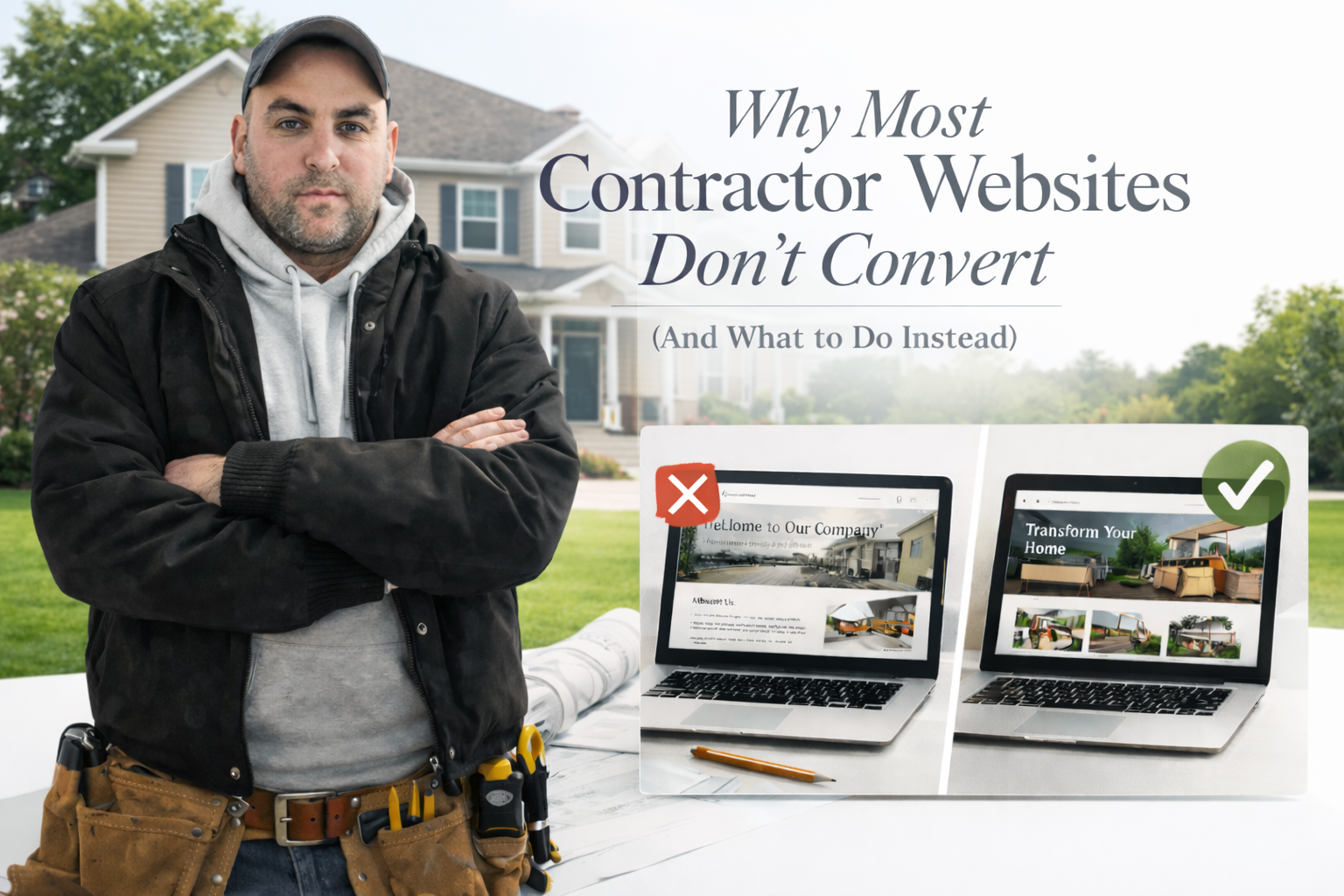
Why Most Contractor Websites Don't Convert (And What to Do Instead)
You're good at what you do. Your customers say so. But your website sits there generating almost nothing — and it's not because contractor websites can't convert. It's because most contractor websites are built like brochures instead of sales tools. Here's what's actually wrong, what homeowners are looking for when they land on your site, and how to build a website that works as hard as you do.

Why Most Dental Practice Websites Lose Patients Before the First Appointment
A potential patient finds your practice online, lands on your website, and leaves within 10 seconds. Not because the dentistry is bad — because the website is. Here's what's costing dental practices patients they'll never know they lost, and how to fix it.

Case Study: When Traffic Drops… But Conversions Explode (A YoY Reality Check)
What happens when website traffic drops but conversions more than triple? This B2B case study breaks down how smarter funnel strategy, trust-building leadership content, and optimized conversion paths turned fewer visitors into more qualified leads.