Evolve the Brand.
Keep the Equity.
Strategic rebranding that transforms an outdated identity into one built for where your business is going — without losing what people already trust. Backed by research, executed across every touchpoint, and rolled out by the same team building your website, social, and ads.
Logo · Visual Identity · Brand Voice · Messaging · Guidelines · Rollout
A rebrand isn't a new logo. It's a strategic repositioning.
A New Logo Without Strategy Is Just a Costume Change
Most rebrands start with aesthetics and end with confusion. Customers don't recognize you, employees can't articulate the new positioning, and the old brand bleeds through everywhere for months. Strategy has to lead.
Your Brand Isn't What You Say It Is. It's What They Feel.
A rebrand touches everything — your website, your pitch deck, your social profiles, your email signatures, your packaging, your signage. If the transformation isn't holistic and coordinated, you end up with a fractured identity that confuses more than it clarifies.
The best rebrands are invisible. Your audience should feel that something evolved — that you've leveled up — without losing the thread of trust they already had. That requires deep understanding of what to keep, what to kill, and what to build new.
Rebranding is a business decision, not a design project. It should be driven by a shift in market position, audience, product offering, or competitive landscape — not a founder's aesthetic preference. When strategy leads, the design becomes inevitable rather than arbitrary.
We don't just redesign brands. We reposition them for growth.
Rebrands That Made History
Some rebrands unlock billions in value. Others destroy it overnight. Click any case study to see what happened, why it worked (or didn't), and the lesson every brand should take from it.
Airbnb
Airbnb replaced its script logo with the "Bélo" symbol — a mark representing belonging and community. The entire visual system, product experience, and brand story were overhauled to reflect their evolution from a budget homestay platform to a global hospitality brand.
The rebrand was rooted in a genuine strategic shift. Airbnb had outgrown its identity and needed visual language that could scale globally across cultures. The Bélo became a symbol hosts proudly displayed — turning customers into brand ambassadors. The design reflected an evolved value proposition, not just a new aesthetic.
Cracker Barrel

As part of a $700 million overhaul, Cracker Barrel replaced its beloved "Uncle Herschel" logo with a minimalist text-only wordmark and began modernizing restaurants — removing dark wood and vintage décor for a brighter, simpler look. The goal was to attract younger diners and reverse stagnating sales.
The logo wasn't just an image — it was a symbol of the entire Cracker Barrel experience: front porch nostalgia, rocking chairs, country hospitality. Removing Uncle Herschel felt like removing the brand's soul. The rollout had no narrative, no phased transition, and no customer preparation. Social media erupted immediately, stock dropped over 11%, and the company reversed course within nine days.
Dunkin'

Dunkin' Donuts dropped "Donuts" from its name to reflect that beverages — especially coffee — now drove 60% of revenue. They kept the iconic pink and orange colors, the familiar font, and the personality. Store designs, packaging, and messaging were all updated to signal a beverage-forward brand.
The name change reflected how customers already talked about the brand — "America Runs on Dunkin'" had primed people for years. By keeping visual equity (colors, typography) while evolving the name, Dunkin' avoided the shock that kills rebrands. The change matched a real product shift, not just a design exercise.
Tropicana
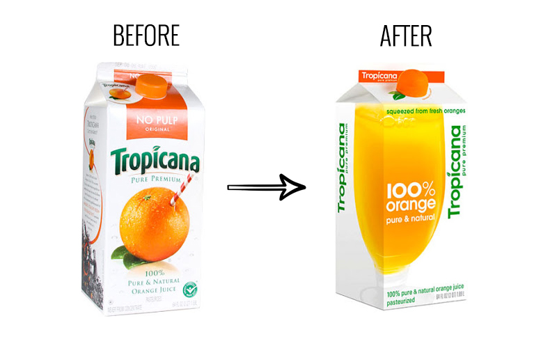
Tropicana replaced its iconic orange-with-a-straw packaging with a minimalist design featuring a glass of juice split across the front and side panels. The logo was rotated vertically, and the distinctive "No Pulp" label was removed. The $35M campaign was designed by agency Arnell.
Customers literally couldn't find the product on shelves. The orange with a straw wasn't just decoration — it communicated freshness and premium quality. The new design looked generic and indistinguishable from store-brand juice. Tropicana broke the cardinal rule: they changed everything at once, destroying every visual anchor their customers relied on.
Burberry
Burberry executed a multi-phase transformation. First, in the 2000s, they shed their association with football hooligans through celebrity partnerships and strategic repositioning. Then in 2023, they restored their classic serif logotype and revived the equestrian knight emblem — returning to heritage after a brief minimalist era.
Burberry understood that rebranding is iterative, not a single event. Each phase addressed a specific strategic problem. Their 2023 move was particularly smart — leaning into British heritage with cultural touchstones rather than chasing minimalist trends. They proved that returning to your roots can be more powerful than chasing what's current.
Gap
Gap replaced its iconic navy-blue-box logo — in use for 20 years — with a plain Helvetica wordmark and a small gradient blue square. The change appeared on the website and social channels without any narrative, product shift, or strategic explanation.
There was no "why." No product evolution, no strategic pivot, no new positioning — just a new logo dropped without context. Within 24 hours, the backlash was enormous: thousands of negative comments, parody Twitter accounts, and viral "make your own Gap logo" sites. The new mark felt generic and corporate, destroying the approachable familiarity of the original.
Mastercard
Mastercard phased its rebrand over three years. First, they simplified the overlapping red and yellow circles and modernized the typography (2016). Then, they dropped the company name entirely from the logo (2019) — confident that the circles alone carried enough recognition worldwide.
The phased approach was brilliant — each change was small enough to stay under the "just noticeable difference" threshold. By the time the name was removed, consumers had already adapted to the simplified design. The logo was also optimized for digital contexts where small icons needed to be instantly recognizable. Pentagram led the work with a clear strategic rationale tied to digital-first commerce.
Twitter → X
Elon Musk replaced Twitter's iconic blue bird — one of the most recognized logos on the internet — with a plain "X" mark. The name "Twitter" was abandoned, along with the entire vocabulary ecosystem: tweets, retweets, the bird. The stated goal was to transform the platform into an "everything app."
Twitter's brand was deeply embedded in culture — "tweeting" had entered the dictionary. The blue bird was a universal symbol. Replacing all of that with a generic letter destroyed an extraordinary amount of built-up cultural equity. The rebrand wasn't tied to a realized product transformation — the "everything app" vision remained unrealized. Years later, many people still call it Twitter.
Six Signals It's Time to Rebrand
A rebrand is a significant investment. It should be driven by business need — not boredom. Here are the signals that tell you it's time.
You've Outgrown Your Brand
Your business has evolved — new services, new markets, a bigger vision — but your brand still looks and sounds like the startup you were five years ago. The gap between who you are and how you present is costing you deals.
You Can't Charge What You're Worth
Your work is excellent but your brand doesn't communicate premium positioning. Prospects compare you to cheaper competitors because your visual identity and messaging don't justify the price difference.
Your Audience Has Shifted
You're targeting a different customer than when you started — different industry, different demographic, different decision-maker. Your brand was built for an audience you've moved past.
Merger, Acquisition, or Pivot
Structural business changes demand a unified identity. Two brands merging, a major product pivot, or a spin-off — these moments require intentional identity work, not just logo mashups.
Your Brand Is Inconsistent
Different teams use different logos, colors, and messaging. Your website says one thing, your sales deck says another, and your social feed looks like it belongs to a different company entirely.
Competitors Have Caught Up
Your industry has matured and competitors now look as polished as you do — or more so. Differentiation through brand has become table stakes, and yours no longer stands out in the category.
Every Rebrand Engagement Ships With
These aren't à la carte add-ons. Every Ritner Digital rebrand is a full-service engagement — from research through rollout — because a rebrand only works when nothing gets missed.
Brand Audit & Research
Deep-dive into your current brand perception, competitive landscape, audience sentiment, and market positioning. We identify what's working, what's holding you back, and where the opportunity is.
Brand Strategy & Positioning
A documented strategic foundation: mission, vision, values, positioning statement, value propositions, and messaging pillars. This is the "why" behind every design decision that follows.
Logo & Visual Identity
A complete logo system — primary mark, wordmark, icon, and responsive variations — plus a full visual identity: typography, color palette, photography style, graphic elements, and iconography.
Learn about logo design →Brand Voice & Messaging
Tone of voice guidelines, messaging frameworks, taglines, and elevator pitches that sound like your brand across every channel — from sales emails to social captions to investor decks.
Brand Guidelines
A comprehensive, usable brand book that ensures consistency — logo usage rules, color specs, typography scales, do's and don'ts, and real application examples. Built so anyone can execute on-brand.
Learn about brand guidelines →Collateral & Templates
Business cards, letterheads, presentation templates, social media templates, email signatures, and any branded collateral your team needs to hit the ground running on launch day.
Website Redesign
Your website is where the rebrand comes to life. We redesign and rebuild your site to reflect the new identity — same team, same timeline, zero handoff friction.
Learn about web design →Social & Digital Rollout
Updated profile assets, cover photos, highlight covers, and a coordinated announcement strategy across every social platform — so the rebrand launches everywhere simultaneously.
Learn about social media →Launch Strategy & Support
A detailed rollout plan with timelines, internal communication templates, press materials, and 30 days of post-launch support to ensure the transition is seamless across every touchpoint.
Your Rebrand + Your Marketing = Compound Impact
Because we also build websites, run paid ads, manage social media, and handle SEO, your rebrand isn't a handoff — it's a coordinated transformation.
One Team, One Launch
Most agencies hand off brand files and wish you luck. We redesign your website, update your social presence, and refresh your ad creative — all in one coordinated rollout. Nothing slips through the cracks.
SEO Continuity
Rebrands often tank search rankings because redirects, meta data, and structured data get botched in the transition. Our SEO team is in the room from day one — ensuring your organic traffic survives and grows through the change.
Ad Creative Refreshed Instantly
The same team running your paid campaigns designed your new brand. That means ad creative is refreshed, tested, and live on launch day — not weeks later after an external handoff.
Post-Launch Brand Consistency
The hardest part of a rebrand is maintaining consistency after the excitement fades. Because we manage your ongoing marketing, we're the guardrails — every piece of content, every ad, every page stays on-brand, permanently.
The Numbers Behind Strategic Rebranding
of consumers say consistent brand presentation increases recognition and trust
average revenue increase for companies that invest in strategic rebranding
of brands report identity inconsistency as their biggest barrier to marketing effectiveness
strong brands command 3–5× the pricing premium over commoditized competitors
From Discovery to Launch Day
Every rebrand follows a clear four-phase process. You'll have visibility into every decision, approve every direction, and launch with confidence — not anxiety.
Discovery & Research
Stakeholder interviews, customer perception research, competitive audit, and brand equity analysis. We identify what to preserve, what to evolve, and what to leave behind — grounded in data, not opinion.
Strategy & Positioning
Brand architecture, positioning framework, messaging pillars, and creative direction. You sign off on the strategic foundation before we touch a single pixel — so the design phase moves with clarity and speed.
Design & Build
Logo system, visual identity, brand guidelines, collateral, website redesign, and all digital assets — created in parallel by one team. Multiple rounds of revision ensure you love every detail before launch.
Launch & Protect
Coordinated rollout across web, social, ads, email, and physical touchpoints. Internal training, press assets, and 30 days of post-launch support to ensure the new brand sticks — everywhere, permanently.
Ready to Build the Brand Your Business Deserves?
Tell us where your brand is today and where your business is headed. We'll show you exactly how a strategic rebrand gets you there — with a clear plan, a coordinated rollout, and a team that sees it through.
Common Questions
It depends on scope — a visual refresh is a different investment than a full strategic rebrand with website redesign and rollout. We provide a fixed project price before any work begins, based on your specific needs. Reach out for a custom quote.
A typical full rebrand — from discovery through launch — takes 8–14 weeks. Visual refreshes can be faster (4–6 weeks). The timeline depends on the number of stakeholders, revision rounds, and whether a website redesign is included. We build a detailed timeline during the proposal phase so there are no surprises.
A brand refresh updates visual elements — logo refinement, color palette modernization, typography — while keeping the core positioning intact. A full rebrand includes strategic repositioning: new messaging, new positioning, and often a new name or brand architecture. We'll help you determine which is right during our discovery phase.
It doesn't have to. Rebrands that damage SEO usually fail because redirects, meta data, and URL structures are handled as an afterthought. Our SEO team is involved from the start — ensuring proper redirect mapping, schema markup, and content continuity. Most of our rebrand clients see improved organic performance within 90 days of launch.
Yes — and that's the point. When the same team handles brand strategy and web design, the website becomes the purest expression of the new brand. No interpretation gaps, no handoff friction. The brand and the site launch together, perfectly aligned.
You'll be involved at key decision points — discovery interviews, strategy approval, creative direction reviews, and final sign-off — but we do the heavy lifting. Expect 2–3 hours per week of your time during the active engagement, concentrated around milestone reviews.