DESIGN THAT CONVERTS, NOT JUST IMPRESSES.
Pretty doesn't pay the bills. A site that looks good but buries its CTA, confuses mobile users, and lacks visual hierarchy isn't a design — it's a liability. We design for behavior, not just aesthetics.
The Problem
Pretty doesn't pay the bills.
Most websites are designed to impress the client, not convert the visitor. Those are different goals — and confusing them is why so many beautiful sites generate no leads.
What We Design
Every touchpoint your user sees.
UX/UI design isn't just about what a site looks like — it's about what it makes people do. Every deliverable we produce is tied to a specific conversion outcome.
Our Design Process
From blank canvas to converting site.
Great design isn't decoration applied at the end. It's a structured process that starts with understanding how your users think and ends with a site that makes them act.
Click each stage to explore →
We learn how your users actually think.
Design decisions made without user data are decoration. We start every engagement with a structured research phase — reviewing analytics for drop-off points, examining heatmaps and session recordings if available, auditing competitor UX patterns, and interviewing stakeholders about what the site needs to accomplish. The insights we gather here dictate every layout, hierarchy, and content decision that follows.
Structure and flow before color and type.
Wireframes are the most important deliverable in the design process — and the most skipped. By designing in grayscale without visual styling, we force decisions to be made on structure, hierarchy, and flow rather than aesthetics. Every page gets a lo-fi wireframe showing exactly what content appears where, in what order, and why. Clients review and approve the blueprint before we apply a single color or typeface.
Hi-fi design built for conversion and brand.
With structure approved, we apply the visual system. Typography, color, spacing, imagery direction, component design, and motion principles — all built to reinforce the hierarchy the wireframe established. Every design decision is intentional: font weight carries meaning, color signals action, whitespace creates focus. We deliver high-fidelity designs for every page and state — desktop, tablet, and mobile — before a single line of code is written.
Real user behavior before we build.
We don't guess if the design works — we test it. Clickable prototypes let real users (or stakeholders) navigate the design before development begins. We watch where people click, where they pause, where they get confused. Heatmap analysis on existing pages informs which elements of the new design to prioritize. If something isn't working in the prototype, fixing it takes minutes. Fixing it after development takes days and costs money.
Everything developers need to build it right.
A design is only as good as how well it survives development. We deliver a complete design handoff package — annotated Figma files with spacing specs, typography scale, color tokens, component behavior notes, and interaction documentation. If we're building the site ourselves, this is our own internal spec. If you're handing to another developer, they get everything they need to build the design as intended without interpretation.
Before & After
The three fixes that move the needle most.
These problems appear on over 80% of sites we audit. Each one is visible within seconds of landing on a page — and fixable within a week.
By the Numbers
What good design actually delivers.
Design isn't subjective when you measure it. These are averages across client engagements where UX/UI improvements were the primary intervention.
Why Ritner Digital
Design with a business brain.
Most design agencies care about how a site looks. We care about what it produces. Every design decision we make is tied to a measurable outcome.
FAQ
Questions we always get.
What's the difference between UX and UI design?
UX (user experience) is the structure and behavior — how a site is organized, how users navigate it, where CTAs live, how forms flow. UI (user interface) is the visual execution — typography, color, spacing, component design. Good design requires both. You can have beautiful UI on top of broken UX (a gorgeous page no one can figure out how to use), or solid UX with forgettable UI (well-organized but visually unmemorable). We do both, and we start with UX because structure determines everything that follows.
Do you redesign existing sites or only build new ones?
Both. Redesigns are actually where we often see the biggest impact — because there's existing data showing exactly what's not working. We audit your current analytics, heatmaps, and conversion data before touching anything. Then we redesign based on what the data shows, not just what looks better to us. If you're starting from scratch, we build the research foundation ourselves before designing.
What platforms do you design for?
We design platform-agnostic — meaning our deliverables are Figma files that can be built on any platform. We have deep experience building on Squarespace, Webflow, WordPress, and custom-coded sites. We'll match the platform recommendation to your needs: content editors who need an easy CMS get a different recommendation than a developer team building something custom.
How long does a UX/UI design project take?
A typical landing page design takes 1–2 weeks. A full website design (5–10 pages) takes 3–6 weeks depending on complexity. The timeline depends heavily on feedback cycles — our design process moves quickly when stakeholders are available to review and provide clear feedback. We'll give you a project-specific timeline at the start of every engagement based on scope and your team's availability.
Do you do development too, or just design?
We do both. Most clients hire us for the full engagement — design through development — because there's no translation loss between what we design and what gets built. That said, if you have a development team you trust, we can deliver a complete design handoff package (annotated Figma files, design tokens, interaction specs) that gives them everything they need to build it correctly.
How do you measure whether the design worked?
We establish baseline metrics before launch — conversion rate, bounce rate, time-on-page, form completion rate — and measure against them after the new design goes live. We also set up heatmap tracking on the new design from day one, so we have data to inform any iteration work. The design isn't "done" when it launches — it's done when the numbers say it's working.
From the Blog
UX/UI Insights

Accordion Folds: UX Hero or SEO Villain?
Accordion folds are a favorite in modern web design — sleek, scannable, and mobile-friendly. But does hiding content behind a click hurt SEO? We break down what Google really sees, what still matters, and how to use accordions without sabotaging your rankings.
Read More →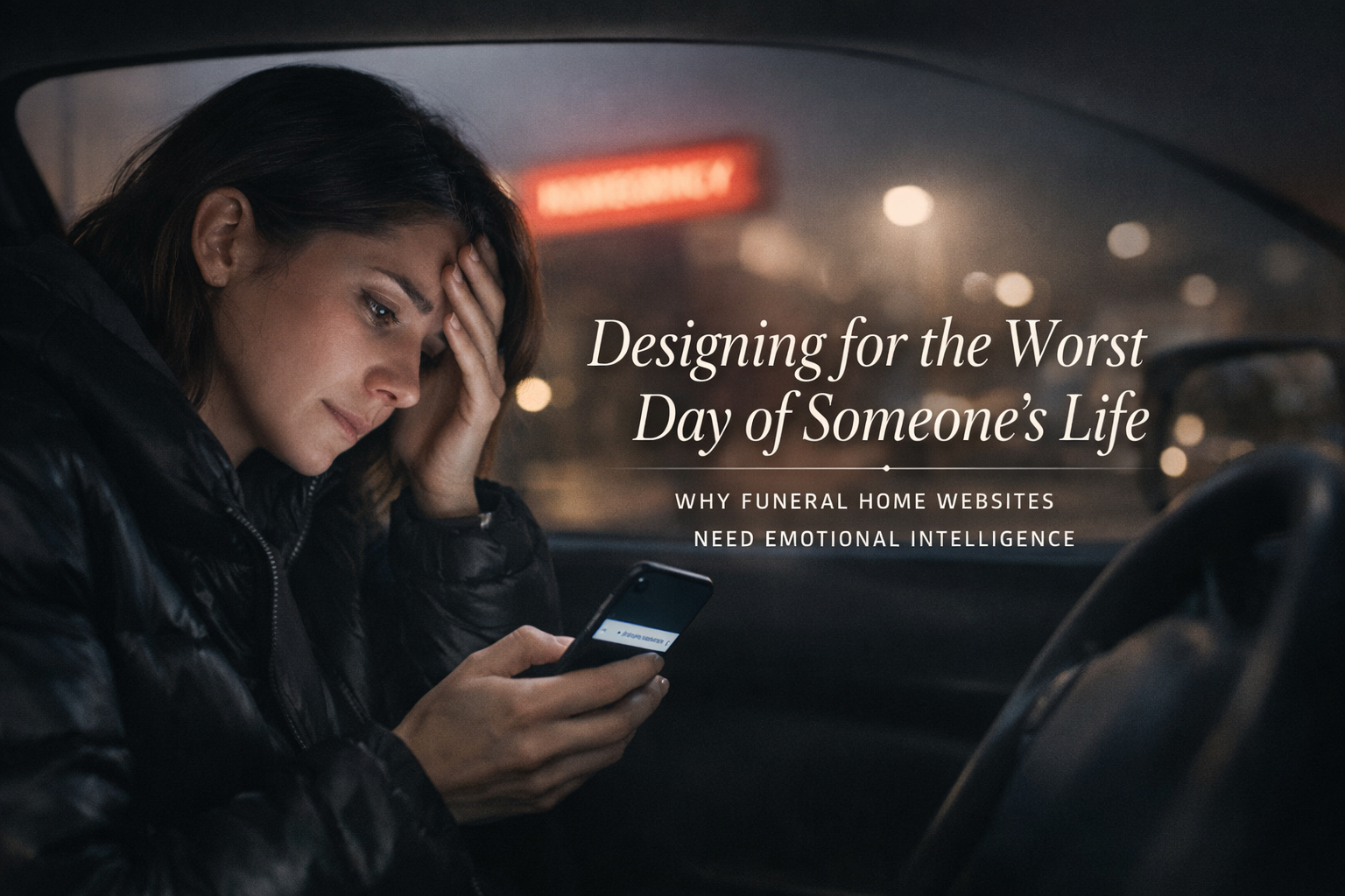
Designing for the Worst Day of Someone's Life
At 2:47 AM, someone is sitting in a hospital parking lot searching "funeral homes near me." Most funeral home websites aren't designed for that person. Here's what it means to design for someone in crisis — and why getting it right is both a moral obligation and a business imperative.
Read More →
Your Best Content Is Behind a Paywall. Is Google Mad at You?
If your best content is behind a paywall, does that mean SEO is off the table? Not quite. This guide breaks down how membership associations can protect premium content and attract organic traffic with a smarter approach to gating, previews, and search visibility.
Read More →Get Started
Ready to find out where your design is losing conversions?
We'll audit your site and show you exactly what's hurting your conversion rate — no pitch deck, no obligation until you're ready to move forward.