Ritner Digital April 2026 Google Analytics Report
Two days ago we published our April 2026 SEO Client Benchmark Report — our real Google Search Console data for ritnerdigital.com and our client site Signed to Keys, with honest analysis of impressions, positions, and the zero-click search environment we're all operating in. That report covered visibility: how often we show up in search and whether people choose to click.
This one covers what happens after the click.
Google Analytics tells a different story than Search Console, and it's one most agencies never show you. GSC tells you how you're doing in search. GA tells you who actually arrives, where they came from, what they did when they got there, and whether any of it is producing real business activity. We're sharing ours — April versus March, real numbers, data anomalies called out honestly, and what we're doing about what we found.
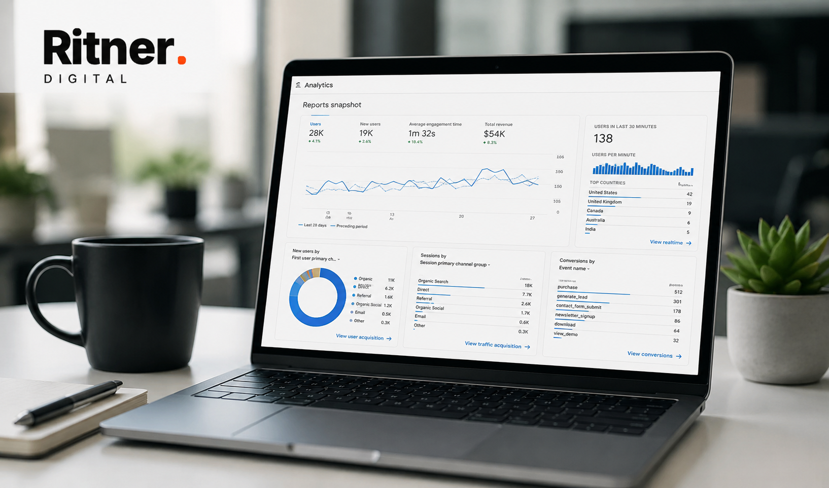
The Top-Line Numbers: April vs. March
Before going into the data, there's something important to address up front. March's numbers look dramatically better on several metrics — page views, scroll events, key events — and the reason is not that March was a breakout month. It's that our analytics in March captured a significant amount of internal testing traffic: sandbox pages, mockup pages, and practice pages that generated enormous page view counts from just one or two internal users. The /aw-mockup page alone drove 275 views from 2 users in March. /practice generated 220 views from 4 users at over 1,000 seconds of average engagement. /homesandbox added another 315 views from 6 users. None of that is real audience behavior.
April's numbers are cleaner. What looks like a drop on several metrics is largely an artifact of the March anomaly, not a real decline.
Here's the honest side-by-side:
The numbers that matter most here are active users (up 12.4%), new users (up 11.9%), sessions (flat), and form starts (up 50%). Everything else that looks like a drop is explained by the March testing anomaly. We'll clean up the data filtering going forward so this comparison isn't necessary in future reports.
Where Traffic Is Coming From: The Channel Breakdown
This is where the data gets most useful for understanding how a service business site actually grows. Four channels drove meaningful traffic in April. Here's how they compared to March — and what each one actually means for the business.
The direct traffic story is the most important one here. Direct grew 12.8% while every other channel contracted slightly. For a B2B agency, direct traffic typically means people who already know you — they typed the URL, bookmarked it, clicked a link in an email, or came through a Slack message or PDF. Growth in direct traffic is a signal that brand awareness is building: more people know Ritner Digital exists and are coming back to the site with purpose.
The slight dip in organic search sessions (down 7.9%) is not a concern when read alongside our Search Console report. Impression volume was growing significantly in April — we were showing up for more queries than ever. The disconnect between more impressions and slightly fewer GA-measured sessions is exactly what you'd expect in a zero-click search environment where a growing share of queries get answered inside Google's AI Overviews without anyone clicking through.
The referral dip is mostly a March anomaly. March's referral channel generated 578 key events from 149 sessions — a 47% conversion rate that reflects a small number of highly targeted referred visitors who came through a specific link and took action. That kind of spike doesn't repeat every month and shouldn't be used as a baseline.
Organic social holding at 160 sessions with 111 key events is solid. The consistent LinkedIn publishing cadence is maintaining a meaningful social audience, and those visitors convert at nearly 20%.
What People Are Actually Doing On-Site: Events
The events data shows the clearest picture of on-site behavior. A few numbers stand out immediately — and one of them is genuinely exciting.
The session start count being nearly identical — 1,082 in March versus 1,078 in April — is the clearest proof that the March gross numbers are inflated. People started sessions at exactly the same rate. What made March look enormous was internal users creating thousands of page views on test pages. April is the accurate read.
The form start jump is the headline event. 120 form starts in April versus 80 in March — a 50% increase — while total sessions were flat. More visitors who arrived in April decided to engage with the contact form. That's conversion intent increasing, which is exactly what you want to see.
The gap between form starts (120) and completed contact form submissions (6 ThankYou page views) is where we're focused next. That's a 95% abandonment rate, which tells us the form itself has friction problems. Length, field order, what fires at completion — we're testing all of it in May.
The 388% jump in on-site search (view_search_results) reflects a growing content library that visitors are trying to navigate. That's a sign of depth, not a problem.
Top Landing Pages: What's Actually Converting
Not all traffic is equal. The pages that earn sessions and then convert them into meaningful actions are the ones that tell you whether your content strategy is working as a business tool, not just a visibility tool.
A few things jump out immediately.
The homepage is the anchor, as it should be — 275 sessions, 34.9% key event rate, 156 seconds of average engagement. People who start on the homepage are spending real time and taking action.
The industry pages are punching above their weight. The law firms industry page converted at 85.7% — 6 key events from 7 sessions. That's a nearly perfect conversion rate for an industry-specific page. The paid ads service page hit 80%. These pages are doing exactly what they're supposed to do.
The blog posts that are converting deserve a callout. The sitemap/internal linking post drove a 50% conversion rate — half the people who landed on it took a meaningful action. The "how to fire my marketing agency" post drove 19 key events from 7 sessions with an average engagement time of over four minutes. These aren't just traffic posts. They're attracting people who are actively evaluating whether to make a change, and the content is meeting them there.
The Canva transparent background post is the counterexample. It drove 30 sessions in April — the second highest landing page by session count after the homepage — with zero key events and 6 seconds of average engagement. It's bringing in traffic with no business relevance whatsoever. That's fine from a volume standpoint but it needs to be understood for what it is: informational traffic with zero conversion potential that should be viewed as top-of-funnel brand exposure at best.
Where Visitors Are Coming From Geographically
The US base grew 16.7% — the primary market, performing exactly as it should. The UK growing 44% is notable and likely connected to our US vs UK marketing trends post continuing to pull international search traffic.
Sweden dropping 73% sounds alarming until you look at the March numbers closely. Thirty Swedish users generating zero key events, zero engaged sessions is a bot or scraper signature. April's eight Swedish users are probably real people. The drop is a cleanup, not a loss.
Singapore is the most interesting international market. Twelve users, 7 key events, 131 seconds of average engagement per user. A small but genuinely engaged audience that is taking real action. Worth watching.
The Full April Story: Was It an Up Month or a Down Month?
This is the question that matters. Reading GA and GSC together, stripping out the noise, and giving an honest verdict on what April actually was.
The honest answer: April was an up month. Not dramatically, not on every metric, but on the numbers that actually matter for a growing agency website — users, brand recognition, conversion intent, and search visibility — the trajectory was positive.
The metrics that look bad (page views down 52%, key events down 64%) are comparison artifacts from March's internal testing traffic inflating the baseline. Strip those out and April's actual performance against real-visitor March traffic was flat-to-up across the board.
The one genuine problem in the data is the form conversion gap. 120 people started filling in the contact form. 6 completed it. That's a 95% abandonment rate and it's the number we're most focused on fixing in May. Everything upstream is working — awareness is building, intent is increasing, the right people are arriving on the right pages. The last step of converting that intent into a contact is where friction exists and where May's work is focused.
What We're Watching in May
The Bigger Picture: GSC + GA Together
These two reports are most useful when read as a pair. The Search Console report showed us what's happening in search: rapidly growing impression volume, a 6x increase in daily impressions over 90 days, more queries, improving positions. The Analytics report shows us what's happening on the site after the click: growing user counts, a direct traffic base building month over month, conversion intent increasing, and one clear conversion gap to close.
Both confirm the same underlying story. The content strategy is working at the top of the funnel. The site is reaching more people, those people are arriving through more channels, and the ones who land on the right pages are engaging and converting at strong rates. The next phase of work — converting awareness into contact — is less about producing more content and more about reducing friction on the path that already exists.
We'll be back next month with May's numbers. By then we'll have a cleaner baseline, a fixed analytics filter, and a read on whether the form conversion work moved the needle the way we expect it to.
Your Data Should Be Telling You a Story Too
If you're looking at your own Google Analytics and it's not making sense — or if you're not sure whether the numbers you're seeing reflect a real trend or an anomaly you haven't caught yet — that's the conversation we're set up for.
Let's look at what your data is actually saying →
Frequently Asked Questions
Why do your page views look so much lower in April than March if you had more users?
Because March's page view count was significantly inflated by internal testing activity. Sandbox pages, mockup pages, and practice build pages generated thousands of page views from just one or two internal users — the /aw-mockup page alone drove 275 views from 2 people, and several other test pages added hundreds more. When you strip that out, April's 3,777 page views from 697 real users is the more accurate number. This is a data hygiene issue that shows up on a lot of growing sites and is easy to miss until you look at the page-level breakdown and notice that a handful of URLs are generating outsized view counts from almost no users.
What is a "key event" in Google Analytics and how is it different from a conversion?
A key event in GA4 is any user action you've designated as meaningful — a form start, a thank-you page view, a button click, a scroll depth threshold, whatever you've configured as worth tracking. It's essentially GA4's replacement for the "goal" concept from Universal Analytics. A conversion is a subset of key events — specifically the ones tied to business outcomes like a completed contact form. In our data, form starts are key events but not conversions. ThankYou page views — which fire when someone completes and submits the contact form — are the closest thing to a true conversion in our current setup. The distinction matters because a high key event count doesn't automatically mean a high conversion count. We had 834 key events in April and 6 ThankYou page views. Those are measuring very different things.
What does a 95% form abandonment rate actually mean and is that normal?
It means 95 out of every 100 people who started filling in the contact form didn't complete it. That number sounds alarming but it's important to understand what "form start" means in GA4 — it fires the moment someone interacts with any field in the form, including a single click or tap. Some portion of those 120 form starts were people who clicked into a field accidentally, changed their mind immediately, or were browsing on mobile and tapped something without intending to fill it out. That said, a 95% abandonment rate is still a real signal that something about the form experience has friction. Whether it's too many fields, unclear required fields, a CTA that doesn't feel safe, or a technical issue on certain devices — it's worth diagnosing. The benchmark for a well-optimized B2B contact form is typically 40 to 60% completion among people who genuinely start it.
Why did organic social traffic drop from March to April if you were publishing consistently?
Two reasons. First, social traffic in GA4 is notoriously underreported — a significant portion of clicks from LinkedIn, for example, get attributed to Direct rather than Organic Social because LinkedIn's app and some link-sharing behaviors strip UTM parameters or use redirects that GA4 can't attribute correctly. Some of what looks like Direct growth in April is likely Social traffic that didn't get properly attributed. Second, content performance on social platforms is inherently variable. A post that performed exceptionally well in March pulls traffic during that window. April's posts may have been strong but targeted different topics or formats that drive engagement without as many link clicks to the site. Neither explanation means the social strategy isn't working — the key event rate from social held roughly steady at around 19%, which means the quality of social-driven visitors didn't decline even if raw volume dipped.
What does direct traffic actually mean and why is it growing?
Direct traffic in GA4 is essentially a catch-all for sessions where the source couldn't be determined — someone typed the URL directly, clicked a browser bookmark, clicked a link in an email client that strips referrer data, came through a Slack or Teams message, clicked a link in a PDF or downloaded document, or arrived through several other untrackable paths. For a B2B agency site, growing direct traffic generally means one of a few things: brand recognition is building and people are actively seeking the site out by name, existing contacts and prospects are returning after a prior interaction, or the site is being shared through channels that don't pass referrer information. A 12.8% month-over-month increase in direct sessions at this stage of the site's growth is a meaningful signal. It means more people know Ritner Digital exists and are choosing to return.
What is the difference between Google Search Console data and Google Analytics data?
Search Console measures what happens in Google search before anyone clicks. It shows impressions (how many times your pages appeared in search results), clicks (how many times someone clicked through), average position, and CTR — all from Google's perspective. Analytics measures what happens after someone arrives on your site. It tracks sessions, users, page views, engagement, events, and conversions — all from your site's perspective. The two tools answer completely different questions. GSC tells you whether you're visible and whether people are choosing to click. GA tells you what those people do when they arrive and whether any of it produces business outcomes. Running both reports together, as we're doing in this series, gives you the full picture that neither tool provides alone. If your GSC shows strong impression growth but your GA shows flat or declining sessions, that's a CTR problem. If your GA shows sessions but no conversions, that's a content-to-conversion gap. Each tool illuminates a different part of the same story.
Your Singapore numbers are small — why bother calling them out?
Because 12 users with 7 key events and 131 seconds of average engagement is a pattern worth noticing, not because it's a large audience but because it's a disproportionately engaged one. Most international traffic on a US-based agency site produces minimal engagement and zero conversions — people land, realize the content isn't relevant to their market, and leave. Singapore-based users engaging at that rate and producing that many key events suggests there's a genuine audience there, possibly connected to specific content topics or a referral source we haven't fully traced yet. Calling it out now means we'll be watching to see whether it grows or was a one-month anomaly. That's what building in public actually requires — noticing things before they're big enough to obviously matter.
What should we actually be tracking in Google Analytics if we're a small B2B service business?
The minimum viable tracking setup for a B2B service site includes: session source and medium (so you know where traffic comes from), page-level engagement data (so you know which pages people actually read), form starts and completions (so you know whether contact intent is increasing), and thank-you or confirmation page views (so you have a reliable proxy for completed conversions). Beyond that, scroll depth tracking on key pages helps you understand whether people are reading or bouncing, and time-on-page on your most important service and pricing pages tells you whether visitors are actually evaluating you or just landing and leaving. What most small B2B sites don't need — at least not yet — is elaborate custom event tracking, multi-touch attribution modeling, or complex funnel visualization. Get the basics clean and consistent first. The fancier stuff is only useful when you have enough conversion volume to draw conclusions from it.
Why do you track the ThankYou page view instead of the form_submit event for conversions?
Because the ThankYou page view is more reliable. In GA4, the form_submit event can fire inconsistently depending on how a form is built — if the form submits via JavaScript without a page reload, or if there's any technical variation in how the submission is handled, the event may not fire correctly or consistently. A ThankYou page view, by contrast, requires an actual page load — someone can only see that page if they successfully submitted the form and were redirected to the confirmation page. It's a harder signal to fake and easier to verify. That said, our April data shows a discrepancy between ThankYou views (6) and form_submit events (0), which tells us our form_submit tracking is broken or not firing correctly. Both signals together give us the clearest picture — when they diverge this much, it's a tracking issue to fix rather than two different numbers to average.
How long does it take before Google Analytics data becomes reliable enough to make decisions from?
For trend analysis — understanding whether traffic is growing or declining, which channels are performing, which pages are converting — you generally need at least three months of clean, consistent data before the patterns are reliable. A single month's numbers can be dominated by anomalies: a post that went briefly viral, an internal testing spike like our March situation, a bot cluster from a specific country, or a one-time referral source that sent unusual traffic. Two months gives you a comparison but not a trend. Three months starts to show you something durable. For conversion optimization specifically — testing form changes, CTA copy, page layouts — you typically need enough monthly conversions to produce statistically meaningful test results, which for a site at our current stage means running tests over longer windows rather than making weekly judgments. The most dangerous thing you can do with early-stage analytics is act on one month of data as if it represents a settled pattern.